

The Persona To Palette Protocol: Decoding Your Brand’s Visual Language

Who Your Client Actually Is
You’re reading this because you’re afraid your outfit will signal the wrong status to people who matter. That’s the real question underneath: does this communicate competence or does it communicate struggle? Here’s the mechanism. Your ideal client isn’t a demographic. They’re a person with specific anxiety. They buy to solve a problem or to prove they’ve already solved it. Your outfit either confirms they made the right choice trusting you, or it creates friction that makes them second-guess the decision they haven’t made yet.
The signals they seek aren’t random. Someone hiring a financial advisor watches for precision: fitted clothes, minimal visual noise, intentional fabric choice. Someone hiring a creative watches for taste: composition, unexpected pairings, evidence of discernment. Someone hiring a coach watches for energy: fit that moves with you, colors that suggest vitality, nothing that reads as performative or tired. This isn’t about matching their style. It’s about matching their internal standard for what competence looks like in their world.
Values Into Fabric

The advice to “dress professionally” is incomplete and often wrong. Professional to a banker means different from professional to a therapist or a SaaS founder. The real work is translating one specific value into one tangible choice, then repeating until your outfit becomes a coordinate system instead of a collection of pieces. Take transparency as a value. Transparent doesn’t mean literal. It means showing your process, your thinking, your reasoning. In fabric terms, this translates to texture you can read: linen over silk, structured cotton over slick synthetics, details you can see work into the garment.
If your brand value is precision, the outfit enforces it through fit and proportion, not logos or recognizable luxury. If your value is accessibility, you demonstrate it by choosing pieces that work without requiring insider knowledge to understand. If your value is innovation, you prove it by combining proportions or materials in a way that feels new without looking costume-like. The outfit becomes proof of concept. Before anyone hears you speak, the clothes answer the question: does this person understand what they’re talking about? Set one primary value. Choose one garment category that will carry that value. Build the rest of the outfit around supporting that single statement.

Beyond Trends: The Enduring Power Of Archetypes For Branding Photo Outfits

Recognize Your Core Brand Type
You want to look intentional in photos because random choices read as confused, and confusion kills credibility. Archetypes work because they’re psychological blueprints people recognize instantly, before conscious thought. The Sage, the Rebel, the Creator, the Leader—these aren’t personality tests. They’re visual contracts between you and your audience about what you deliver and who you are.
Identifying your archetype means naming the singular problem you solve and the worldview you hold about it. If you teach people to break rules, you’re the Rebel—your outfit should telegraph permission and boundary-breaking. If you help others find clarity, you’re the Sage—your outfit communicates precision and restraint. The archetype anchors every clothing choice that follows. Without it, you’re just picking items that look good, which guarantees they’ll look generic.
Amplify Through Coherent Constraint
The common mistake is treating a photoshoot like a fashion opportunity. It’s not. Every garment either strengthens or dilutes your archetype’s signal. Coherent constraint means choosing a narrow palette and silhouette that reinforce one narrative, not competing for attention across multiple looks.
If you’ve identified as the Creator archetype, your outfit amplifies through texture and individuality—but within bounds. One statement piece. Neutral foundation. Accessories that hint at your process. The mechanism is signal-to-noise ratio: the fewer competing visual elements, the louder your core message becomes. Wear what your archetype demands, not what trend cycles suggest.
The Signal To Noise Ratio: How Your Attire Communicates Status

Clarity Over Complexity
You want people to perceive you as competent without thinking about why. That’s the real goal here. In military strategy, signal clarity determines whether orders reach soldiers intact or get lost in static. Your outfit works the same way: every piece either amplifies your intended message or degrades it. A blouse that demands attention pulls focus from your face and expertise. A color that clashes with your skin tone wastes cognitive load the viewer could spend processing your credibility. The mechanism is simple. Observers have limited attention. You compete for it. Waste none on accidental noise.
The common advice says wear something that expresses your personality. That’s incomplete. What actually matters is whether each element strengthens the single message you want sent. A structured blazer communicates authority. A well-fitted pair of trousers communicates intention. A contrasting necklace communicates distraction. You are not here to be interesting. You are here to be understood. Strip the outfit down to components that directly support how you want to be perceived, then stop adding.
Purposeful Minimalism In Construction
Every garment element must earn its place. Not every color combination reads as intentional. Not every texture adds dimension without creating visual friction. Photographers light faces, not wardrobes, so fabric choice matters more than pattern. Matte fabrics absorb light and recede. Shiny fabrics reflect light and advance toward the camera. If you wear a glossy silk blouse, it competes with your face for attention. If you wear structured cotton or linen, the fabric stays neutral and your presence dominates the frame.
Remove anything that requires explanation. Trendy pieces date fast and dilute your professional signal. Logos draw the eye away from your expression. Multiple competing patterns create visual noise that reads as chaos, not style. Your outfit should disappear the moment someone looks at you. The mechanism works like this: as you speak, your outfit fades into the background. The viewer absorbs your words and remembers your competence. That’s the math. Build your branding photoshoot outfits to make themselves invisible so your actual value becomes visible.
The Inversion Principle: What NOT To Wear For Business Fotoshoot Success

Pattern Clashes And Fit Failures
You’re afraid the camera will expose what you already suspect: that you don’t look like the person you’re trying to become. Here’s the mechanism that matters. In visual design, contrast works like signal-to-noise ratio in engineering. Poor fit and clashing patterns are noise. They compete with your face, your message, and your authority. A blazer two sizes too large reads as uncertainty. Horizontal stripes layered under a geometric print read as chaotic. The camera amplifies what your eye forgives in the mirror.
Fit problems aren’t style problems, they’re communication problems. When fabric bunches at the armpit or pulls across the chest, the viewer’s attention fragments. They notice the struggle instead of the strategy. Pattern clashes work the same way. Mixing incompatible scales and color systems forces the eye to work too hard. The rule is mechanical: one dominant pattern per outfit, one neutral anchor. Your body should disappear into clarity, not fight for space against itself.
Logos, Prints, And The Attention Tax
This is where conventional advice fails you. Everyone says “wear what represents your brand,” which is backwards. Your brand is represented by your competence, your positioning, and your clarity of message. A visible logo or busy print doesn’t communicate your brand. It communicates that you’re renting someone else’s credibility. Designer logos especially create visual debt. They pull focus away from your face and toward the label, which means they pull focus away from you.
Busy prints carry a different cost: they date fast and they exhaust the viewer. A photoshoot outfit lives in rotation for years. A graphic tee with trend-dependent imagery or a blouse covered in small-scale florals becomes archive footage within months. Solid colors and minimal textures age differently. They compound in value. A navy blazer shot in 2023 still reads as current in 2026. That’s not boring. That’s strategic. Choose solid fabrics in neutral or jewel tones, with texture as your only pattern layer—a subtle weave, a cable knit, a fine herringbone. The print tax isn’t worth what you lose.
The Tactical Wardrobe: Building Versatility For Work Photo Ideas

Building Your Core Shoot Pieces
You want a wardrobe that signals competence without effort because you’re tired of overthinking what to wear. The real mechanism here is constraint. A capsule system forces you to choose pieces that work across multiple scenarios, which eliminates the decision paralysis that kills productivity on shoot day. You’re not building a closet. You’re building a system that produces consistent, professional output.
Start with three neutral base layers: a fitted white button-up, a black blazer, and a cream or grey long-sleeve fitted top. Add two bottoms that fit perfectly and photograph clean—tailored trousers in navy or black, and one midi skirt or higher-waisted trouser in a complementary neutral. These six pieces form the foundation. Everything else you shoot will either build on these anchors or replace them strategically. Don’t buy trend pieces. Buy pieces that survive rotation across six different shoot concepts without looking dated.
The Architecture Of Layering
Layering borrows its logic from architecture: load-bearing walls support everything above them. Your base layer is the load-bearing wall. A fitted white shirt under an open blazer creates depth and visual separation without adding bulk. The shirt reads professional. The open blazer adds authority. The gap between them creates the frame that makes you look intentional instead of overdressed.
The second move is texture stacking without color multiplication. Wear a structured knit over a fitted base, then add a blazer or cardigan. The eye reads progression and intentionality. Keep all colors within the same temperature family—warm neutrals together, cool neutrals together—so the outfit reads as one unit, not competing pieces. The camera catches texture; it catches line; it catches proportion. It does not catch confusion.
Girl Boss Photoshooting Ideas: The Subtle Art Of Authority

The Color Palette That Commands Rooms
You want people to take you seriously before you open your mouth. That’s the mechanism here: color triggers neurological association faster than any word you’ll speak. Drawing from color theory in environmental psychology, certain hues function as optical authority signals, establishing dominance through wavelength rather than volume. Navy, charcoal, and deep jewel tones compress visual space and draw attention inward to your face. These aren’t aggressive. They’re economical.
Black reads as closure and control in professional contexts. Navy signals stability without the harshness. Charcoal offers sophistication while remaining approachable. Avoid pastels entirely in authority-focused shoots. They diffuse presence rather than concentrate it. Warm neutrals like camel and taupe work only if paired with fitted silhouettes that emphasize structure. The color alone means nothing. The color plus the cut equals the statement.
Accessories That Anchor Your Presence
Accessories fail when they compete with your message. The rule is simple: one focal point per zone. A structured watch handles the wrist. A thin gold chain handles the neck. A leather belt handles the waist. Overloading dilutes impact and reads as nervous.
- Structured watches with leather or metal bands: Establish time ownership and decisiveness. Metal reads more authoritative than fabric.
- Minimal jewelry in gold or silver: One statement piece per area prevents visual chaos. Avoid mixing metals or layering multiple necklaces.
- Leather belts with defined buckles: Cinch silhouettes at natural waistlines to create proportion and intentional framing.
- Structured bags in neutral leather: A briefcase or structured tote signals preparation and organization without distraction.
- Tailored blazer with clean lines: Acts as both clothing and accessory, defining shoulders and creating architectural authority through cut alone.
Strategic accessories work because they don’t demand explanation. They exist as visual punctuation, not performance. Your photographer should frame shots tight enough that accessories register but loose enough that your face and posture remain the primary focal points. Test each piece in frame before shooting begins.
The Environmental Integration: Matching Attire To Shooting Photo Corporate Location

Urban Backdrops Demand Intentional Contrast
You’re worried the location will swallow you whole and you’ll vanish into the background like every other corporate headshot. That’s not actually the problem. The mechanism is contrast: urban environments already contain visual noise, so your outfit either competes with that noise or becomes part of it. Choose fabrics and colors that read from ten feet away. Matte finishes beat shine in cluttered settings. Solid colors outperform patterns. The backdrop is not your enemy; it’s a baseline you measure yourself against.
Modern cities offer concrete, glass, and metal. These materials reflect light differently than skin does. Wear jewel tones or deep neutrals that don’t disappear into gray architecture. A burgundy blazer works. Black does not. Avoid white unless you want to test your camera’s exposure settings. Avoid pastels entirely. The outfit must sit visually separate from the building behind you while still belonging to the same frame. This is a calibration, not a decoration.
Natural Settings Require Texture And Subtlety
Common advice says wear earth tones outdoors. That’s incomplete. The real mechanism comes from fabric weight and texture, not color theory. Natural light is unforgiving because it has no filter. It exposes thin materials, cheap construction, and wrinkles instantly. Invest in structured pieces with weight behind them. Cotton blends over pure cotton. Linen that’s been treated to resist wrinkling over untreated linen. Outdoor shoots demand fabric you can actually see.
Green and brown backgrounds don’t need you to match them. They need you to occupy a different visual plane entirely. Wear jewel tones, deep charcoal, or cream. Layering creates dimension where flat color fails. A structured blazer over a fitted base adds shadows the camera reads as depth. Texture here is the actual asset: a cable knit sweater photographs stronger than a smooth one against trees and grass. You’re creating visual separation through material quality, not color coordination.
The CV Photoshoot Advantage: Professionalism Beyond The Resume
What Actually Reads In Frame
You want the photo to do the hiring before the interview starts. That’s the real game here. In photography, there’s a principle called signal-to-noise ratio: the strength of your intended message versus everything competing for attention. Your outfit is signal. Every unnecessary detail, every trend, every “personality pop” is noise. A CV photoshoot outfit works backward from what kills credibility, not from what looks good on Instagram.
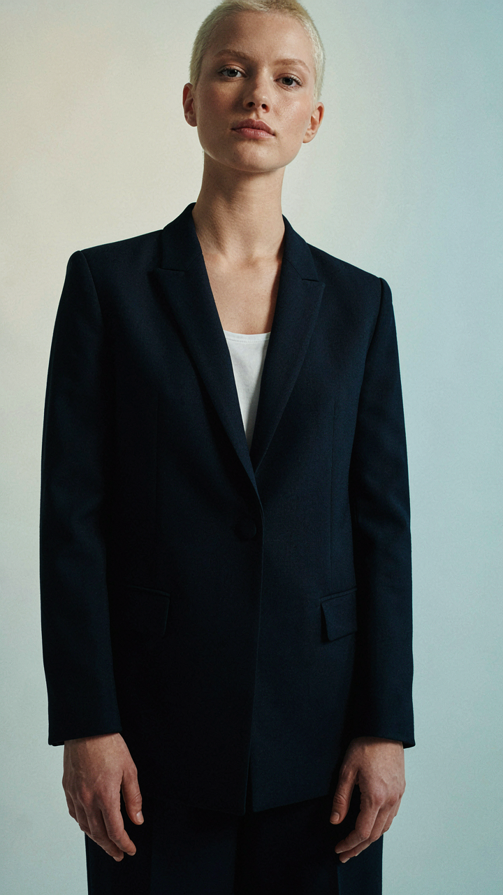
The mechanism is contrast suppression. Your face and shoulders need to be the only variables the viewer processes. Neutral, fitted layers achieve this. Think structured blazer in navy, charcoal, or black. The fabric matters more than the color: cotton blends hold shape, wool reads expensive without trying. Skip logos, patterns, and jewelry that moves. Stillness in fabric reads as stillness in character.
The Architecture Of Restraint
The advice to “let your personality shine through your outfit” is incomplete and misses the point. Personality gets interpreted through competence first. Your outfit’s job is to remove doubt about whether you’re serious, not to prove you have taste.
Layering creates the illusion of structure without bulk. A fitted sweater under an open blazer. A simple white or cream base layer. The blazer does the work: it signals boundary, authority, and intention. Fit matters more than price. An expensive blazer that pulls at the shoulders reads worse than a tailored mid-range piece that skims your frame. Get one seam adjusted if it means the shoulder sits flush.
Neutral colors aren’t boring—they’re economical. Navy, black, camel, and charcoal work across lighting setups and don’t distract from your face. A photographer’s light meter reads fabric tone; if your outfit reflects light unevenly, it competes with your skin tone and eyes. Matte fabrics outperform shiny ones. Choose textures that absorb light rather than throw it back. Before the shoot, check your outfit under the exact lighting conditions your photographer will use.
The Unspoken Language: Confidence And Poise In Marketing Portraiture

Movement Reveals Your Real State
You care about this section because you know the camera catches what you’re hiding. Restricted clothing creates visible tension. Your shoulders rise. Your neck tightens. Your jaw locks. In biomechanics, we call this the “bracing response”—when the body senses constraint, it protects itself by locking joints. A branding photoshoot outfit triggers this same mechanism if it fights your natural range of motion. The photographer frames the result: you look defended, not open.
Clothes that work require a specific engineering approach. Fabric needs give, not stretch. Seams must sit where joints bend, not across them. Armholes should sit low enough that raising your arms feels like an action, not a rebellion. Test every pose before the shoot: sit, stand, reach sideways, cross your arms, lean forward. If anything pulls, restricts, or rides up, eliminate it. This is not comfort—this is structural integrity for camera angles.
The Optical Authority Effect
Confidence in attire isn’t psychology. It’s signal clarity. When your outfit fits correctly, your nervous system receives no pain feedback during the shoot. No feedback means no micro-expressions of discomfort. The camera sees only intentional gestures and authentic expressions. Your attention stays on the message, not the garment pulling at your underarm or the waistband cutting circulation.
This is why fit matters more than trend. A well-fitted neutral blazer reads as executive authority. An oversized blazer reads as hiding. The difference is measurable in pixel data—posture straightens, eye contact sharpens, and micro-expressions align with intention. Before booking the photographer, book a tailor to check the sleeve length, shoulder seams, and torso length. One fitting session removes ninety percent of in-shoot self-awareness problems.
The Real Obstacle Isn’t The Outfit; It’s Your Underdeveloped Understanding Of Self And Market

You don’t need a better outfit. You need clarity on who you actually serve and why they should care. Most women waste time styling themselves for some imaginary audience instead of the specific person who buys their offer. Spend tonight writing down your ideal client’s biggest problem and how you solve it. Then pick clothes that communicate that solution, not clothes that look good on Instagram. The outfit is just the vehicle. The message is everything.