

The Unseen Resume: Your Graduation Photoshoot Aesthetic As A Professional Statement

Dress Code As Dominance Signal
You want these photos to matter for your career, not just your Instagram. Here’s the mechanism: in economics, we call this “signaling”—when you communicate information about yourself that others can’t directly verify. Your outfit does this work before anyone reads your resume. Neutral, structured pieces in quality fabrics signal you understand professional environments. Logos, trends, and excess fabric signal the opposite. The brain processes your clothing in under two seconds and locks in a conclusion.
A tailored blazer, white button-down, or structured dress operates like professional armor in photography. The camera catches texture and fit before it catches personality. Wrinkles, loose fabric, or trend-forward pieces distract from competence. Your graduation photos live in perpetuity—LinkedIn, job interviews, client meetings. They’re not documenting celebration. They’re documenting your first statement about who you are in work. Choose fabrics that photograph as intentional: cotton blends that hold shape, wool that reads as investment-grade, linen if cut structured.
The Pitfalls That Undercut Your Position

Most advice says “wear what makes you feel confident.” This is incomplete guidance that costs you. Oversized silhouettes read as shapeless on camera. Metallics and sequins belong in evening wear, not professional documentation. Busy patterns fracture attention. Bare shoulders or cropped lengths signal “party mode,” not “boardroom ready.” The graduation photoshoot outfit that looks bold in the mirror often looks unfocused in stills. Photographers frame you tightly. Your outfit has nowhere to hide.
Avoid anything requiring constant adjustment—straps that slip, hems that ride up, necklines that gape. Stick to clean lines and neutral color palettes: black, navy, white, cream, muted earth tones. These aren’t boring. They’re professional architecture. Your face and posture become the focal point instead of competing with fabric movement. Wear what photographs like strategy, not what feels like rebellion.

The Signaling Protocol: Colors And Fabrics For Impactful Convocation Poses

Color Choice As Social Proof
You want people to know you belong in the frame. That’s the real question underneath this section. Color works like a signal in economics: it communicates information faster than your resume can. Darker colors read as intentional and serious in photographs because they create contrast against skin and background. Navy, charcoal, and deep jewel tones consistently photograph as confident choices, not because they’re trendy but because they absorb light and define edges without distraction.
The mistake most advice gives is treating all colors equally. They aren’t. Bright pastels and neons read as costume in stills. Neutral grounds like cream, taupe, and black let the photograph focus on your face and posture instead of fighting the outfit. When you’re being documented at a milestone moment, the color should reinforce the occasion’s weight, not compete for attention.
Fabric As Technical Detail
Fabric quality signals discipline. This isn’t aesthetic preference, it’s observable fact. Natural fibers like silk, linen blends, and quality cotton hold their shape under studio lighting and throughout a three-hour shoot. Cheap synthetics wrinkle, pill, and flatten in photographs, making you look like you didn’t prepare. Structured fabrics that maintain their form all day demonstrate you understood what the moment required.
Matte finishes photograph cleaner than shiny ones because they don’t create hot spots or glare in flash. Crepe, ponte, gabardine, and heavyweight cotton blends are industry standard for reason. When selecting fabric, touch it. If it feels thin or plastic, the camera will confirm that judgment. Your outfit should feel as intentional as your presence at graduation.
Beyond The Gown: Strategic Under Outfits For Grad Gown Pictures
The Power Outfit Beneath
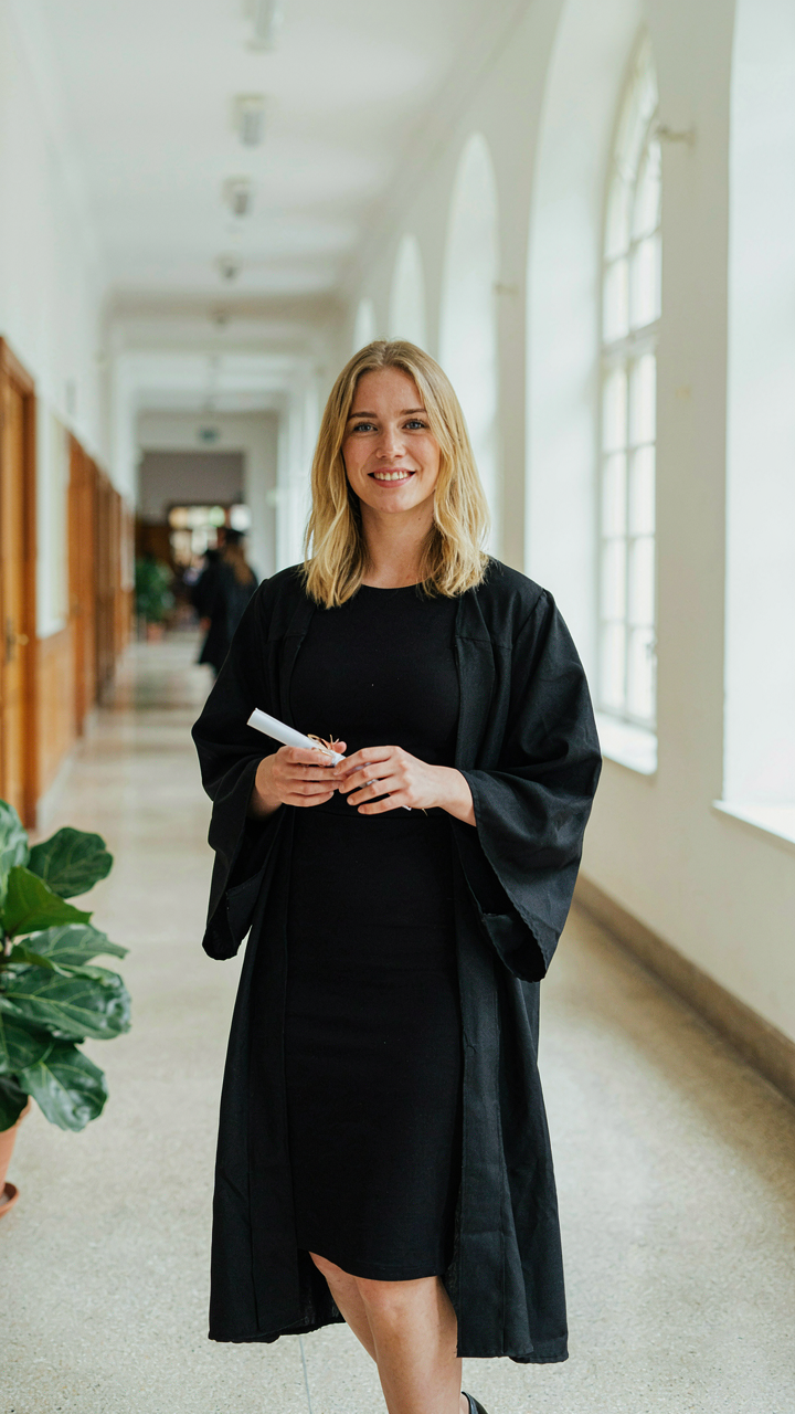
You care about this because you’re spending money on professional photos and you don’t want to waste them on a half-thought outfit that kills the shot from the neck down. What you wear under the gown controls three things: how you move, how the gown drapes, and what’s visible in the transition shots nobody plans for but everyone takes. The mechanism is simple. Fabric weight and fit determine silhouette. A loose dress creates volume under the gown that photographs as shapeless. A fitted option holds structure, so when you unbutton or remove the gown mid-shoot, you have a defined form instead of deflated fabric pooling at your sides.
Wear tailored separates or a fitted sheath dress in solid colors. Black, navy, ivory, or jewel tones work without competing visually. Avoid horizontal stripes, busy patterns, or anything with thick seams that show through gown fabric. The fit matters more than the formality. A well-fitted casual dress outperforms an ill-fitting formal one because it reads as intentional, not desperate. When the photographer asks you to slip the gown off your shoulders or remove it entirely, your core outfit becomes the entire composition.
Seamless Transitions From Casual To Professional Shots
The common advice here is wrong: you don’t need two separate outfits. What you need is one base outfit that works across contexts by adding or removing single pieces. Think like a military loadout system, where each component serves a purpose and stacks efficiently. Your base is the fitted dress or separates. Your variables are the outer layer (blazer, structured cardigan, or oversized button-up), the footwear swap, and minimal jewelry changes.
Professional shots demand structured pieces. Throw on a tailored blazer over your base dress, and you’ve elevated it instantly. For casual shots, roll the blazer sleeves, unbutton the top, or remove it entirely and go back to the base. Footwear shifts the vibe too: heels feel formal, white sneakers or loafers feel approachable. Change shoes between setups. This approach eliminates outfit changes in the dressing room and keeps hair and makeup stable while you reset the visual tone. One outfit, multiple contexts, no chaos.
The Archetype Arsenal: Crafting Your Persona For Women’s Graduation Photoshoot

Find Your Professional Identity
You want to know which outfit signals competence because the photos will outlast the ceremony. Here’s the mechanism: your brain categorizes people in three seconds based on visual signals, and graduation photos get pulled out for LinkedIn, family conversations, and job interviews for years. The professional archetype framework comes from organizational psychology, where researchers identified that people naturally project one of three leadership identities. In graduation photoshoots, your outfit operates like organizational signaling: it announces whether you’re the type who leads through vision, execution, or deep expertise.
Most advice tells you to “dress like your future self.” That’s vague and backwards. Instead, identify which archetype matches your actual trajectory and strengths. The leader archetype commands through presence and decision-making authority. The innovator operates through disruption and forward momentum. The specialist owns through mastery and credibility in a specific domain. Your outfit should reflect which one you actually are, not which one sounds impressive in theory. This distinction matters because forced archetypes read as inauthentic in photos, and cameras catch that immediately.
Outfits That Signal Your Archetype
The leader archetype wears structured pieces with commanding proportions. A tailored blazer with strong shoulders, high-waisted trousers, and minimal accessories projects decision-making authority. The fabric matters here: wool blends and structured cotton hold shape and read as intentional. Colors like navy, black, or deep charcoal amplify this effect. Avoid anything that looks borrowed or oversized, because leadership reads through precision.
The innovator wears elevated basics that suggest forward thinking without costume energy. A sleek turtleneck under a modern cut dress, paired with minimal jewelry and clean lines, signals movement and clarity. The specialist wears pieces that suggest deep knowledge of craft: fine layering, unexpected texture combinations, or subtle technical details visible only to people who know the field. A fitted sweater under a slip dress, or structured fabrics that suggest intentional material selection, communicate mastery. All three archetypes work in photos because they’re honest about who you are when the camera stops rolling.
The Leverage Principle: Accessorizing For Masters Graduation Photo Ideas
Where Your Eyes Actually Land First
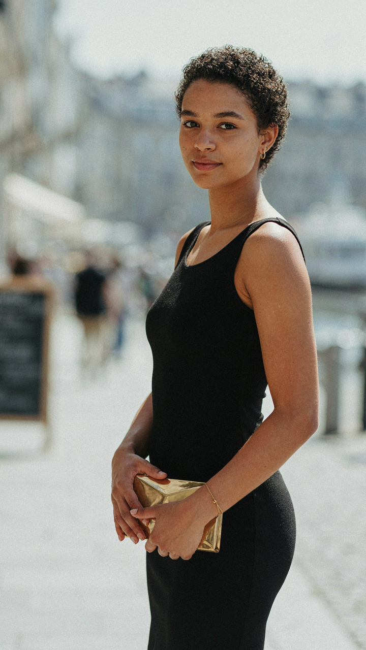
You want accessories to do the work you’re afraid your outfit won’t. That’s the real reason this matters. In physics, a fulcrum multiplies force by positioning it at the right point. Your accessories function the same way. A statement piece positioned correctly shifts visual weight and creates hierarchy without needing to change your entire ensemble. The camera sees the accessory first, then reads backward to your outfit.
Most graduation advice says “add what feels right.” That’s incomplete. Strategic placement means anchoring attention to your strongest asset. If your face photographs well, keep the neckline clear and use a delicate pendant that doesn’t compete. If your hands are visible, a structured clutch or bold ring becomes a focal point. The accessory doesn’t enhance the outfit. It redirects where the viewer’s attention lands.
Subtraction Before Addition
The instinct is wrong here. More accessories don’t photograph better. Fewer, intentional pieces do. One statement earring works harder than two. A single layered necklace works harder than multiple thin ones fighting for space. This isn’t minimalism as an aesthetic choice. It’s signal clarity. In a photo, clutter reads as noise. The camera flattens everything, so competing elements cancel each other out.
Pick one focal point accessory per outfit. Everything else recedes. If you wear a structured metallic belt, skip the bracelets. If you wear chandelier earrings, keep your necklace absent or barely there. If you carry an architectural clutch, your shoes become supporting players. This constraint forces you to choose what actually matters. The result photographs sharper, reads cleaner, and makes you look deliberately composed instead of assembled.
The Investment Mindset: Choosing A Graduation Photoshoot Dress That Pays Off

Buy Once, Wear Twice
You’re worried the dress won’t matter after one day. That’s the real fear underneath this whole decision. Here’s the mechanism: a graduation photoshoot outfit functions like capital equipment. You either extract value from it once, or multiple times. A structured midi dress in a neutral tone works at the photoshoot, then at a wedding, then at a professional event six months later. A neon bodycon dress designed purely for impact works at the photoshoot and nowhere else.
The math is simple. Fabrics like cotton blends, crepe, and structured linen hold shape through multiple wears without degrading. A classic silhouette in cream, black, navy, or sage green survives trend cycles. You’re not buying nostalgia. You’re buying a tool that solves more than one problem. When you choose accordingly, the photoshoot becomes the opening act, not the entire show.
The True Cost Per Wear Calculation
Economics teaches us opportunity cost: what you give up by choosing one thing over another. Apply that to your dress purchase. A 300 dollar outfit worn once costs 300 dollars per wear. A 300 dollar outfit worn six times costs 50 dollars per wear. Most women ignore this frame entirely. They buy based on what looks best in a single moment, then shelve it.
Reverse the logic. Start with the price point you can afford. Then ask: where else will I wear this? If you can name zero places besides the photoshoot, the dress is too specific. If you can name three or more, you’ve found a legitimate investment. The mechanism is ruthless. You either expand the utility of what you buy, or you waste money on single-use costumes. Track where you actually wear pieces over twelve months. That data becomes your filter for the next purchase.
The Contextual Code: Location Specific Graduation Photoshoot Outfits
Matching Your Outfit To The Environment
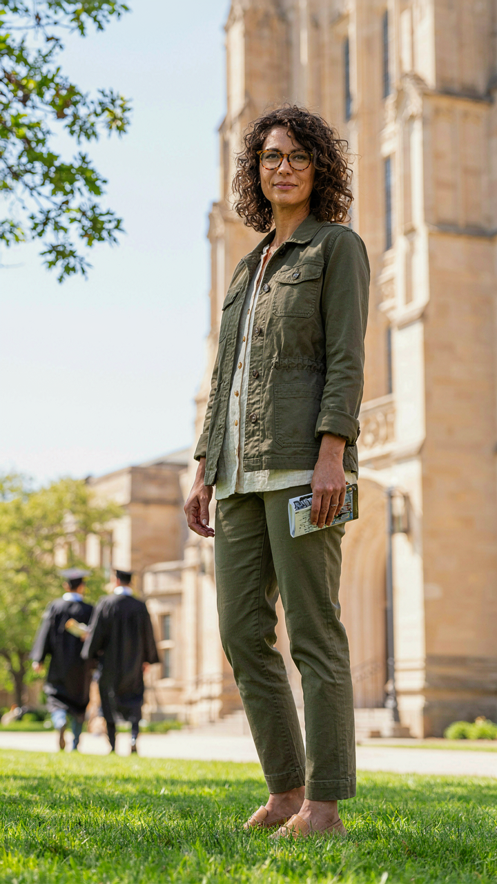
You care about this because you sense that showing up in the wrong outfit for the wrong location reads as tone deaf. The mechanism is contrast theory from visual design: your outfit either competes with the backdrop or completes it. A heavy velvet dress against a dense forest reads as muddled. The same dress against a clean white building reads as intentional. The environment isn’t the stage your outfit performs on—it’s the equation your outfit solves.
Choose fabrics and colors that create visual separation or harmony depending on what the location already dominates. A cream linen suit against sandstone architecture creates continuity and depth. Bright jewel tones against muted brick read as deliberate emphasis. Dark jewel tones against dark foliage disappear. Saturation and value contrast are the only variables that matter here. Test your outfit mentally against the actual location before the shoot.
Environment As Narrative Container
The common advice here is soft: pick a location that “speaks to you” or “represents your journey.” That’s useless. The real mechanism is semiotics, the study of signs and meaning. Your location doesn’t represent anything by accident—it makes claims about who you are through visual language that viewers decode instantly. A botanical garden implies cultivation and growth. A urban concrete setting implies ambition and edge. An empty field implies solitude and transition.
Build your outfit to reinforce the specific meaning the location already carries. Don’t fight it. If you shoot in front of classical architecture, wear structured pieces with clean lines that echo that vocabulary. If you shoot in a natural setting, let texture and organic fabrics mirror the environment. The outfit and location aren’t separate elements—they’re a unified argument about who you are at this moment. Align them so every detail supports the same narrative claim, from fabric texture to silhouette to color story.
The Pose Command: Directing Your Body For Powerful Graduation Poses Women

Confidence Through Structural Alignment
You want to look powerful in photos because it signals you earned something real. The mechanism is simple: your skeleton either creates angles that compress energy or angles that distribute it. Think of architecture. A building with load-bearing walls placed strategically withstands pressure. Your body works the same way. Alignment that channels tension outward reads as confidence. Misalignment that folds inward reads as uncertainty.
The specific moves matter more than the feeling. Keep shoulders slightly back and down, not hunched or forced. Plant feet hip-width apart or stagger one forward. Tilt your chin parallel to the ground or slightly down, never up. This positioning opens your chest cavity and prevents the slouch that cameras punish. Your arms should have purpose, not dangle. These are load-bearing points.
- Shoulder positioning: Drop shoulders away from ears and retract them slightly. This opens your collarbone and chest, reading as authority rather than tension or defensiveness.
- Staggered stance: Place one foot forward of the other at a 45-degree angle. This creates dynamic stability and prevents the flat, static appearance of standing square to the camera.
- Chin angle: Keep your chin level or tilt it fractionally downward. Tilting up elongates the neck but often creates an unnatural or insecure appearance in photographs.
- Arm placement: Rest hands on hips, hold a diploma, or let arms frame your body. Avoid straight-down positioning, which flattens your silhouette against the background.
- Core engagement: Tighten your core slightly without visible tension. This prevents slouching and ensures your outline reads sharp, not undefined.
The photographer will give basic direction. You have to execute the mechanics without thinking about them. Practice these positions before the shoot so your body defaults to them instead of fighting unfamiliar angles during the session.
The Poses That Sabotage You
Generic advice says smile and relax. That’s incomplete. The real killers are poses that bury your silhouette or create visual confusion. Turned-in feet, crossed legs that hide your frame, arms pressed against your torso, forward head tilt that creates a double-chin shadow, asymmetrical weight distribution that reads as off-balance. These aren’t style choices. They’re visual noise that dilutes the image.
Avoid turning inward toward the camera unless you’re creating a profile shot. Don’t cross your arms tight against your body. Don’t let your head sit forward of your shoulders. Don’t lock your knees or stand with weight on one leg excessively, which tilts your hips unnaturally. When you hold your diploma or props, keep them at your sternum or waist, not blocking your torso. The job of your pose is to present maximum surface area and clean lines. Everything else subtracts.
The Narrative Edge: Storytelling Through Your Convocation Photoshoot Wardrobe

What Your Outfit Actually Says
You want these photos to prove you belong in the next room. That’s the real reason you’re thinking about this. Most advice tells you to “express yourself” or “wear what makes you comfortable.” That’s incomplete. The mechanism is borrowed from semiotics: your outfit functions as a sign system that communicates status, intention, and trajectory to whoever views the image months or years later. Every fabric choice, color, and silhouette carries information independent of your intentions.
Your convocation photoshoot outfit works like a visual thesis statement about who you’re becoming. A structured blazer signals professional ambition differently than a flowing dress. Neutral tones read as intentional restraint while bold colors broadcast confidence or artistic direction. The photos live forever on LinkedIn, family walls, and your own memory. You’re not dressing for the moment. You’re dressing for the permanent record of this transition.
Anchoring Your Visual Identity To Tomorrow
The common mistake is treating your outfit as decoration rather than declaration. You pick something that looks good today without asking what it claims about your next chapter. Start instead by identifying the single professional or personal direction you’re moving toward post-graduation. Then choose one outfit element that signals that direction unmistakably. If you’re entering tech, crisp tailoring matters more than trendiness. If you’re pursuing creative work, distinctive texture or cut becomes your differentiator.
Work backward from your intended audience. The people who will see these photos first are often admissions committees, hiring managers, or collaborators evaluating your judgment. They’re reading your choices as data about your decision-making. Select one anchor piece—a well-fitted blazer, a structured dress, or tailored trousers—and build everything else around it. That single commitment to clarity over ambiguity changes how the entire image reads.
The Editing Imperative: Post Production For A Polished Graduation Photoshoot
Skin And Fabric Refinement
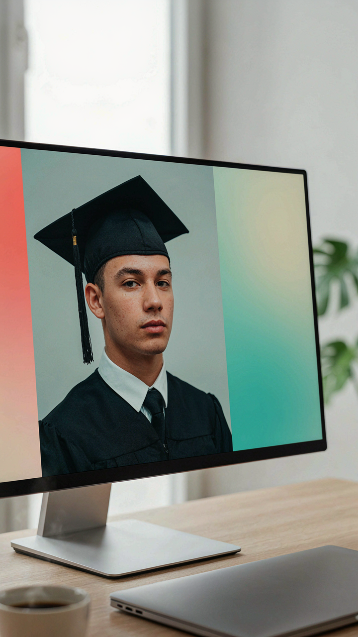
You care about this because unedited photos broadcast incompetence. The mechanism is simple: editing isn’t about fakery. It’s about removing the noise between what you wore and what the camera captured. Graduation outfits demand skin retouching that erases temporary blemishes, uneven tone, and the red marks clothing creates on your neck and shoulders. This is correction, not transformation. A professional editor targets only what disrupts the outfit’s visual read.
Fabric textures benefit from selective sharpening and contrast adjustment. Matte finishes need slightly reduced highlights to avoid washing out. Satin and silk require careful shadow work to keep the sheen dimensional rather than flat. The dress itself must appear as intended in person, not dulled or blown out by lighting conditions the camera encountered. This work happens in the midtones where your outfit lives, not in extreme highlights or shadows.
The Dress In Context
When you evaluate retouched graduation photos, look for consistency in skin tone across your entire visible body. Uneven editing creates a patchwork effect that reads as amateurish faster than minor blemishes. The dress color should match what you see in natural light photos taken outside, not the warm or cool cast of indoor studio lighting. Check that seams, pleats, and hemlines remain sharp and defined, not softened into vagueness by over-processing.
Real retouching makes the outfit the subject, not the editing. If you notice the editing before you notice the dress, the editor overcorrected. Your graduation photoshoot dress should look like the best version of itself on the day it was worn, nothing more.
The Real Obstacle Isn’t Finding The Right Outfit, It’s Accepting Your Power To Shape Perception

Most women treat their graduation photoshoot outfit like a costume they’re borrowing. You’re not borrowing anything. You’re announcing who you’ve become. The outfit isn’t the real decision here. Deciding whether you’ll show up as a version of yourself or a watered-down compromise is. Stop asking what looks safe. Ask what makes you feel undeniable. Then wear that. Your appearance on that day shapes how people remember this moment, but more importantly, how you remember yourself in it. Confidence isn’t something you wear. It’s something you demand.