

The Unseen Psychology Behind Every Profitable Fashion Lookbook Layout

Aspiration Gap And Visual Proof
You’re reading this because you want proof that your clothes matter, and you need to prove it to people with money. Most brands think a lookbook is a catalog. It’s not. A lookbook is behavioral economics at work. You’re creating what psychologists call “aspirational distance”—the gap between who someone is now and who they imagine becoming. Close the gap too much and the product feels attainable but unremarkable. Keep it too wide and it feels impossible. The layout determines which side of that gap your customer lands on.
The real mechanism is framing context, not just clothing. Each image placement, pose, and background choice narrows what the viewer can project onto the product. A flat lay with minimal context lets buyers imagine infinite uses. A styled environment with specific props, lighting, and model positioning does the opposite—it tells them exactly who wears this and why. The second approach converts better because it removes decision friction. The buyer doesn’t wonder if the piece fits their life. They’ve already seen their life wearing it.
Constructed Scarcity Through Narrative Structure

The common advice here is wrong. Most brands think exclusivity comes from limited quantities or high prices. It doesn’t. Exclusivity in a lookbook comes from story construction that makes the viewer feel like they’re part of a select group that understands the code. This is how luxury fashion uses semiotics—the study of signs and their meanings. Your lookbook layout is a sign system. Every detail signals who’s allowed in and who isn’t.
The mechanism works like this: establish a specific lifestyle, aesthetic principle, or problem the clothes solve, then repeat it across images with enough variation that it feels earned, not obvious. A viewer sees the pattern before consciously recognizing it. They feel smart for catching it. That feeling of recognition creates perceived membership. They believe they’re the type of person who wears this brand because the lookbook made them decode something. The final step is consistency across every image placement, color palette, and model expression so the viewer’s brain registers the pattern as intentional—therefore real.

Beyond Basic: Creative Lookbook Ideas That Command Attention
Build Around A Visual System, Not A Product Drop
You want your lookbook to matter because you’re tired of posting inventory shots that disappear into the feed noise. Here’s the mechanism: a conceptual theme operates like a narrative anchor in graphic design—it gives every image permission to exist within a coherent visual language instead of standing alone. Your clothes aren’t the story. The story frames the clothes so they mean something.
A visual system means repeating color palettes, compositional rules, or environmental logic across every shot. If you shot your first lookbook in a brutalist warehouse with concrete and steel, the second one uses the same location with different seasons or times of day. The viewer’s brain recognizes the pattern. That familiarity builds brand recall faster than unique backdrops ever will. Consistency across lookbooks creates a style signature that competes with larger brands that have actual ad budgets.
Shoot Where Your Customer Actually Lives
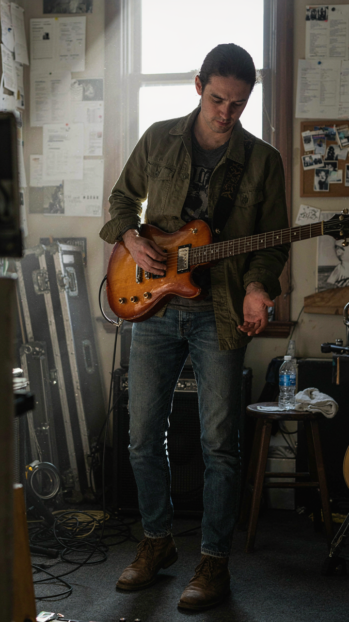
The common advice here is dead: “Find an aesthetic location.” That’s how you end up with the same warehouse everyone else used. Authenticity in casting and location means choosing real spaces that connect to your brand’s actual customer base, not abstract mood boards.
If your brand targets musicians, shoot in a practice space or green room. If you’re selling workwear for trades people, document the job site or workshop. The friction of the real environment—the lighting problems, the texture of worn tools, the way fabric moves during actual labor—creates visual tension that styled shoots cannot fake. Your customer sees themselves in the frame because the frame is their world. That recognition converts lookbook viewers into buyers.
The Scarcity Loop Lookbook Design Ideas Protocol
Visual Cues That Signal Limited Availability
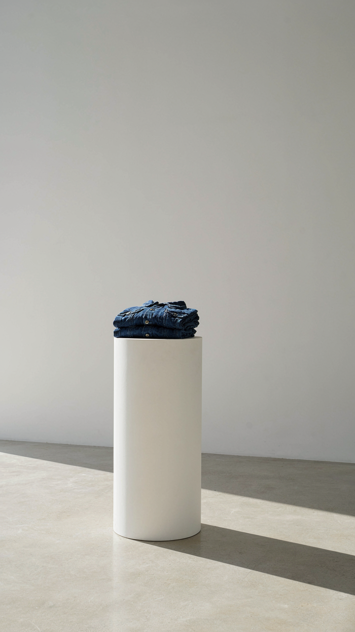
You want people to believe your stuff matters because you don’t have much of it. That’s the real mechanism here. Scarcity in economics works because humans assign value inversely to supply. Apply that directly to your lookbook photography: show fewer items per frame, shoot against empty space instead of cluttered backdrops, and photograph pieces in single or paired units rather than full collections laid out at once.
The visual language matters more than the narrative. Shoot tight crops on details and materials instead of wide shots of racks. Use negative space aggressively. When a viewer sees one folded garment on a plain surface with nothing else competing for attention, their brain treats it as rare before you say a single word. That’s the mechanism working. Consistency in this approach across your entire lookbook trains the eye to expect limitation.
Creating Anticipation For Future Drops
Nobody teaches this part: anticipation isn’t about hype. It’s about information asymmetry. Show partial products in your lookbook, partially obscured details, or deliberately cropped shots that don’t reveal the full piece. Tease colorways and silhouettes without showing them complete. This forces the viewer’s brain to complete the image, which creates cognitive investment before purchase intent even forms.
Time your lookbook releases to match your production cycle. If you drop new inventory every month, release lookbook content on a predictable schedule two weeks before that drop. Show behind the scenes of production in the lookbook itself: fabric folding, seaming, quality checks. Make the making visible and limited. When people see the actual labor involved, they stop comparing your pricing to mass production. That’s when the scarcity loop closes.
Fashion Layout: How To Manipulate The Eye And Mind

Formation Before Content
You want layout to feel effortless because you think that means your clothes will sell themselves. It won’t. Layout is force multiplier—it determines whether the viewer’s brain processes your garment as premium or commodity in under two seconds. Military strategists call this “terrain advantage.” In fashion lookbooks, terrain is the frame itself: where you place the subject, the negative space ratio, the axis lines. Control the composition first, and the clothes become secondary to the psychological state you’ve engineered.
Every layout choice either narrows focus or diffuses it. Tight framing with minimal negative space creates urgency and perceived value. Wide frames with balanced white space signal luxury and restraint. Most small brands do neither deliberately—they just post what looks “nice.” That’s the mistake. You need a compositional strategy before you shoot a single frame.
The Focal Point As Weapon
Attention doesn’t spread equally across an image. The eye moves in predictable patterns based on contrast, line weight, and color saturation. Military tacticians call this “concentration of force”—put maximum resources where they matter most. In a lookbook frame, your focal point is where you concentrate visual weight. A garment gets 80 percent of the viewer’s processing power if you force the eye there first through line direction, lighting isolation, or color block placement.
Most lookbooks fail because they treat the entire frame as equally important. Your job is to make the secondary elements invisible. If the background competes with the product, you’ve lost. If the model’s pose doesn’t guide the eye to the garment’s hero detail, you’ve wasted the shot. Place contrast where the seam detail lives. Direct light where the fabric quality shows. Make every compositional element point inward to one non-negotiable feature.
Lookbook Editorial: Storytelling That Sells, Not Just Shows

The Brand Myth You Actually Need
You want your lookbook to feel “authentic” because you’re afraid it won’t convert otherwise. Here’s the mechanism: a brand myth is the repeatable origin story that explains why your design choices exist. Not your company history. The reason your silhouettes, fabrics, and color palettes solve a specific human problem that competitors ignore.
Strong brand myths aren’t invented. They’re extracted from the constraint that forced your first design decision. Helmut Lang built minimalism around the idea that fashion had become noise. Carhartt’s workwear mythology came from actual construction sites, not a marketing brainstorm. Your myth becomes the lens through which every lookbook image gets framed. It’s the invisible architecture holding your visual choices together.
When Emotion Replaces Product Description
The common advice says “show the garment and its features.” That’s incomplete. Psychology research on decision-making shows humans don’t buy products; they buy identity shifts. A lookbook that leads with fabric weight or seam construction speaks to the three percent of buyers who’ve already decided. The other ninety-seven percent need to see themselves wearing the piece first.
Emotion in a lookbook operates like narrative tension in film. The viewer’s nervous system has to register contrast between their current state and the state the garment enables. Shoot your pieces on models in environments that telegraph aspiration, not just style. The mechanism is simple: frame the before-and-after emotional arc in every image, and your lookbook stops being a catalog.
The “Anti Generic” Lookbook Ideas Toolkit

Stop Copying What Works For Everyone Else
You want to stand out without taking real risk. The mechanism is simple: consensus lookbook tactics exist because they’re safe, repeatable, and they work for brands with massive distribution. But safety is invisible. Nobody remembers safe. Most fashion lookbooks fail because they follow the same structure—model in outfit, neutral background, three angles, repeat. This isn’t strategy. It’s template thinking. Break it by identifying what your competitors refuse to shoot.
The real move is borrowing from systems thinking, where leverage points determine outcome disproportionately. In fashion lookbooks, the leverage point isn’t better lighting or more poses—it’s constraint. Shoot only close-ups of fabric details and construction. Feature real customers instead of models. Show the garment actually being worn while doing something specific, not standing still. Document the making process. Use inconsistent color grading intentionally. Each breaks the pattern your audience expects, which means each one registers as different.
- Constraint Based Storytelling: Limit yourself to one location, one time of day, or one angle per outfit. Restriction forces creative decisions that generic lookbooks avoid.
- Customer Takeovers: Feature real people wearing your pieces in their actual environment. This proves fit, builds community, and bypasses the artificial feel of professional shoots.
- Process Over Product: Show pattern drafting, seam stitching, fabric sourcing, or fitting adjustments. Audiences trust what they see being made more than finished goods presented without context.
- Intentional Imprecision: Shoot handheld instead of tripod. Use natural light only. Let shadows fall where they fall. Precision reads as corporate when you’re small.
- Seasonal Decay: Document the same garment at different stages of wear across months. This proves durability and creates narrative momentum that a single shoot cannot.
Stop competing on production value. You don’t have it. Compete on specificity instead. A lookbook that shows exactly how a piece functions beats one that shows how beautiful it looks in a studio. Specificity is what small brands own that big ones cannot replicate without losing credibility.
Imperfection As The Actual Strategy
Flawless lookbooks suggest your brand has something to hide. Visible stitching, wrinkled fabric, asymmetrical framing, awkward posing—these read as honest in a field drowning in retouching. The strategic move is distinguishing between sloppy and intentional. Sloppy loses sales. Intentional builds trust. The difference is consistency. If you blur backgrounds, blur them on purpose every time. If you shoot grainy, shoot grainy everywhere. Audiences sense when imperfection is accidental versus designed.
Authenticity isn’t a feeling. It’s a pattern. When your lookbook shows consistent, deliberate imperfections across all images, viewers conclude the brand is confident enough to be real. This beats trying to hide flaws because hiding always shows. Use natural wrinkles in fabric as foreground interest. Let the model’s actual body proportions define how the piece drapes instead of pinning it to perfection. Shoot after the garment has been worn, not fresh off the production line. The worn state proves the piece survives use—which is the only promise worth making.
Fashion Brand Lookbook: Building An Identity, Not Just A Collection

The Aesthetic System That Runs Beneath Everything
You want people to recognize your brand in a feed without seeing your logo. That’s status disguised as taste. The real mechanism is constraint. Every brand that survives operates on a repeatable visual system, not random good taste. This system is borrowed from architecture: a design language with rules, proportions, and deliberate limitations that compound over time.
Your lookbook becomes the codification of that system. Consistent color palettes, lighting setups, model positioning, fabric textures, photography angles. Not because consistency is virtuous, but because repetition builds neural pathways. A customer scrolls past fifty images and recognizes your work instantly. That recognition converts. Document your exact rules now—lighting temperature, backdrop materials, seasonal color shifts—and execute them identically across every shoot.
The One Visual Element That Sticks
Most advice says “find your unique angle” and stops there. That’s lazy. Brands with staying power anchor their lookbooks to one specific visual marker that becomes synonymous with them. Not a vague aesthetic, but a concrete thing. A particular fabric drape, a signature stitch visible in close-ups, a consistent cropping ratio, a specific styling choice like always pairing items with one type of accessory.
The marker works because it’s repeatable and immediately recognizable. Supreme’s red box. Rick Owens’ silhouettes. Not their entire aesthetic, but the single node that people associate first. Choose one element from your brand’s actual production or design process, not something invented for the lookbook, and make it the visual anchor across every image set. This becomes your visual handshake.
Optimizing Your Lookbook For Maximum Impact And Conversion

Where Your Lookbook Actually Lives
You want distribution strategy because you’re afraid your lookbook will disappear into the void. Here’s the mechanism: a lookbook only converts when it meets qualified eyes at the moment they’re primed to buy. Distribution determines both reach and timing. Most brands dump their lookbook on Instagram and call it done. That’s reactive, not strategic.
Your distribution channels must match where your customer actually shops and researches. Instagram works for discovery. Pinterest drives intent and long-tail search traffic. Email reaches buyers already in your funnel. TikTok works if your brand skews younger and you have video content. Each channel requires different formatting and messaging. Don’t repurpose one version everywhere. Tailor the assets to the platform’s function, not just its dimensions.
The Metrics That Reveal Real Traction
Vanity metrics like views and likes tell you nothing about whether a lookbook moved product. Engagement beyond the scroll requires tracking what actually matters: click-through rate to product pages, time spent on specific product shots, cart additions, and revenue attributed to the lookbook. These metrics reveal whether your styling choices, photography, or product selection resonates with buyers or just entertains browsers. Most brands track impressions and move on. That’s why they can’t improve.
Set up UTM parameters for every link in your lookbook so you know which products and which outfits drive traffic. Track which platform sends the highest-quality traffic, not the most traffic. A hundred clicks from email that convert at 8 percent beat ten thousand impressions that convert at zero. Measure whether customers who engage with the lookbook return for repeat purchases. Repeat purchase rate from lookbook viewers reveals whether you’re building brand loyalty or just capturing one-time curiosity.
Monetizing Your Lookbook: Turning Pages Into Profits

Convert Browsers Into Buyers
You want proof that your lookbook matters. The real reason you care about this section is that a beautiful lookbook that doesn’t sell feels like wasted time. Here’s the mechanism: a lookbook is a conversion tool, not a gallery. In retail economics, “consideration” is the stage between awareness and purchase. Your lookbook lives there. It answers the question the customer hasn’t asked yet: how do I actually wear this? That specificity collapses decision friction. Every outfit shown is a removal of one excuse not to buy.
Your call to action can’t hide. Link each outfit directly to the product bundle or individual pieces. Use clear language: “Shop This Look” beats “Learn More.” Track which outfits drive clicks and which don’t. This data tells you what your audience actually wants to wear, not what you think they should. Test different placement—top of the lookbook versus bottom—and measure conversion rate by position. The lookbook that doesn’t move inventory is just content.
Link Products Directly Into Context
E-commerce integration isn’t about embedding a store into your lookbook. It’s about eliminating the gap between desire and transaction. When someone sees an outfit styled correctly, their brain has already decided to buy the individual pieces. Your job is to make that decision executable in two clicks or less.
Most brands waste this moment by forcing readers back to their homepage to search for items. Wrong move. Tag each product in your lookbook with a direct link to that specific product page or a “quick view” modal that shows price, size options, and an add-to-cart button. If you’re using a platform like Shopify, apps like Lookbook or Outfyt automate this. On Instagram, use the native Shopping Tags feature to link directly to products. The faster someone moves from image to checkout, the higher your conversion rate climbs.
The Real Obstacle Isn’t Your Budget; It’s Your Inability To Weaponize Perception

Most small brands fail their lookbooks because they treat photography like documentation instead of persuasion. You’re not capturing clothes. You’re manufacturing desire. The difference between a brand that sells and one that doesn’t isn’t the camera quality or location budget. It’s whether you understand that every frame must answer a single question: why should someone buy this instead of the thousand other options? Stop shooting what your products look like. Start shooting what owning them feels like. Pick one outfit today and photograph it like you’re selling a lifestyle, not inventory.