

The Muted Myth: Why “Soft Autumn” Isn’t A Style Prison

Color Rules Are Borrowed Confidence
You’re looking for permission to stop thinking. That’s the real draw of a color palette system. The mechanism works like a contract: follow the chart, get the result. But soft autumn isn’t a cage. It’s a lighting condition. Your skin reads certain wavelengths better than others. Warm undertones, low saturation, and earthiness describe how light reflects off you, not a mandate for your closet.
The standard advice claims you must stay inside the palette or risk clashing. That’s incomplete. The actual rule is this: your skin’s undertone stays constant, but saturation and depth move independently. A soft autumn can wear a bright red if it leans orange-red instead of blue-red. The color itself isn’t forbidden. The wavelength is. Learn the difference between rejecting a color and adjusting its temperature. That’s when soft autumn stops feeling like a prison and becomes a diagnostic tool.
Muted Doesn’t Mean Invisible

Common wisdom says muted equals subdued, safe, boring. Wrong. Muted in design terms means low chroma, high complexity. Think of it like signal-to-noise ratio in audio engineering: the signal isn’t quieter, the background interference is lower. A soft autumn outfit in muted tones creates impact through contrast and texture, not screaming saturation. The eye stays longer because there’s something to parse.
A muted taupe next to a muted rust creates visual tension without aggression. The depth comes from undertone layering, not brightness. Wear a soft autumn outfit where every piece sits in the muted range, and you project control. You’re not fighting the light. You’re using it. The protocol is simple: build contrast through tone and value first, saturation second.

Unlocking Your Personal Palette: Beyond Generic Seasonal Color Analysis Soft Autumn

What Your Undertone Actually Determines
You’re reading this because you want permission to stop guessing what colors work on you. The real mechanism here is simple: undertone isn’t about your season, it’s about what wavelengths of light your skin absorbs versus reflects. Your undertone is a physical property, not a marketing category.
Soft autumn undertones sit in the middle ground. You have a mix of warm and cool reflectance. The mistake most color analysis systems make is forcing you into a binary. They’ll tell you you’re either warm or cool. That’s incomplete. What matters is identifying whether gold, silver, or muted metallics sit closest to your skin’s actual light-bounce profile. Test this directly: hold a warm bronze and cool silver next to your jawline in natural light. Whichever disappears into your skin rather than creating contrast is your answer. That’s your undertone, not a name or a season.
Strategic Neutrals Make Off Palette Colors Work
The common advice fails here: “stick to your palette.” That’s risk-averse nonsense. Off-palette colors work if you build them through a neutral buffer. Think of it like color theory in graphic design: a complementary accent needs a dominant neutral to prevent visual chaos.
In soft autumn outfits, your strategic neutrals are warm grays, warm taupes, soft olive, and warm whites. These act as visual anchors that let you wear colors outside your standard palette without creating jarring contrast against your skin. If you want to wear a color that technically sits in cool autumn territory, place it as an accent piece against one of these neutrals as the base or secondary color. Your skin tone becomes secondary to the outfit’s internal color logic. The protocol: choose your outfit’s dominant neutral first, then layer in one accent color—whether it’s within or outside soft autumn—as long as it’s muted enough to read as intentional rather than accidental.
The “Autumn Girl Color Palette” Deception: Warm Muted Color Palette Fashion

What Instagram Calls Autumn Isn’t Actually Soft Autumn
You want permission to buy clothes without overthinking it. That’s the real reason you’re reading about color palettes. The mechanism killing your soft autumn outfits is simple: trending “autumn aesthetics” online conflate warm colors with muted colors, but they’re not the same thing. Burnt orange, terracotta, and deep rust dominate the feed because they photograph well and feel “cozy.” Soft autumn needs neither the saturation nor the depth of those colors.
Most soft autumns chase these vibrant warm tones and end up looking exhausted or costumey. The palette you actually need sits between true autumn and soft summer, closer to the undertones of aged fabric than fresh produce. The colors that work have already been lived in. They’re the distinction between a color that photographs and a color that flatters your actual skin.
The Muted Warmth That Actually Works
Color theory teaches us about saturation as the difference between a pure hue and its grayness. Soft autumn operates at low saturation. A muted warm olive isn’t just olive that’s been dulled down, it’s olive with a gray undertone woven through the molecule itself. You can’t achieve this by simply darkening or lightening a vibrant warm color. The mechanism is different.
A true soft autumn palette includes warm colors that feel like background colors, not feature colors. Warm beige, soft bronze, dusty gold, muted caramel, and subdued copper work because they recede slightly instead of demanding attention. When you layer these tones, they create depth through restraint rather than contrast. Start by identifying one genuinely muted warm piece you own that doesn’t make you look washed out, then match its undertone to everything else.
The Subtlety System: Mastering Soft Autumn Blues And Greens
What Muted Tones Actually Signal
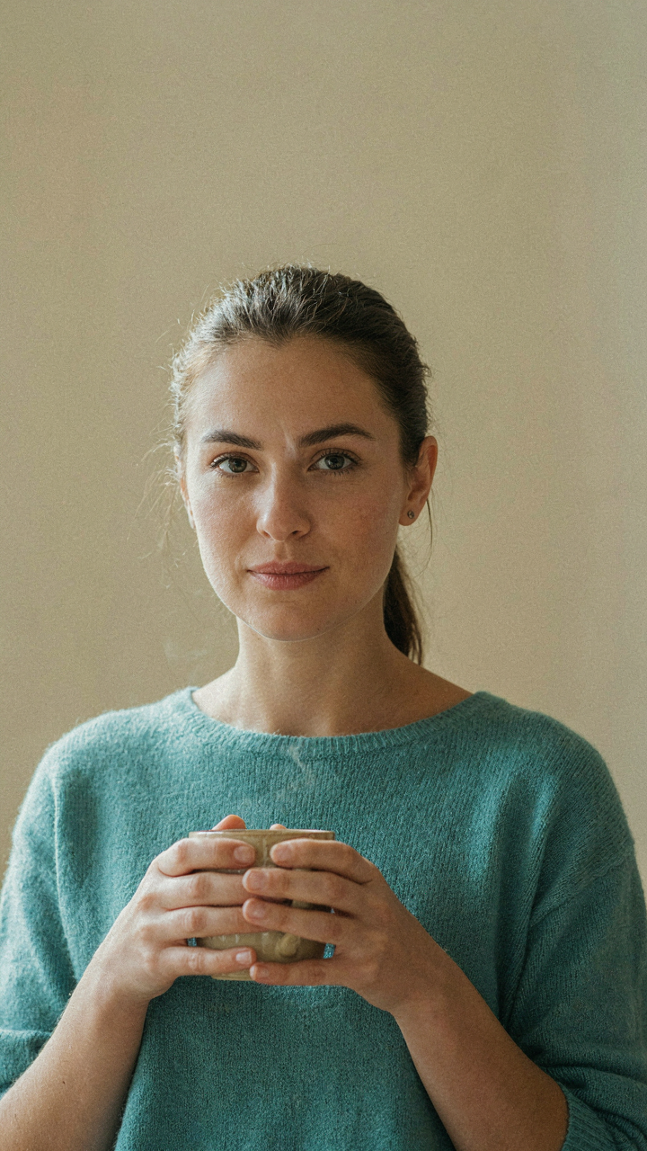
You want to know if wearing the right color makes people respect you more. It doesn’t work that way, but the mechanism does matter. Color psychology operates like a signal—not a command. Muted tones convey restraint, which reads as competence. Soft autumn blues and greens contain gray undertones that lower saturation. This creates visual calm instead of visual demand. The brain interprets low-demand colors as trustworthy rather than attention-seeking. A soft teal or dusty sage doesn’t shout; it settles. That settling is the actual tool.
The confusion starts because people think color psychology is mystical. It’s not. Muted blues and greens work in soft autumn palettes because they match your undertone and reflect light differently than bright versions. Your skin absorbs and reflects wavelengths. When those wavelengths align, no visual friction occurs. When friction disappears, people perceive ease and coherence. This isn’t manipulation. It’s alignment. Wear a bright cobalt blue next to warm skin, and your face competes with your shirt for attention. Wear a dusty slate blue, and your face wins because nothing contradicts it.
Empty Space Shapes What Remains
Art theory teaches that composition lives in negative space, not objects. Soft autumn outfits fail when every piece fights for attention. The mechanism works backward from how most people think: subtract first, then add. A soft autumn green sweater worn alone reads louder than the same sweater layered under a neutral linen jacket. The jacket creates breathing room. Your eye settles on the green because it’s the only element with texture or depth. Everything else recedes.
Apply this to outfit building by treating your palette like an art canvas. One muted blue or green becomes the focal point. Everything else—your base layer, your outerwear, your accessories—should be cream, taupe, warm gray, or another neutral from the soft autumn range. This isn’t minimalism for its own sake. It’s hierarchical contrast. When you eliminate competition between colors, the softer tones finally work. The blue or green you chose stops being lost in visual noise and becomes intentional. Build outfits by placing one color in negative space, then filling the rest with neutrals.
Fall Winter Fashion 2026: The 3 Autumn Color Palette Fallacy

When Trends Override Your Actual Coloring
You’re worried you’re dressing wrong and falling behind while everyone else knows the secret code. Here’s the mechanism: the fashion industry profits from selling you new “seasonal palettes” every two years, and soft autumn got bundled into that cycle the moment it became searchable. Your actual undertone doesn’t change in 2026. The colors that made you look alive in 2024 still do. Seasonal trend forecasting is real marketing, not real science about your skin.
The common advice is backwards. Marketing calls it “fall winter fashion 2026” to create urgency. Your soft autumn palette exists independent of what runways show next season. Trend forecasting firms predict color directions based on economic cycles, fabric innovation, and cultural mood, not on what flatters your face. You need a static reference system, not a revolving door of palettes that obsolete themselves annually. Build toward your actual colors instead of chasing what expires.
Core Pieces That Outlast The Cycle
Soft autumn’s power comes from constancy, not novelty. In economics, this is called having low replacement velocity: items that stay functional and relevant across multiple seasons require less frequent repurchasing. A camel wool coat in warm undertone lands the same way in 2024, 2026, and 2030 because the mechanism is your skin’s light absorption, not fashion magazine layouts. The industry doesn’t want you to know this because static wardrobes reduce sales.
Start with three anchor pieces: a camel or warm taupe wool coat, an olive or muted rust knit, and cream or warm white trousers. Wear them for two years straight and notice what actually works on you, not what the algorithm says should. Don’t buy a new palette version next season. Deepen it with accessories in the same undertone family, test their staying power against your actual life, then commit to what doesn’t need replacing.
The Visual Weight Protocol: Soft Autumn Outfits That Command Attention
Contrast And Texture From Built Spaces
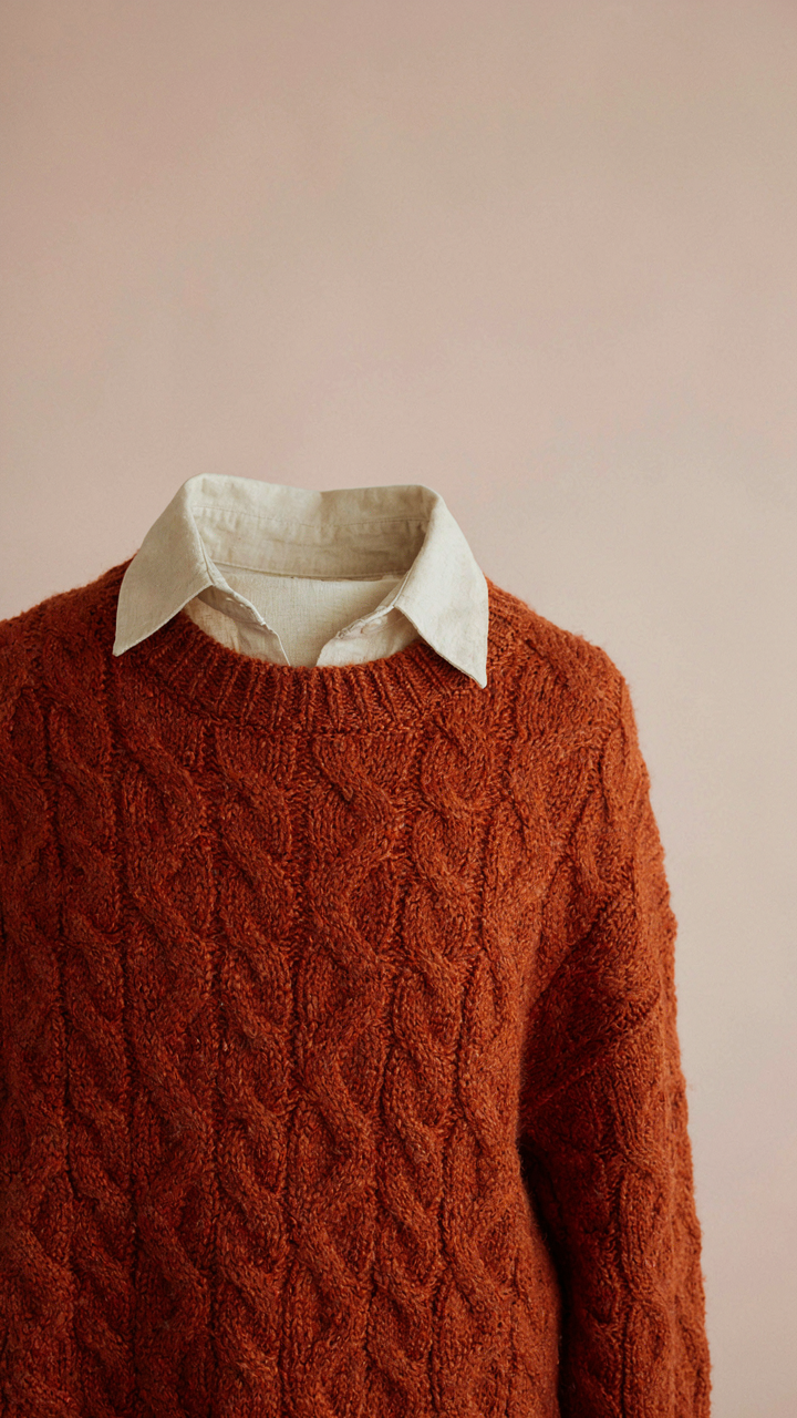
You want people to notice you without looking like you’re trying. That’s the real reason you care about this section. Architecture solves this through load-bearing: visual weight must distribute across a structure or it collapses into chaos. Your outfit works the same way. Soft autumn colors are muted, so they lack inherent contrast. You build contrast through texture instead. Rough against smooth. Matte against subtle sheen. This distributes visual attention across the entire ensemble rather than concentrating it in one dead spot.
A camel wool coat over a cream linen shirt creates structural integrity through material opposition, not color shock. Pairing a terracotta knit with cognac corduroy generates movement through surface variation. The eye travels because textures demand it. Most soft autumn advice stops at color matching and wonders why the outfit feels flat. The mechanism nobody names is texture layering. Without it, muted palettes disappear into the background.
Where The Eye Actually Lands
Photography positioning teaches focal point theory: the viewer’s gaze goes where contrast, scale, or isolation directs it. Apply this deliberately to soft autumn outfits by controlling where visual information concentrates. A structured burnt sienna blazer at chest height becomes the focal point. Everything else recedes. Soft olive pants, neutral socks, minimal accessories. The focal point holds because you’ve stripped competing details elsewhere.
The mistake is distributing visual weight evenly across the body, which creates confusion instead of authority. Choose one garment to carry visual complexity. Let everything else support it. A rust-toned textured sweater commands the upper body. Taupe trousers stay simple. Chocolate brown boots ground the look without competing for attention. This protocol transforms soft autumn outfits from invisible to intentional. The mechanism is strategic subtraction, not addition.
Autumn Mute Colours: Practical Application For Everyday

The Core Capsule For Soft Autumn
You want to buy less and feel more put together. The real mechanism is constraint, not expansion. Soft autumn works because muted earth tones reduce decision friction. Build around five neutral anchors instead of rotating between seasons.
- Warm taupe or greige base layer: Functions as your tonal anchor. Pairs with every other soft autumn shade without requiring mental calculation each morning.
- Olive or moss green outerwear: Replaces navy or black. The undertone sits naturally against warm skin and hair, creating cohesion rather than contrast.
- Terracotta or rust sweater: The warm red earth tone. Works for both professional and casual contexts without needing seasonal rotation.
- Warm cream or sand trouser or jean: Lighter base that reads cleaner than white but doesn’t demand constant maintenance like true white does.
- Warm brown or cognac leather shoes: Extends across every outfit without tonal fighting. The warmth prevents the jarring disconnect cool browns create.
These five pieces solve 80 percent of your outfit decisions. Stack them against each other first. Add nothing else until each combination works without visual strain.
Accessories That Sharpen Rather Than Distract
The common advice says accessories are “personality” and “fun.” Wrong. Accessories either reinforce your color story or sabotage it by introducing competing undertones. A cool-toned silver necklace against warm soft autumn fabric creates visual noise, not sophistication.
Choose metal finishes that match your base palette: warm gold, bronze, or aged copper. Choose fabric accessories in your existing mute tones: scarves in warm camel or muted burgundy, belts in cognac or warm brown. Restraint here isn’t boring. It’s the difference between looking intentional and looking confused.
Your Personal Palette Is A Dynamic System, Not A Static Rulebook

When Your Taste Changes, Your Colors Do Too
You want permission to break the rules without looking like you failed at them. Here’s the mechanism: soft autumn palettes work because they sit in a narrow band of undertone harmony, but that band shifts as your life does. Your skin doesn’t change. Your preference architecture does. The moment you stop treating your palette as law and start treating it as a diagnostic tool for what actually works on your body right now, the system becomes usable instead of restrictive.
Soft autumn started as a seasonal typing system in the 1980s, designed to match undertone and depth. That framework was static by design. But your wardrobe doesn’t need to be. If terracotta felt right last year and now it feels dated, that’s not palette failure. That’s signal that your style has matured or shifted context. You’re allowed to drop colors. You’re allowed to add muted jewel tones that technically sit outside traditional soft autumn if they genuinely work with your skin. The palette exists to serve you, not the inverse.
Trust What Works On You, Not What You’re Told Should Work
Everyone claims their palette advice is about harmony, but most of it is about compliance. The real variable is whether a color makes your skin look clear or tired, whether it makes your eyes read or disappear. That’s observable. That’s not opinion. Wear a rust brown next to your face for five minutes, then wear a taupe brown. One will create contrast and lift. One will flatten. Your intuition isn’t magical—it’s visual data processing faster than your conscious mind can articulate.
Start a single file on your phone: photos of yourself in soft autumn colors, taken in natural light, from the same angle and distance. Wear each color long enough to see how it reads against your actual skin, not Pinterest skin. Mark which ones create definition. Mark which ones blur your features. After thirty days, you’ll see your real palette pattern. It won’t match the rules perfectly. That’s the point. Your outfit system works when it’s built on what your specific face and coloring actually need, not what a category promises.
The Real Obstacle Isn’t Finding Your Colors; It’s Discarding The Mental Clutter That Tells You To Blindly Follow A Chart Instead Of Cultivating Visual Intelligence
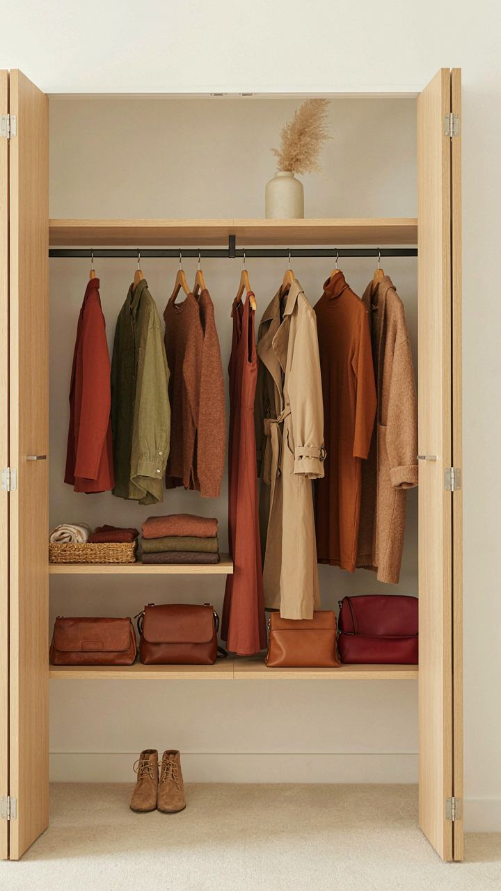
Stop treating soft autumn like a rulebook. You don’t need permission to wear a color. You need to train your eye to see how terracotta, olive, and warm bronze actually work on your specific frame. The chart is a starting point, not a prison. Open your closet today and pull three pieces that already feel right. Study why they work. That’s your real palette, not some color wheel designed for everyone. Your taste beats any system.