

The Myth Of Universal Harmony: Why Basic Color Wheels Fail Your Olive Green Outfit
Context Trumps Everything Else
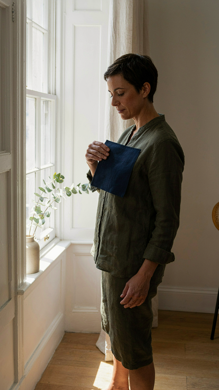
You want permission to stop overthinking this. The color wheel exists to sell design courses, not to dress you. Olive green exists in a specific context: the light hitting it changes its read completely. A color wheel assumes static, controlled laboratory conditions. Real life has windows, artificial lighting, and fabric texture that shift what olive actually looks like moment to moment.
The mechanism is simple: olive green is a desaturated yellow-green, which means it contains competing signals. In warm light it reads almost khaki. In cool light it reads almost gray-blue. No chart accounts for this variance because charts need to stay simple to remain sellable. Your actual decision-making starts by naming the light source where you’ll wear the outfit, not by memorizing complementary colors.
Olive Resists Simple Pairing

The common advice says pair olive with neutrals or earth tones. That’s incomplete. Olive sits in an awkward middle zone where traditional color theory breaks down because it’s neither warm nor cool in any pure sense. It’s a muted tone masquerading as a primary color family, which means it hijacks the rules. Olive paired with true primary colors often looks muddy instead of intentional.
What actually works: pair olive with either deeper, more saturated colors that anchor it, or lighter tints that let it recede. Navy works because it has enough saturation to stand equal with olive without competing for the same visual space. Cream works because it’s so light that olive dominates without strain. The protocol is to test your specific olive piece under the exact lighting where you’ll wear it, then choose colors that either match its saturation level or fall at least two steps away from it on the brightness scale.

Decoding Olive’s Spectrum: Unpacking Its Hidden Undertones For Optimal Olive Color Combos
The Temperature Of Your Olive
You care about this because you’ve already bought the olive piece and now you’re terrified it won’t work. Here’s what nobody tells you: olive isn’t one color. It’s a temperature spectrum, and you need to identify which side of that spectrum your specific garment occupies before you pair it with anything. Think of it like a color’s own internal bias, measurable the same way a bias current flows through a circuit. Your olive either leans warm or cool, and that determines everything that comes next.
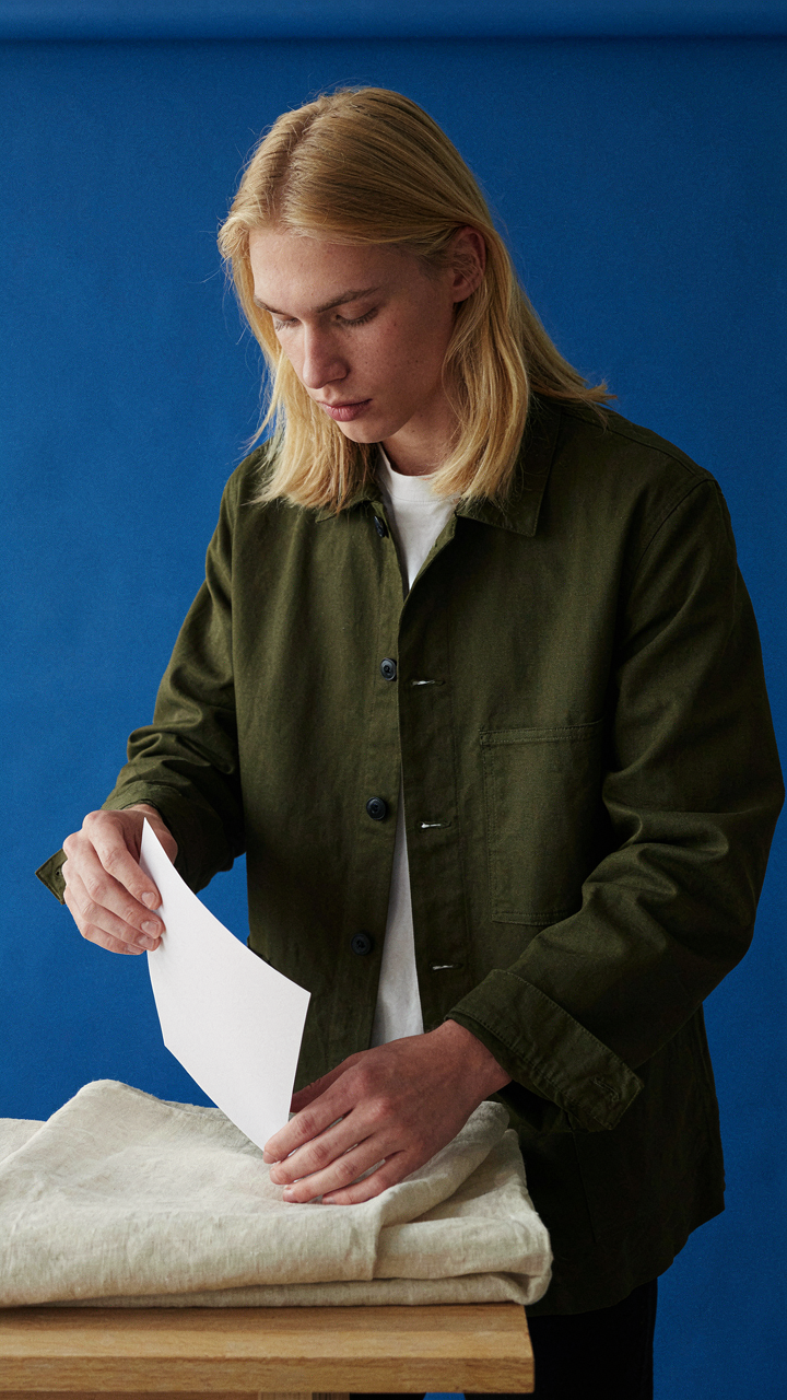
Most people default to “it’s earthy so pair it with earth tones,” which is lazy and wrong. Warm olives contain yellow or brown undertones and live comfortably next to rust, terracotta, cream, and camel. Cool olives shift toward gray or blue undertones and demand navy, charcoal, burgundy, or stone. The mechanism is simple: hold your olive garment next to a piece of white paper in natural daylight. If the olive appears golden or muddy, it’s warm. If it appears muted or slightly ashy, it’s cool. Your next color match flows directly from that diagnosis.
Lighting And Fabric Rewrite What You See
The same olive green shifts appearance depending on where you wear it and what material holds the color. This is material physics at work: a linen olive reads different than a wool olive because thread density and fiber absorption change how light bounces back at your eye. A matte finish flattens the undertone. A glossy or satin finish amplifies it. The location matters too. Olive under fluorescent office lighting appears cooler and duller. The same piece under warm incandescent bulbs or daylight reads warmer and more saturated.
This isn’t a problem to solve. It’s a variable to account for. You cannot choose one pairing and expect it to work everywhere. Instead, pick your secondary color based on where you’ll wear the outfit most. If that’s an office with fluorescent lights, lean toward slightly warmer complements to counteract the cool shift the lighting creates. If that’s daylight environments, you have flexibility. The fabric itself demands a quick test: rub your thumb across the garment and observe if the color deepens or lightens. A color that deepens holds its undertone across conditions. A color that lightens signals a thinner dye load, meaning your pairings need buffer colors between olive and your bold secondary choice.
The Contrast Protocol: Engineering Visual Impact With Olive Green Colour Combo

When Bold Statements Need Backbone
You want to know this because you’re tired of blending in. High contrast works like value theory in painting: the wider the distance between two tones on the value scale, the more your eye stops and registers the combination. Olive green sits in the mid-range, so you have two directions to exploit. Push toward pure white, cream, or near-white neutrals on one end. Push toward deep charcoal, black, or navy on the other. Both create arrest. The mechanism is simple: your brain processes extreme differences as intentional, not accidental.
White or cream paired with olive green reads as deliberate separation. Think structured composition: cream trousers with an olive shirt, or an olive jacket over a white base layer. Black or charcoal does the inverse—it deepens the olive and creates visual weight. Dark jeans with an olive top, or olive outerwear over charcoal. The contrast isn’t subtle, and that’s the point. Contrast forces clarity. If your goal is to be noticed and remembered, contrast builds the foundation.
Restraint As A Refinement Signal
The common advice here is garbage. Most style guides tell you to pair olive with “earth tones” as if that’s a strategy rather than a cop-out. Low contrast doesn’t mean beige-on-beige wallpaper living. It means orchestrating colors within a narrow band of the color wheel so your outfit reads as a single, unified statement instead of a collision. Olive pairs with taupe, warm grays, soft browns, and muted mustards because they share similar saturation and value range—they whisper instead of shout.
The mechanism: colors at similar saturation levels create visual coherence your brain reads as intentional refinement. Olive shirt with taupe trousers. Olive cardigan with a warm grey base layer. Olive blazer with soft camel or dusty brown. These combinations don’t announce themselves, which means they signal control. Sophistication operates through restraint, not volume. The protocol is to stay within two to three steps on the saturation scale, keeping everything grounded in earth-adjacent territory. This builds the appearance of someone who understands proportion.
Monochromatic Mastery: The Subtle Art Of The All Olive Combination

Layering Olive Shades For Depth
You want to wear one color because you think it signals confidence. The mechanism is different: monochromatic dressing works because your brain processes variation within a limited palette as intentional rather than lazy. Olive comes in distinct shades—from khaki-leaning pale olive to deep forest olive to muted yellow-green. Stacking these tones creates visual separation without introducing competing colors that demand attention.
The depth comes from contrast in value, not hue. A pale olive linen shirt under a deep olive wool sweater reads as layered and considered. Your eye tracks the boundaries between shades naturally. This works because humans distinguish tonal shifts faster than they process completely different colors. The outfit gains structure without looking accidental or monochrome-flat.
Fabric Creates The Real Contrast
Everyone says to use texture, then leaves you guessing. Here’s what texture actually does: it manipulates how light hits the surface, which changes how the same olive shade reads to the observer. A matte cotton olive tee paired with a shiny silk olive blouse in identical color appear as two distinct pieces. The mechanism is light absorption and reflection, borrowed from materials science. Your brain registers fabric difference before it consciously notices color.
Texture also prevents the visual dead zone—that moment when an outfit becomes invisible because it’s too uniform. Pair a smooth olive chino with a chunky knit olive sweater. Add a linen overshirt. The surface variation forces your eye to move across the outfit, which reads as intentional composition rather than accidental matching. This is your protocol: establish one olive base, then introduce at least two fabric weights that differ visibly.
Beyond Beige: Unconventional Neutrals That Elevate Colors That Go With Olive

Charcoal: The Modern Swap For Gray
You want permission to break from the safe play. Charcoal works with olive because of contrast—the mechanism borrowed from graphic design’s principle of value separation. Charcoal sits darker than traditional grays, which means it creates distance from olive’s muted tone instead of blending into it. This separation reads as intentional, not accidental. Most people default to khaki or tan with olive because those are “supposed to” work. They do. They also make you invisible.
Charcoal pulls olive forward instead of letting it disappear into a neutral wash. The dark absorbs light while olive reflects it, creating a visual hierarchy your eye reads as deliberate. Wear charcoal pants or a charcoal sweater with an olive jacket or shirt and you’ve solved the problem that beige creates: blandness. Pair charcoal pieces with olive in a 60-40 ratio, with charcoal as your anchor piece, to establish the relationship clearly.
Deep Blues And Forest Greens: Expanding Your Neutral Range
The common advice stops at neutrals meaning beige, gray, and black. Wrong. Deep blue and forest green function as neutrals when they sit at similar saturation and value levels as olive. This is color harmony through similarity, not contrast. Your eye groups them together rather than separating them. Navy or forest green with olive creates coherence, not conflict. The pieces feel like they belong to the same palette.
The mechanic here is saturation matching. Olive is muted—low saturation, medium value. When you pair it with forest green or deep blue at the same muted intensity, they read as a family. Start by layering olive with a deep forest green base layer or dark navy outerwear. The trick is avoiding bright blues or neon greens, which break the system by introducing saturation that olive doesn’t have. Keep everything in the muted range and the combinations sustain themselves.
The “Predator Prey” Color Strategy For Olive Green Goes With What Color

Blending In Through Restraint
You want permission to play it safe without looking boring. Here’s the mechanism: biology uses camouflage by matching colors to environment, and olive green operates the same way. The field is biomimicry, and the term is “concealment through harmony.” Pair olive with earth tones—warm grays, taupes, cream, soft browns—and you disappear into coherence instead of standing out through contrast. These colors share olive’s muted saturation and warm undertone, so your outfit reads as one unified field rather than competing elements fighting for attention.
The reason this works is substrate matching. Olive green contains both yellow and gray, making it naturally recessive. Pair it with colors in that same desaturated family and you amplify the effect—the eye has no edge to land on. Cream and taupe don’t compete; they extend. This is the opposite of what most style advice suggests, but that advice assumes you want visibility. If you want sophistication and visual authority, restraint through color matching beats novelty every time.
Shock Value Through Strategic Contrast
Most guides tell you to add a “pop of color” to olive without explaining why or when that actually works. The real mechanism comes from aposematism—nature’s warning system. Bold colors announce presence and intention. When you pair olive with saturated accents like burnt orange, mustard yellow, or deep burgundy, you’re not decorating. You’re signaling intentionality. The contrast works because the base is so neutral it doesn’t compete with the accent, so the accent lands hard and reads as deliberate rather than accidental.
The protocol is simple: use one saturated accent color, keep it to one garment piece or accessory, and make sure the olive piece is larger. A burgundy scarf against an olive coat. A mustard bag against olive trousers. The ratio matters—70 percent muted, 30 percent bold. This prevents visual chaos while still creating the tension that reads as confidence. Skip the layered approach of multiple bright colors; that’s decoration. One bold choice against restraint is strategy.
Accessorizing For Authority: Strategic Colour Contrast With Olive Green
Metals And Jewels That Amplify Or Subdue
You’re actually worried that accessories will ruin the outfit you built around olive green. Here’s the mechanism: metals and gemstones work through contrast value, not matching. Think of it like signal detection in engineering. A weak signal disappears into noise. A strong signal cuts through. Gold, brass, and warm copper create high contrast against olive’s cool undertone and push the outfit forward. Silver and white metals create lower contrast, which subdues and softens. Warm metals make olive read as more authoritative. Cool metals make it read as refined or distant.
The real error most people make is treating all gold as the same. Rose gold sits between warm and cool, which creates visual confusion with olive green. It neither amplifies nor subdues cleanly. Stick to either classical yellow gold or brushed brass for authority, or polished silver for restraint. Gemstones follow the same rule. Warm stones like amber, citrine, or garnet push forward. Cool stones like emerald, sapphire, or amethyst recede. Pick your metals and stones based on whether you want the olive to dominate or support the overall statement.
Footwear And Bags Complete The Narrative
- Cream or off-white shoes: Create visual lift and distance from the earth-tone base. Works when you want olive to recede slightly and the silhouette to read as polished.
- Chocolate brown or tan bags: Echo the warm undertone in olive without repeating it directly. Grounds the outfit and adds depth without competing for attention.
- Black footwear: The highest contrast option. Makes olive appear more sophisticated and contained. Use when you need visual weight at the bottom.
- Burgundy or wine accessories: Sits in the warm family with olive but darker. Creates cohesion through temperature while establishing hierarchy through value.
- Camel or tan outerwear with olive base: Acts as a tonal bridge. Prevents the outfit from feeling disconnected or fragmented across pieces.
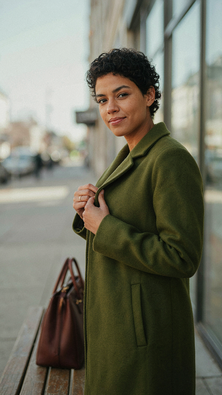
Footwear and bags aren’t decoration. They’re the story’s ending. Most people treat them as afterthought, which breaks the narrative halfway through. Your shoes and bag should either reinforce what the olive green established or deliberately contradict it for strategic effect. If your olive piece is the hero, choose neutrals or earth tones in your shoes and bag. If your olive is supporting a bolder top or statement piece, your accessories can take more visual weight. The coherence comes from deciding what story you’re telling, then letting the accessories finish it.
The Psychology Of The Olive Green Colour Combo: Signalling Intent With Every Shade

Authority And Resilience: What Olive Green Communicates Silently
You want to know this because you sense that clothes send a message before you open your mouth, and you’re right. Olive green uses a mechanism borrowed from military symbolism: high-value targets adopt muted, earthy palettes to project competence over spectacle. Olive communicates restraint. It says you have nothing to prove because your track record speaks. The color originated from practical camouflage but evolved into a cultural shorthand for someone who makes decisions, not statements.
Pairing olive with black, charcoal, or dark navy amplifies this signal. These combinations create visual weight without noise. Cream or warm beige soften the message while keeping it grounded. The key is avoiding colors that compete for attention: bright reds, neons, or high-saturation hues undercut the authority olive establishes. Wear olive with intention, not as background filler.
Intentional Dissonance: When To Break The Rules On Purpose
The generic advice says match olive with “earth tones” and call it done. That’s incomplete. Real control comes from knowing which color breaks actually strengthen your position. Pair olive with rust, terracotta, or warm gold and you shift from authority to accessibility. Pair it with cream or off-white and you read as deliberate, almost Scandinavian.
Intentional dissonance works when the contrast serves a function, not when you’re searching for “pop.” Olive with burgundy or deep plum creates visual tension that signals taste, not accident. A structured approach: start with one neutral base (olive), add one accent that breaks expectation, then anchor the look with black or white. Breaking the rules on purpose requires you to understand the rules first. Test the pairing in natural light before committing to the full outfit.
The Real Problem Isn’t Color Matching; It’s Your Fear Of Standing Out

You already know which colors work with olive green. The real issue? You’re afraid to actually wear them. You scroll through palettes but reach for black anyway. Stop. Tomorrow, wear one olive piece with something you think clashes. Notice that nobody cares. Most people are too busy thinking about themselves to judge your outfit. Permission granted, now stop asking for it.