

The Cognitive Bias Of Matching

Why Basic Pairings Limit Perceived Options
You want permission to stop overthinking this. Most people assume matching navy means picking colors that “go together” according to some invisible rulebook, which is why you keep seeing the same five combinations everywhere. This constraint is borrowed from basic color theory, where navy sits in the cool family and the bias tells you to stay there. But constraint isn’t the problem—illusion is. You think the rules are fixed when they’re actually just default settings that fashion marketing repeated until it became consensus.
Navy works with far more colors than most guides admit because those guides mistake safety for accuracy. The real mechanism is saturation, not color family. A muted rust, desaturated gold, or even a dusty terracotta pairs cleanly with navy because the low saturation creates visual breathing room. Navy’s depth acts as an anchor, not a cage. The moment you stop filtering through “does this match” and start filtering through “does this balance,” your options multiply. Stop asking whether a color is supposed to match navy. Ask whether it competes with navy for visual weight.
Breaking Free From Conventional Color Dogma

The common advice here is incomplete. Most style guides tell you navy pairs with white, gray, and cream, then maybe suggest a pop of color. That’s not wrong—it’s just cowardly. Navy doesn’t need those combinations because it’s popular and safe. Navy needs them because they’re easy. The real mechanism is contrast and intention, not tradition. You can pair navy with colors that conventional guidance ignores entirely if you understand why contrast works and when it fails.
The action step is simple: stop treating navy as a base that needs complementary colors and start treating it as a dominant note that can absorb unexpected partners. A rich olive, a faded burgundy, or even a muted blush work with navy when the rest of your outfit has proportional contrast. Decide what navy’s role is first. If it’s your statement piece, everything else recedes. If it’s your foundation, everything else can be bolder. The pairing rule that actually matters isn’t about color names—it’s about visual hierarchy.

Navy’s Hidden Spectrum: Beyond Just Blue

The Undertone Decision That Changes Everything
You’re here because you’ve worn navy and looked flat, and you want to know why without buying ten outfits to find out. The real mechanism is this: navy isn’t one color. It’s a range anchored by blue, but the undertones shift the entire palette it pairs with. A navy with red undertones behaves like a different color than navy with green undertones.
Undertone is borrowed from color theory in physics, where we measure wavelength. Think of undertone as the wavelength navy is biased toward. Most navies contain traces of other colors beneath the primary blue: red shifts navy toward purple, green shifts it toward teal, and black undertones flatten it toward charcoal. You identify undertone by holding navy next to a true neutral like white or gray. If it reads warmer or cooler, that’s your signal. This distinction determines whether warm metallics or cool silvers work, and whether earth tones or jewel tones become your allies.
Variation Rules The Pairing Game
The common advice treats navy as one static anchor. It’s not. Subtle shifts in saturation and depth completely rewrite which colors harmonize. A muted, desaturated navy demands different companions than a bright, saturated navy straight from a premium textile mill.
Navy with high saturation and minimal undertone skew pairs cleanly with nearly any neutral and bright accent colors. Navy with low saturation and strong undertones requires more precision. A desaturated navy with red undertones pairs naturally with warm neutrals and muted corals, while the same navy with green undertones opens to sage and olive. When you buy navy, photograph it under natural light next to a piece of white paper. Compare that photo to the colors you own. Match tone depth first, then refine by undertone. This single step eliminates ninety percent of color clashes.
The Contrast Calibration Method For Navy Complimentary Colors

Where Your Eye Actually Stops
You want this to work because you’re afraid of looking washed out or, worse, invisible. Here’s what nobody tells you: contrast is a physics problem, not a style problem. Your eye gravitates toward boundaries where light values shift. Navy sits in the dark end of the spectrum, so it creates a void unless you place something with actual luminosity next to it. The mechanism is simple: light reflects differently off surfaces with different values, and your brain reads that difference as intentional design rather than accident.
The Goldilocks Zone means finding colors that register visually against navy without competing for attention. Pale colors fail because they merge into the darkness. Neon fails differently: it overwhelms and reads as costume rather than composition. White, cream, and pale gray work because they’re high enough in value to create readable contrast while staying neutral enough to let navy remain the anchor. Muted jewel tones like emerald or sapphire work for the same reason: they have depth but still reflect enough light to separate from navy’s density.
The Saturation Line That Actually Matters
Most advice about saturation is incomplete. It says “match the intensity” but ignores that navy is already a desaturated color, so pairing it with another desaturated color creates visual numbness instead of balance. The real mechanism: saturation difference should create interest, not confusion. When both colors sit at similar saturation levels and similar darkness, they blur together on the body.
Saturated colors force navy to recede and read as the supporting player. A rich burgundy, deep teal, or warm caramel against navy forces your eye to process both colors as separate entities. The inverse also works: pair navy with very pale, barely-there neutrals and navy dominates as intended. The trap is the middle ground: muted sage, dusty rose, or washed taupe against navy looks like you couldn’t decide, not like you chose restraint. Your job is to pick saturation deliberately, not inherit it by accident.
Strategic Color Deployment: The Military Principle

Accent Colors As Visual Anchors
You want to know this because you’re afraid a navy outfit will disappear into monotony and waste your effort. Here’s the actual mechanism: military strategy borrows from warfare the concept of “concentration of force” – deploying resources at the point of highest impact rather than spreading them thin. In color pairing, this means one accent color placed strategically beats three mediocre colors scattered everywhere. Navy absorbs light and flattens, so a single bright accent redirects the eye and creates dimension the navy alone cannot provide.
White, cream, or warm gold function as anchors because they contrast sharply against navy’s darkness without competing for attention. Place your accent at the natural focal point: a belt, shoes, a pocket detail, or jewelry. The accent doesn’t need to cover large area – a small, deliberate placement creates more impact than a larger diffused application. This is why a white collar, gold watch, or cream bag stops navy from feeling heavy.
Reinforcement Through Color Repetition
Everyone says “add a pop of color,” which misses the real power dynamic. Reinforcement in design works like reinforcement in structures – repetition of the same element at different scales and points creates coherence and strength. A single navy outfit with one accent color looks like you tried. Navy with the same accent color repeated two or three times across your outfit (shoes, belt, bag, or jewelry) signals intentionality and control.
The mechanism is about pattern recognition. Your brain registers repetition as a system, not accident. If you wear navy with white sneakers, a white belt, and a white bag, the outfit becomes “navy with white” rather than “navy plus random stuff.” Tonal repetition works identically: navy shirt, charcoal pants, black shoes creates cohesion through descending darkness. Pick one supporting color and deploy it at least twice on your body before calling the outfit complete.
What To Wear With Navy Blue Pants: Beyond The Obvious

Greige And Warm Gray Over White
You want to look like you have taste without overthinking it. Here’s the mechanism: white reads as competition to navy. It creates visual noise because both demand attention equally. Greige—that gray-beige hybrid—and warm gray instead create hierarchy. Navy becomes the anchor while these neutrals recede, making you the subject, not your clothes. The contrast exists but doesn’t scream.
Greige works because it sits in the chromatic dead zone where your eye doesn’t ping-pong between two strong colors. Warm gray achieves the same stability. Pair navy pants with a greige sweater or warm gray button-up, and the outfit holds. The mechanism is suppression through similarity. Your silhouette reads first, color palette second. This is why menswear gravitated here decades ago.
Texture As The Real Differentiator
Everyone says “add a pop of color” to navy pants. That’s lazy. Texture does more work than hue in this context. A matte cotton shirt against navy works differently than a satin or linen version of the same color family. The light absorption changes. Depth emerges.
Linen creates visual texture that reads as intentional without adding chromatic risk. Corduroy, canvas, and knit fabrics all shift how navy appears next to them. Ribbed knitwear against smooth navy chinos creates visual separation without color contrast. This is why the best navy outfits often use three textures minimum: the pants, the top, and an outer layer. Start by choosing your top fabric first, not the color.
The Dynamic Duo: Navy Color Combinations With Earth Tones

Why Natural Hues Ground Navy
You’re looking for permission to stop overthinking this. The real mechanism is contrast management: earth tones work because they sit opposite navy on the value spectrum without competing for attention. Natural hues—browns, taupes, olives, rust—contain enough gray to neutralize navy’s saturation. They don’t fight it. They anchor it.
Navy paired with earth tones reads as intentional rather than accidental. This combo works across decades because it mirrors natural hierarchies: think soil against sky. The palette doesn’t demand explanation or trend cycles. You wear it and move through the day without your outfit becoming the conversation.
Earth Tone Pairings That Actually Work
Forget the generic advice that “anything neutral works with navy.” Most neutrals actually clash because they’re too bright or too cold. The separation that matters happens when you pick earth tones with genuine warmth and depth.
- Warm Brown: Creates visual weight and stability. Works for layering pieces like blazers or sweaters over navy bases.
- Taupe: Sits in the gray-brown middle ground. Useful for bridging navy and lighter neutrals without jarring transitions.
- Olive Green: Shares navy’s saturation level, making the pairing feel unified rather than contrasted. Strong for structured pieces.
- Rust or Burnt Orange: Adds depth without brightness. Best deployed in smaller volumes—scarves, belts, shoes—to avoid visual chaos.
- Camel: Delivers warmth and lightness simultaneously. Works as a neutral alternative to brown when you need Navy to remain dominant.
The protocol is simple: test the pairing by distance. If it reads as cohesive from five feet away, the color relationship works. If it fragments or vibrates, one tone is too bright or too desaturated for the other.
Colors That Go Well With Navy Blue: The Power Of Monochromatic Depth

Layering Shades Of Blue For Effortless Elegance
You want permission to wear navy without looking boring. The mechanism is simple: monochromatic dressing uses value contrast, not hue shift, to create visual interest. Navy paired with lighter blues, powder blue, or even white creates depth through light-dark relationships rather than color conflict. Your eye reads these combinations as intentional and refined because the brain recognizes tonal hierarchy.
The mistake most people make is treating all blues as interchangeable. They’re not. Pairing navy with a true medium blue creates visual tension because they compete for the same space. Pair navy with a significantly lighter blue or near-white, and the contrast reads as deliberate. The tonal gap does the work. Wear a navy blazer over a light blue shirt, and you’ve created a visual anchor without complexity.
Achieving Visual Complexity With Subtle Tonal Shifts
Graphic design uses the concept of “value” to control hierarchy and readability. Apply value here: navy sits at roughly 20-30% brightness on the scale. Introduce grays, off-whites, and cool-toned neutrals that sit at 60-80% brightness, and you’ve engineered a visual system that feels sophisticated because it’s mathematically balanced, not random.
The reason this works is contrast without clashing. Navy with charcoal gray, light gray, or cream doesn’t trigger the eye’s alarm system the way navy with red or gold does. You’re staying within a cool-toned family while manipulating brightness. Test this by adding a single neutral accessory—a gray scarf, cream shoe, or silver belt—and watch how the outfit gains definition without adding visual noise.
The “Pop” Principle: Activating Colors That Go With Navy
Brights As Focal Points, Not Decoration
You want the outfit to feel intentional, not accidental. This is borrowed from contrast theory in visual design: a bright color against navy creates what designers call “figure-ground separation.” The bright becomes the figure your eye lands on first. The navy recedes. This isn’t about adding color for color’s sake. It’s about directing attention to exactly where you want it.
Coral, chartreuse, or hot pink placed strategically on navy accomplishes what muted tones cannot: they stop visual noise. A bright pocket square, belt, or shoe against a navy suit reads as deliberate choice. A muted taupe or greige does the same work at lower stakes. The mechanism is simple: contrast forces focus. Place the bright where you want the viewer’s eye to land and linger.
One Accent Holds More Power Than Multiple
Most advice says “add color” without defining where or how much. More color doesn’t mean more impact. One strong accent against navy reads clean and controlled. Two or three competing brights turn an outfit into visual chaos. The principle mirrors restraint in any communication: remove everything unnecessary and what remains hits harder.
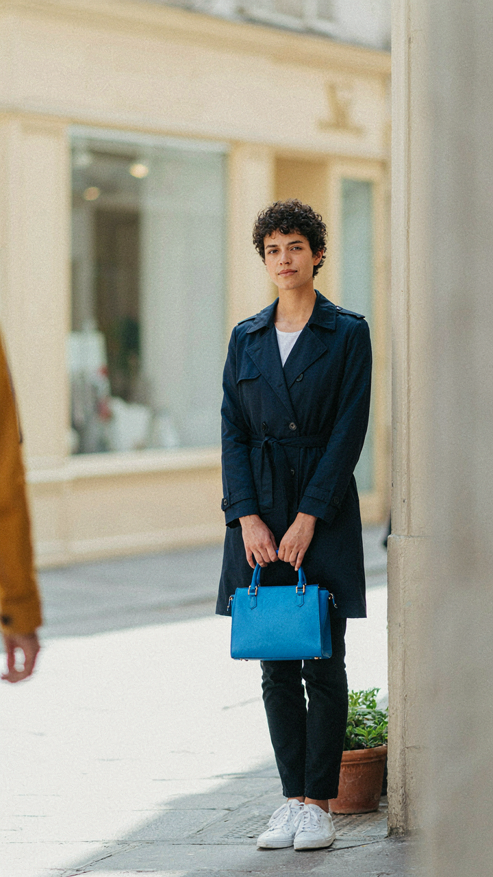
A single bright element forces the outfit into a hierarchy. Your eye knows where to go. This is tactical dressing, not aesthetic indulgence. Wear navy trousers, a navy sweater, and one electric blue bag. Not navy trousers, a coral top, a chartreuse scarf, and pink shoes. The first outfit has architecture. The second has clutter. Execute one bright focal point per outfit, positioned where the outfit’s narrative ends.
Navy Blue Palette Combination: Decoding The Seasonal Shift

Lightening Navy For Warm Weather Dressing
You want to know this because wearing navy in summer without adjustment reads as either clueless or intentionally formal, and you’re betting there’s a workaround that keeps you in the color without the seasonal penalty. The mechanism is saturation and temperature: warm climates demand colors that reflect light rather than absorb it, which is why the same navy that works in October becomes visually heavy in July. Pair navy with white, cream, or pale sand to create contrast that feels seasonally appropriate. The lightness of the secondary color compensates for navy’s visual weight.
Linen and cotton become non-negotiable in warm weather navy combinations, not just for comfort but because these fabrics photograph lighter and feel less formal than wool or dense blends. Lighter neutrals also expand breathing room in an outfit visually. Add a cream linen shirt under a navy unstructured blazer, or wear navy shorts with a white cotton tee. The outfit stays cohesive without the visual heaviness of full saturation on saturation. Fabric choice determines whether seasonal navy reads as intentional or tone-deaf.
Deepening Navy For Cold Weather Impact
Navy in winter needs accomplices that anchor rather than lighten, which contradicts what most people default to when they think “winter colors.” This is where the principle of value contrast from art direction applies: in cold months, you’re working with reduced natural light and muted backgrounds, so navy needs colors with either deeper saturation or higher contrast to maintain definition. Pair navy with burgundy, deep forest green, or charcoal instead of black, which flattens the palette rather than enriching it. These combinations create depth instead of just darkness.
Texture becomes the second lever in cold weather navy combinations. Wool, cashmere, and suede interact with navy differently than summer fabrics do, adding visual weight that matches the season’s visual density. Layer a navy sweater under a charcoal wool coat, or combine navy with oxblood leather accessories. Cold weather navy demands materials that feel substantial and colors that read as intentional rather than safe. The outfit’s impact lives or dies in how these elements stack together, not in whether you picked the “right” colors.
Navy Pants Outfits For Women: Sculpting The Silhouette With Color

Color As Visual Weight Distribution
You want to look slimmer or draw attention away from your midsection, and you think the outfit itself will do it. It won’t. Color placement controls where the eye lands, and that’s what determines perceived proportion. Think of contrast as visual mass: high contrast fabrics draw focus, low contrast recedes. A cream or white top with navy pants creates a strong horizontal line at your torso. A matching navy top compresses the entire vertical space, making your frame appear longer and narrower. The mechanism is simple contrast ratios determine attention flow, not the cut of fabric alone.
Your pants are the anchor. Everything above them is either amplifying or minimizing that navy base. A bright coral or yellow top advances toward the viewer’s eye, making your upper half feel larger. A charcoal or black top recedes, creating visual continuity with the navy and elongating your silhouette. Warm neutrals like camel or tan sit somewhere neutral, directing focus without competing. The specific color you choose above the waist determines whether navy pants make you look defined or shapeless.
Strategic Layering And Accent Placement
Most advice tells you to match your top to your pants for a streamlined look, then add an accent. That’s incomplete. The real lever is where you place your contrast color. A structured blazer in a contrasting shade over navy pants creates a defined waistline and separates your silhouette into clear sections. A scarf or jewelry in a pop color keeps focus on your face and upper shoulders, not your lower half. A belt in cream or cognac at your natural waist creates a visual anchor that breaks up the navy mass and defines your proportions.
Layering order matters. A long cardigan over a navy pant outfit in a muted tone elongates your frame. A cropped layer in contrast shortens the visual line and emphasizes hip placement. Accessories become anchors when placed strategically: a contrasting shoe redirects the eye downward, a statement necklace lifts it upward. Your job is deciding what section of your body the outfit should emphasize, then using color placement to control where the viewer’s attention actually lands.
The Real Problem Isn’t Color Confusion; It’s Your Reliance On External Validation For Personal Style

You already know what colors work with navy. You just don’t trust yourself. Stop asking the internet which shade complements your skin tone and start asking yourself what you actually want to wear. Your gut reaction to a color matters more than any rule. Pick one outfit today that breaks the conventional navy pairing. Wear it. Notice that nobody cares. That’s when your style actually begins.