

The Brown Paradox: Why You’re Playing It Safe (and Losing)

Brown Gets Labeled Neutral, So You Stop Thinking
You want permission to wear brown without looking boring. That’s the real question hiding under this one. The mechanism is simple: brown earned the label “neutral” because it sits between warm and cool on the color wheel, which made it safe for interior design trends starting in the early 2000s. That safety label killed your creativity. You now treat brown like beige, when brown is actually a compressed orange—it has heat and intention baked in.
The advice you’ve heard is incomplete. Brown isn’t neutral because it lacks color properties. Brown is neutral because designers needed a middle ground that wouldn’t offend in corporate spaces and rental apartments. That’s a business constraint, not a design truth. Your clothes aren’t a rental. Brown paired with the colors most people suggest—navy, cream, black—works because those combinations don’t fail, not because they pop.
The Real Mechanism: Saturation, Not Tradition

Think of brown like a resistor in an electrical circuit: it moderates the flow of visual energy. Saturation is the actual lever you control, not color family. A rich chocolate brown next to a muted sage green creates visual rest. That same brown next to a saturated teal or magenta creates tension. Most people avoid the tension because unsaturated combinations feel “safe.” Tension is what makes an outfit hold attention.
The mistake isn’t pairing brown with unexpected colors. The mistake is pairing brown with colors at the wrong saturation level, then blaming brown. Muted burgundy with brown feels cohesive. Bright red with brown feels chaotic. But bright red with brown isn’t wrong—it’s intentional. Your saturation choice determines whether an outfit reads as refined or careless. Dial saturation deliberately, then commit to the pairing.

Beyond Beige: The ‘Chocolate Brown Combo’ You Never Considered

Rust And Chocolate Brown Create Depth
You’re here because you’re tired of the safe answer. You want permission to wear something that looks intentional instead of like you grabbed what was clean. Here’s the mechanism: rust operates as a complement to chocolate brown in the same way opposing forces in physics create tension and stability simultaneously. Rust sits on the warm side of the color wheel but carries enough red undertone to register as distinct from brown’s earthiness. The pairing works because both colors share historical weight—rust from oxidation, brown from soil—so they read as natural, not accidental.
Rust doesn’t compete with chocolate brown. It amplifies it. When you layer these two, the eye sees depth instead of a monotone outfit. A rust-toned sweater under a chocolate brown jacket, or rust chinos with a chocolate brown shirt, creates visual separation without jarring the viewer. The commonality in their undertones keeps the combination from fracturing. Most people avoid this pairing because it feels “too brown” until they see how the rust breaks the monotony by introducing warmer red notes that chocolate brown lacks.
Deep Teal Against Brown Demands Contrast
The advice to pair brown with navy or black is incomplete because it misses what modern aesthetics actually reward: decisive contrast that doesn’t default to black. Deep teal forces a choice. It’s saturated enough to read as a bold statement alongside chocolate brown, but cool enough that the two don’t blur into each other. This is where color theory meets wearability—complementary colors sit across from each other on the wheel, and teal’s blue-green sits far enough from brown’s warm undertones to create visual tension that reads as intentional.
A deep teal blazer over a chocolate brown base transforms the brown from background to anchor. The teal commands attention without drowning the brown. This combination works in professional settings because both colors carry weight independently, so together they signal deliberation rather than accident. Wear deep teal as a statement piece and let chocolate brown stabilize the look. The mechanism is simple: teal’s cool frequency pulls the eye forward, chocolate brown’s warmth recedes slightly, and the contrast creates hierarchy your outfit didn’t have before.
The ‘Brown Combinations’ Algorithm: A Scientific Approach
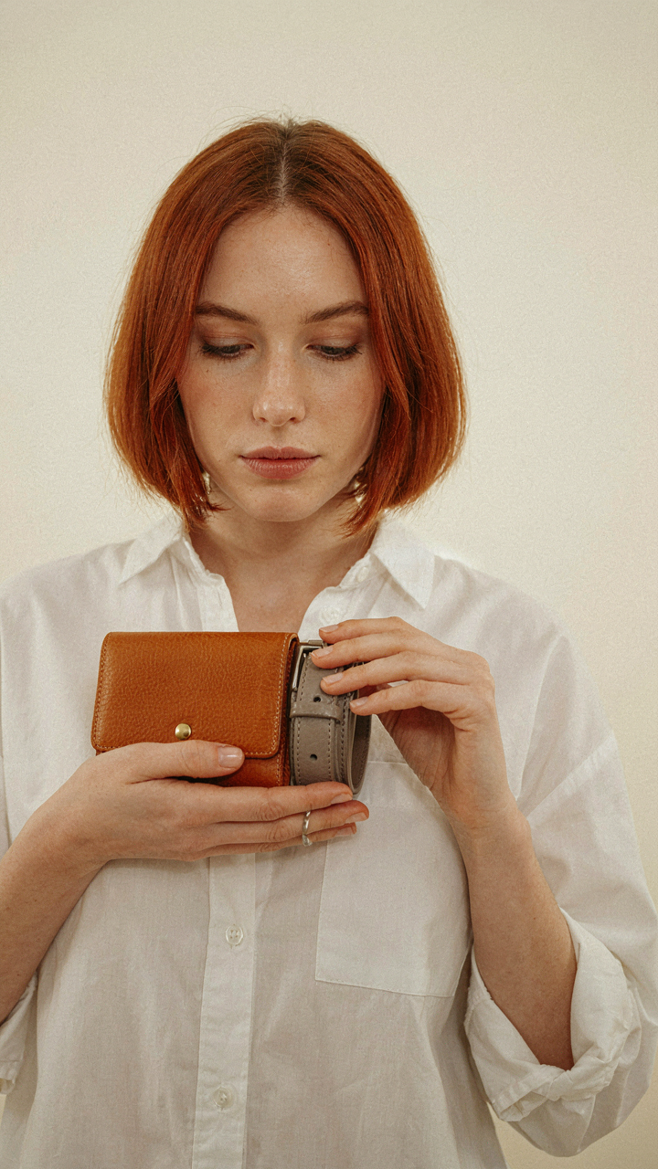
How The Color Wheel Actually Works With Brown
You’re reading this because you’re tired of guessing and want certainty that your outfit won’t land wrong. The color wheel is a physics problem, not an art opinion. It maps how human eyes perceive wavelengths of light relative to each other, and brown sits at a specific point in that spectrum that determines what harmonizes with it mechanically.
Brown is a desaturated orange. This matters because it means brown shares undertones with everything on the orange side of the wheel—yellows, reds, and earth tones occupy its natural neighbors. Opposite brown on the wheel sit blues and teals, which create maximum contrast. The wheel doesn’t suggest what looks good; it predicts what your eye will read as coherent or jarring based on how wavelengths interact.
Reading Brown’s Temperature To Match Everything Else
The mistake most people make is treating brown as one color. There’s no such thing. A warm chocolate brown with red undertones behaves differently than a cool taupe brown with gray undertones, and pairing either one wrong kills the entire combination.
Warm browns—chestnut, caramel, burnt sienna—pair with warm colors: cream, olive, rust, gold, terracotta. Your eye sees warmth matching warmth. Cool browns—taupe, greige, mushroom—pair with cool colors: gray, navy, cream, blush, sage. The undertone is the mechanism. Before choosing a pairing color, hold the brown piece against neutral light and identify whether it leans red, yellow, or gray. That undertone determines your palette.
The ‘Colors That Go With Chocolate Brown’ Power Play

Jewel Tones For The Contrast Play
You want this section because you’re tired of looking safe and invisible. The mechanism is simple: jewel tones work with chocolate brown because they exploit color contrast without clashing. Think of contrast as leverage in design—you’re using opposing positions on the color wheel to create visual tension that reads as intentional, not accidental. Emerald, sapphire, and deep burgundy don’t fight brown; they amplify it by sitting far enough away on the spectrum to register as deliberate pairing rather than accident.
Chocolate brown is a low-saturation neutral that needs a color with actual presence to avoid looking dull. Jewel tones carry saturation and depth, so they don’t disappear next to brown the way pastels do. The combination works in fabrics because both have weight—a deep emerald sweater with brown trousers lands different than a pale green ever could. This pairing works best when one piece dominates and the other accents, not when they split visual real estate equally.
Earth Tones And Unexpected Depth
Most advice stops at “earth tones go with brown” and calls it a day. That’s incomplete. The real move is knowing which earth tones create visual separation versus which ones blur together into one muddy mass. Olive greens and muted teals work because they share brown’s earthy origin but occupy different temperature zones. A burnt sienna brown paired with sage green creates distinction through tone, not just hue similarity.
Navy and slate blue landed in this category historically because they appeared in workwear and military uniforms alongside browns, cementing the pairing as “reliable.” But the actual mechanism is temperature control: brown leans warm, so cooler blues and greens prevent the outfit from reading as monotone. Start by choosing your brown shade first, then pick a green or blue that sits noticeably cooler or warmer than it, never identical. This creates the visual separation your eye reads as “intentional color blocking” instead of “I grabbed whatever was clean.”
The Colour Combos With Brown Expansion Pack
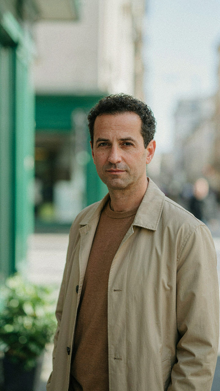
Monochromatic Brown Layering Strategies
You want this section because you’re afraid brown reads as boring or safe, and you need permission to wear it anyway. The real mechanism is tonal variance. Monochromatic doesn’t mean wearing identical shades—it means working within the brown family by shifting lightness and saturation, which creates visual depth without introducing new hues. Fashion borrowed this from painting: value is how light or dark a color appears, independent of its name.
- Light tan with medium brown: Creates a two-tone foundation that reads as intentional, not accidental. The contrast is subtle enough to stay cohesive but distinct enough to show structure.
- Chocolate brown base with caramel accents: Establishes hierarchy. The darker shade grounds the outfit, the lighter shade draws attention to specific pieces like a scarf or belt.
- Taupe layering over warm brown: Taupe desaturates the warmth while staying in the brown family. This works for muted, sophisticated looks where you’re toning down intensity.
- Espresso with cognac highlights: The darkest brown paired with a richer, more orange-toned brown. Both are dark, but they occupy different temperature zones within brown itself.
- Khaki over rust brown: Rust pushes toward red while remaining brown. Khaki lightens the palette. Together they create movement without leaving the color family entirely.
The mistake most people make is treating brown as a single color instead of a spectrum. Brown exists across light, medium, and dark values. Stack pieces across at least two of these zones and you bypass the “all one color” flatness that kills monochromatic outfits. The depth lives in the value shift, not in adding a second color.
Analogous Color Schemes With Brown
Analogous schemes use colors that sit next to each other on the color wheel, and brown’s position matters here because brown is red and yellow pushed toward desaturation. Brown neighbors warm oranges, rust tones, and olive greens. This is why these combinations feel natural instead of forced—they share undertones.
Brown with olive green is the hardest sell but the most interesting choice. Both are desaturated earth tones, so they don’t clash. Olive reads as a lighter, cooler sibling to brown. Pair a brown leather jacket with an olive knit and you get a cohesive outfit that doesn’t announce itself. Brown with rust or terracotta works because both lean into the red-yellow foundation brown already has. A rust shirt under a brown sweater or brown trousers with a rust accent piece maintains visual harmony. Caramel and tan with brown are the safe plays here—they’re lighter analogous neighbors that feel effortless but offer less contrast. If your goal is to avoid mistakes, pick caramel. If your goal is to build a memorable look, lean into olive or rust and let the color relationship do the work. The mechanism is simple: analogous colors share pigment family members, so your eye doesn’t work to reconcile them. Choose your brown shade first, identify what temperature it leans toward (warm or cool), then pick the analogous color in that same temperature direction to activate the scheme without creating tension.
The ‘Colors To Match With Brown’ Matrix: Applying Game Theory

Zero Sum Thinking Kills Your Fits
You’re looking for permission to stop second-guessing yourself. Here’s the mechanism: most people treat color pairing like a zero-sum game where one color “wins” and others lose. That’s backward. In game theory, zero-sum means one player’s gain is another’s loss. Color combinations don’t work that way. Brown paired with navy isn’t a compromise where brown sacrifices saturation so navy can dominate. Both colors stabilize each other through contrast and value separation. When you stop treating color matching as a competition between shades, you see what actually happens: complementary colors create visual equilibrium instead of tension.
The mistake everyone makes is choosing colors that don’t clash rather than colors that reinforce. Beige with brown feels safe but produces visual flatness because both occupy the same tonal weight. Cream with brown works because cream steps back while brown commands. Olive or burgundy with brown creates a win-win pairing where neither color demands dominance, and the outfit reads as intentional instead of cautious. Stop asking which color should “go better.” Ask which pairing gives each color its clearest role.
Predicting What Brown Actually Does
Brown’s visual weight depends on saturation and value. Medium to dark browns reflect less light than lighter shades, so they read as heavier on the color spectrum. This isn’t opinion. It’s how the eye processes reflected wavelengths. When you pair a heavy brown with a light, saturated color like coral or bright white, the brown recedes slightly and the accent pops. Reverse that: pair brown with an equally dark, desaturated color like charcoal, and both colors flatten into a muted, intentional aesthetic.
The real variable isn’t the color itself but whether your brown is warm or cool-toned. Warm browns (caramel, cognac, tan) pair predictably with warm neutrals, earth tones, and warm jewel tones like emerald or rust. Cool browns (taupe, chocolate, greige) pair with cool grays, cool blacks, and cool jewel tones like sapphire or plum. Predict the impact by checking which undertone dominates your brown first, then match undertone families. This eliminates guesswork and replaces it with a protocol: identify brown’s warmth, then select from the corresponding color family.
The Colors That Go With Brown Outfits Commandment

How Fabric Changes What Color Actually Means
You’re worried people will judge the outfit before they even process what you’re wearing. That fear is real, so stop ignoring texture. Fabric texture operates like a light filter in photography: it controls how much of a color your eye actually receives. Linen reads lighter and more muted than wool. Silk reads richer and more saturated. The same brown paired with cream on cotton looks pedestrian. That same brown on cashmere with cream looks intentional. Texture rewrites the color contract before accessories enter the equation.
Most people skip this step because they’re shopping by color swatch alone. They see brown and cream match on a flat sample, buy it, then wonder why the outfit feels off in daylight. The mechanism at work is surface reflection. Rough fabrics scatter light and dull colors down. Smooth fabrics concentrate light and amplify intensity. A textured brown blazer paired with a matte cream shirt creates visual separation. That same pairing in shiny fabrics blurs together. Texture creates hierarchy. Without it, colors just sit next to each other like objects in a warehouse.
Metal Tones Are Compatibility Signals, Not Decoration
Metallics aren’t accessories you add because something looks bare. They’re a language that either matches or clashes with brown’s undertone. Brown contains red, yellow, or gray depending on the depth. Gold amplifies warm undertones in brown. Silver and platinum work when brown skews cool or neutral. This isn’t opinion. It’s about undertone alignment. Copper occupies the middle ground because it contains both warm and cool properties, making it a workaround when you’re unsure.
Most advice tells you to “mix metals” or “choose one and commit.” That’s lazy. The real play is using metal tone as a diagnostic tool. If a gold watch feels wrong with your brown leather jacket, your brown runs cool or desaturated. Switch to silver and test again. If silver still feels off, your brown is likely a greige, and you need warm metals with gray undertones like rose gold or bronze. The action: before buying brown, hold it against silver, gold, and copper under natural light. Whatever doesn’t clash is your compatibility zone.
The ‘Color Combinations For Clothes’ Deception
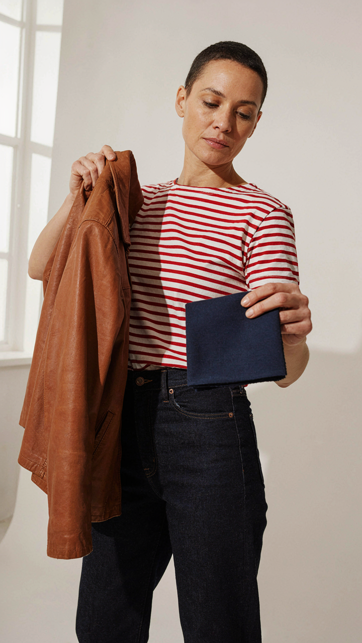
Why Generic Color Rules Break Down With Brown
You’re looking for permission to dress well without thinking, which is why every blog tells you the same five combinations. Brown doesn’t work that way. The problem isn’t brown itself—it’s that most advice treats color as a standalone property when it’s actually contextual. Brown’s warmth, saturation, and undertone shift dramatically based on fabric, lighting, and what surrounds it. Generic rules ignore this entirely and hand you formulas instead of frameworks.
The real mechanism comes from how human perception works: your eye doesn’t judge a color in isolation. Brown reads differently next to black versus cream versus rust because of simultaneous contrast, a principle from perceptual psychology. A khaki that looks warm indoors appears flat in natural light. A chocolate brown that harmonizes with navy in winter fluorescence clashes under summer sun. Most advice skips this layer and gives you static pairings that work sometimes, nowhere, or accidentally.
Building A Brown System That Actually Responds
Stop collecting color combinations and start identifying your brown’s actual properties first. Measure warmth by comparing your brown directly to neutrals you own: does it sit closer to gold, gray, or red? This isn’t subjective—it’s about where the pigment actually lands on the warm-to-cool spectrum. Once you know this, you’ve inverted the problem. Instead of asking what matches brown, you ask what your brown demands from other colors to maintain visual balance and intention.
The protocol is simple. Pull three fabrics in your brown: a casual piece, a neutral weight, and something refined. Photograph each under natural light, indoor light, and if possible, the specific environments where you wear brown most. Place test colors next to each photo—neutrals first, then accent colors. Notice which combinations feel intentional versus accidental. Your system isn’t a palette you memorize; it’s a decision tree you build by observing your own brown’s behavior across real conditions. This becomes your reference for every pairing decision moving forward.
The Anti Rulebook: Mastering Brown’s Unconventional Power

Trial And Error Beats Theory
You want permission to break the rules without looking stupid. Here’s the mechanism: brown operates on contrast ratios, not taste. The fashion industry spent decades telling you what works with brown, so most people wear the same five combinations and call it safe. Real control comes from testing what your specific brown actually does under different lighting with different colors, then building from what you observe, not from what you read.
The common advice treats brown like a neutral that pairs with “earth tones” or “jewel tones.” That’s incomplete. Brown isn’t neutral. It’s a warm mid-tone that either absorbs or reflects light depending on its undertone, saturation, and the colors next to it. Navy might flatten your particular brown or electrify it. Olive might disappear into it or create separation. You won’t know until you wear the combination and pay attention to what actually happens in real light, not in a mirror under retail lighting.
Wear What Feels Deliberate
Confidence in brown comes from understanding you made a choice, not from following a formula. Most people wear safe brown combinations because they’re terrified of looking mismatched. That fear is legitimate but misplaced. The real risk isn’t picking the “wrong” color with brown. The risk is picking colors that look accidental, like you grabbed whatever was clean.
When you pair brown with burgundy, forest green, cream, or charcoal, you’re not breaking a rule. You’re demonstrating that you saw the combination and decided it worked. That decision alone signals intention. The mechanism is simple: wear combinations that would look strange on purpose, then wear them with total certainty. Hesitation kills execution. Certainty makes unusual pairings read as style instead of error.
The Real Obstacle Isn’t Color Theory; It’s Your Timid Conformity To Outdated Fashion Dogma

You already know which colors work with brown. The real problem is you’re waiting for permission to wear them. Fashion gatekeepers spent decades telling you brown belongs in a box. It doesn’t. Open your closet today and pair brown with one color that scares you. Cream, rust, navy, olive. Pick one. Wear it. The only rule that matters is whether you own your choice or apologize for it.