
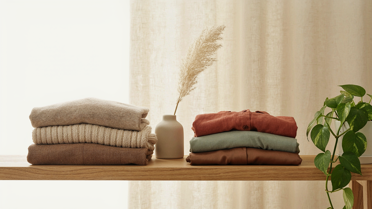
The Subtlety System: Why Neutrals Aren’t “Safe,” They’re Strategic

Color Psychology Shapes Perception Before Words Do
You want neutrals because you think they’re invisible. They’re not. Beige, cream, and brown operate on the same principle as military camouflage in urban environments: they control attention by establishing a baseline. Color psychology shows that neutral tones trigger trust and competence because they demand no explanation. Your brain reads them as intentional restraint, not indifference. This is authority by subtraction.
Warm neutrals specifically activate different neural pathways than cool ones. Beige and cream sit in the warm spectrum, reading as approachable yet controlled. Brown grounds the palette with weight and stability without aggression. The mechanism is simple: your outfit becomes a container for your face and message instead of competing for focus. This is why executives don’t dress in neon. Restriction of the color field increases perceived power.
Texture And Fit Determine Neutral Effectiveness

Most advice says neutrals work because they “go with anything.” Wrong. Neutrals fail constantly because people ignore the material. A cream cotton t-shirt reads casual. A cream linen shirt reads intentional. The same color fails or succeeds based on fabric choice, which determines how light interacts with the surface and how the garment holds its structure. Fit amplifies this effect. Oversized neutral shapes diffuse authority. Tailored neutrals concentrate it.
The real work happens in the details. Beige wool crepe holds shape differently than beige linen, changing how the outfit photographs and how you move in it. Brown suede conveys different intent than brown canvas. Your neutral palette only functions when the fabric weight, weave, and finish match your purpose. Start by choosing the fabric first, then the color. The outfit’s power lives in that intersection, not in having three safe colors in your closet.

Deconstructing “Beige”: The Spectrum Of Understated Power

What Beige Actually Is
You want beige to feel intentional, not like you gave up. Here’s what nobody says plainly: beige isn’t a color—it’s a decision about contrast. True beige sits between brown and gray, a desaturated warm neutral that reads as competent rather than invisible. Cream pushes toward white and lightness. Brown anchors toward earth. Each occupies different visual weight in an outfit.
The mechanism is saturation. A fabric with zero undertone reads flat and cheap. Real beige has a faint warm cast from its brown ancestry, which is why it photographs better and reads as deliberate on skin. Cream does the same with its white heritage. Brown simply commits to depth. When you pick between them, you’re not choosing a shade—you’re choosing how much visual noise you want the piece to carry in the outfit’s hierarchy.
Finding Your Shade Match
Most advice on neutrals for skin tone is incomplete because it ignores undertone variance within skin itself. Warm, cool, and olive skin tones don’t read color the same way, but the real issue is contrast sensitivity. A very fair person in pale cream might vanish entirely. A deep-toned person in warm beige might look washed unless the beige has genuine brown depth. This isn’t about flattery—it’s about readability.
Test beige and cream against your jawline in natural light, not fluorescent. You’re looking for the shade that creates definition without making you appear tired or jaundiced. Brown works across most tones because it has actual pigment, but its depth matters: lighter skin often needs warmer or cooler browns to avoid heaviness, while deeper skin tones can hold richer browns without visual fatigue. Hold the fabric for sixty seconds. If your face still has dimension, the shade works.
The “Scarcity Principle” Of Style: Less Color, More Impact

When Demand Meets Limited Palette
You’re hoping neutral outfits will make you invisible so people focus on your face and character instead of your clothes. That’s backwards. Scarcity works the opposite way. In economics, restricted supply drives perceived value upward. The same applies to your outfit’s color bandwidth. Beige, cream, and brown create artificial scarcity by eliminating visual noise. Your eye lands on texture, fit, and proportion instead of bouncing between competing hues. The constraint forces intentionality.
When you remove color choices, you’re not simplifying your life—you’re redirecting attention. Each piece demands justification. A cream linen shirt needs better structure than a graphic tee ever would. The brown leather belt must earn its position through quality and placement. Beige pants require thoughtful draping or they vanish entirely. Scarcity removes excuses.
Draw The Viewer’s Eye Inward
Neutral outfits don’t fade into the background. They compress the visual field to create focal points. A limited palette forces hierarchy. Your face becomes the primary focus because the outfit stops competing for attention. The secondary focus shifts to intentional details: seaming, weight of fabric, how an edge lands on your body. Tertiary elements like accessories or footwear gain disproportionate impact because they’re the only variables in a controlled system.
This mechanism works because human vision processes information through contrast. When you remove chromatic noise, structural contrast intensifies. A single texture becomes notable. A break in line becomes decisive. The outfit stops being a costume and starts being a frame. Wear one neutral outfit for three days and notice how people reference specific elements—the way something fits, not the color palette.
Neutral Outfits Women: Beyond Trends, Into Timelessness

The Foundations That Don’t Rot
You’re reading this because you suspect your closet is a graveyard of purchases that seemed right for six months. Here’s the mechanism: most wardrobes fail because people buy answers to temporary problems instead of building systems. Think of wardrobe construction like structural engineering. In engineering, load-bearing walls distribute weight efficiently across time. Your neutral core does the same with your attention and money, letting every new piece stack on existing foundations instead of replacing them.
The core pieces do actual work. They layer without competing. They accept different shoes, bags, and textures without demanding the room’s attention first. Beige, cream, and brown aren’t retreats into boredom. They’re the infrastructure that makes mixing and matching inevitable, not optional.
- Cream Oversized Button Down: Works untucked over fitted bases, tucked into high-waisted trousers, or worn as an overshirt in linen. Holds its shape across seasons because structure matters more than fabric weight.
- Beige Crewneck Sweater: Medium weight merino or cotton blend. Pairs under blazers, over collared shirts, or solo. Acts as a neutral anchor that absorbs color from bottoms without fighting for dominance.
- Brown Tailored Trousers: Mid-to-dark brown in a flat front or minimal pleating. High rise, straight leg. The single most versatile bottom because brown bridges warm and cool tones simultaneously.
- Cream Fitted Tee: Thick cotton that doesn’t cling or warp after washing. Worn under everything or alone. The invisible workhorse piece that vanishes under layering but anchors simple outfits.
- Beige Minimal Slip Dress: Bias cut or structured linen. Worn over long sleeves, under open shirts, or solo. The piece that proves neutrals can move and breathe instead of just existing.
These five pieces create 40-plus outfit combinations before you touch accessories or bottoms. The compounding effect is the point. Each new neutral addition multiplies the system instead of requiring you to rebuild it.
Quality Doesn’t Age, Trends Do
The conventional advice says buy less and pay more. That’s not wrong, but it misses why. A $40 synthetic sweater and a $180 wool sweater age differently because materials have different failure curves. Synthetics pill, yellow, and lose shape within two seasons. Natural fibers like merino wool, linen, and cotton actually improve with wear if you choose tight weaves and proper construction.
What actually survives is constraint. A brown trouser in a classic cut outlasts one with a specific rise or hem width because fashion redirects those details every three to five years. Neutral colors give you permission to ignore those redirects. Buy pieces with minimal design seams, flat front construction, and timeless proportions. Check the fiber content before the price tag. A well-made neutral piece should take 50 washings before losing color or shape. That threshold tells you whether you’re investing or spending.
The Uniform Protocol: How Elite Performers Use Beige & Brown

Work Outfits Women Professional Non Distraction
You want permission to stop thinking about what you’re wearing. That’s the real ask here.
Cognitive load works like bandwidth. You have X amount of mental energy before 9 AM. Spending it on outfit decisions leaves less for work that matters. The mechanism is simple: neutral palettes in beige and brown eliminate the variable. A cream blouse, brown blazer, and beige trousers don’t require recalibration each morning. You wear the same structure. The brain stops processing your appearance and redirects that processing power to your job. This is why Steve Jobs wore black. Not for mystique. For efficiency.
Professional environments reward invisibility. Your outfit’s job is to signal competence, not personality. Beige communicates stability. Brown reads as grounded and trustworthy. Cream offsets both without adding noise. When colleagues remember your work instead of your clothes, you’ve won the room. This is the actual advantage of neutral work outfits.
Signature Look Creates Psychological Ownership
A repeated outfit isn’t boring. It’s a brand decision.
When you wear the same beige and brown combination consistently, people anchor to it. They recognize you faster. They associate that palette with your output. This repetition builds what psychologists call “recognition fluency” but what actually happens is simpler: you become synonymous with a look. Marissa Mayer’s white outfit. Anna Wintour’s sunglasses. Not because they’re extraordinary. Because they’re constant.
The power is in the constraint itself. Fewer choices mean stronger identity. Beige, cream, and brown together form a recognizable signature because they’re uncommon as a deliberate system. Once established, you don’t rebuild your image every season. You refine the same three pieces. This compounds over years. Colleagues start to see the outfit as an extension of your professional reliability, not a fashion statement.
Beige Knit Sweater Outfit: Mastering The Texture Game

Stack Contrast Through Fabric Weight
You want people to notice you without trying. That’s why texture matters. Most advice says “just add layers,” which is useless. The real mechanism comes from visual hierarchy: your eye reads texture as depth before color. A beige sweater alone reads flat. Stack it against cotton, linen, or denim, and suddenly there’s dimension.
Weight differential is what creates visual interest. Pair a lightweight merino knit with heavy canvas trousers or structured wool blend pants. The contrast between loose knit structure and tight weave fabric makes the outfit read as intentional, not lazy. This isn’t decoration. It’s visual contrast that makes neutral colors work at all.
Mixing Fibers For Controlled Sophistication
Wool against cashmere against cotton isn’t luxury cosplay. It’s a deliberate play on how fabric behaves under light. Wool has texture and tooth. Cashmere has sheen without shine. Cotton reads matte and straightforward. Combine all three in one outfit and you’ve built a neutral look that holds visual weight.
A beige cashmere sweater over a cream cotton button-up, tucked into brown wool trousers, creates tactile hierarchy your brain reads as “this person knows what they’re doing.” The materials do the work. You don’t need color variation when fibers speak different visual languages. Finish with a structured bag in smooth leather to ground the outfit without adding another texture layer.
Neutral Winter Outfit: The Art Of Cold Weather Command

Insulation And Elegance
You want to look composed when it’s freezing. The mechanism is simple: layering is load distribution. Borrow from thermal engineering—strategic heat retention without visible mass. Beige and cream base layers trap air while staying visually thin. Brown mid-layers add depth without adding volume. The common advice ignores density: most people stack fabrics until they look padded. The real move is choosing materials that compress—merino wool, fine cashmere blends, technical knits that don’t puff outward.
Winter dressing rewards material selection over quantity. A cream turtleneck under a structured brown wool blazer works because the knit compresses against your frame while the wool shell blocks wind. Add cream trousers and you’ve eliminated visual noise entirely. Footwear matters: a brown leather boot grounds the palette and handles weather without fussing. The outfit communicates control through restraint, not through layers you can see from across the room.
Winter Engagement Photos
Photography exposes what clothing actually does under pressure. A neutral winter palette becomes the frame—not the subject. Beige and cream backgrounds don’t compete with faces or expressions. Brown tones add warmth to skin in natural light without the clinical feel of pure white or gray backdrops. Winter light is soft and low. These colors work with it instead of fighting it.
The real tactic is this: wear what photographs as intentional, not what photographs as “cold.” A structured cream coat over beige layers reads as composed. Random textures and color mixing read as confusion. Shoot in open shade or during golden hour to maximize how beige holds light. The outfit vanishes from memory—your presence stays. That’s the only outcome that matters in engagement photography.
The Accessory Amplifier: When (and How) To Break Neutral
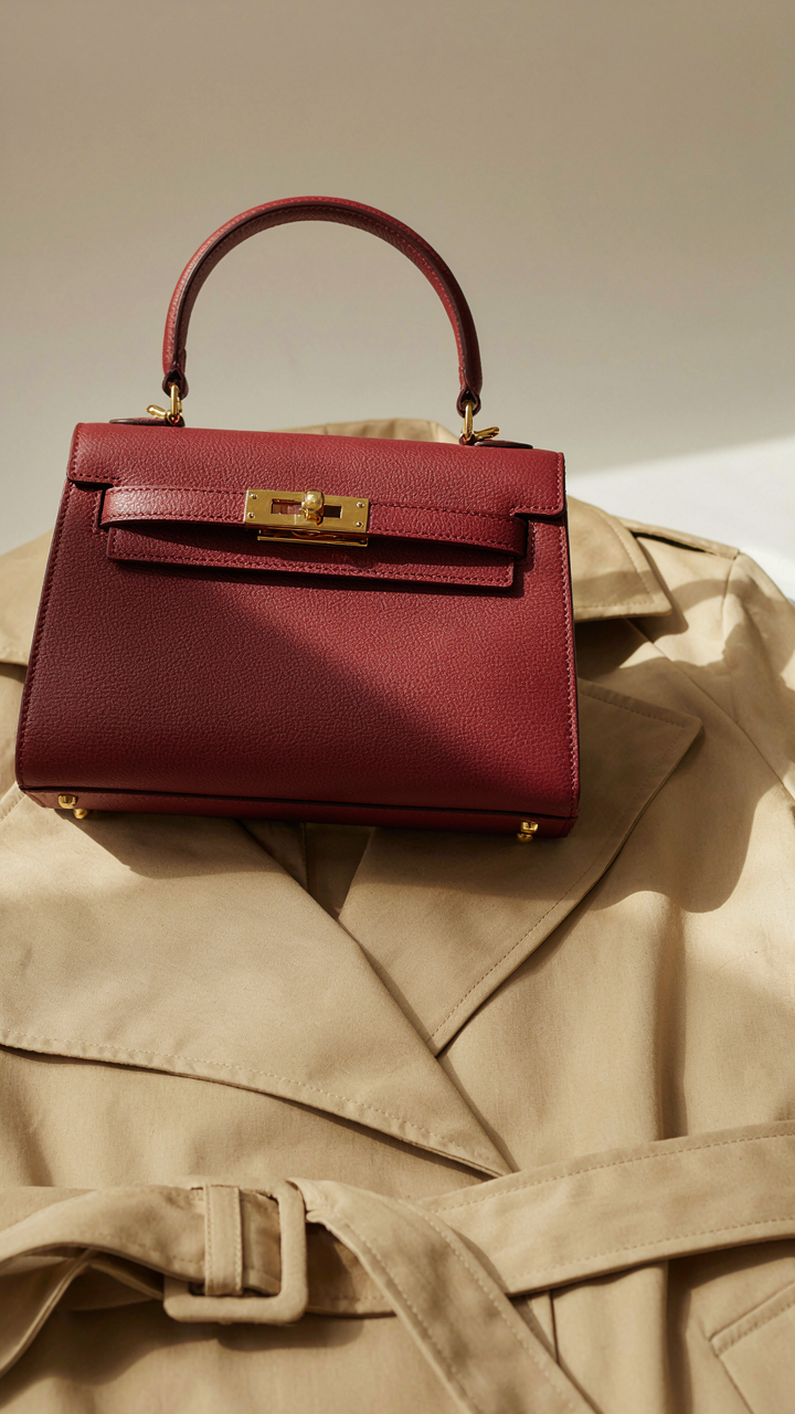
One Point Of Contrast Wins
You want permission to add color without looking chaotic. Here’s the mechanism: your brain processes contrast as hierarchy. One focal point tells the viewer where to look. Multiple competing colors dilute that signal and make you look unsure.
Beige, cream, and brown create a visual vacuum. They’re so unified that a single accent—a burgundy bag, a forest green scarf, a rust belt—becomes magnetic. The outfit doesn’t feel broken. It feels intentional. The key is restraint: one accessory, one color story, one reason the eye stops there.
Metals, Leather, And Weight
Industrial design borrowed a principle from materials science: visual weight follows material density. Silver, gold, and copper read differently on neutral palettes. Leather—whether matte or polished—anchors an outfit through tactile presence alone.
A cognac leather belt on a cream dress doesn’t need another color to perform. It works because leather has inherent visual mass. Same with aged brass jewelry or a deep bronze buckle. Natural elements like wood, stone, or structured suede add dimension without noise. This is why neutral outfits actually reward investment in quality hardware. Cheap metal disappears. Good metal becomes the story.
The Real Obstacle Isn’t Your Wardrobe; It’s Your Fear Of Intentional Anonymity

Most people don’t avoid neutral outfits because they lack options. They avoid them because blending in feels like disappearing. But here’s what actually happens: you stop performing for strangers and start building real credibility. The shift kills decision fatigue, saves money, and makes you harder to dismiss. Pick one beige, cream, or brown piece today and wear it for a week straight. Watch how nobody cares, and you suddenly do.