
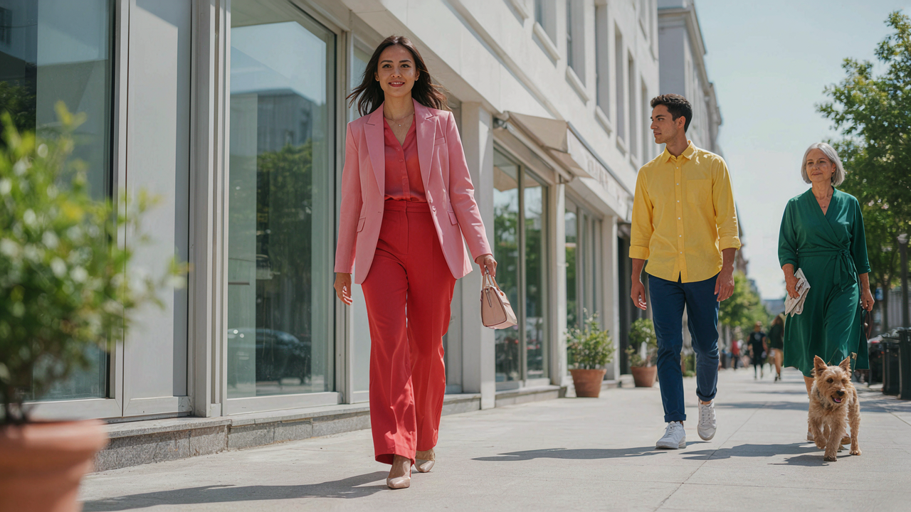
The Color Theory Deception: Why “Clashing” Is A Myth

What Your Brain Actually Sees
You care about this because you’ve been told pink and red don’t work together, and you want permission to ignore that rule without looking incompetent. Here’s the mechanism: your eye doesn’t process colors in isolation. It processes them through contrast and context. When pink and red sit next to each other, your brain isn’t evaluating them against some universal harmony standard. It’s measuring the distance between them on the visible spectrum and deciding whether that distance creates visual tension or coherence.
Most fashion advice treats color clash as a fixed law. It’s not. It’s a design choice. The Renaissance painters understood this. They placed complementary and analogous colors adjacent to force the viewer’s eye to move through the composition deliberately. Pink and red work the same way. The perceived discord comes from saturation levels and fabric texture, not the colors themselves. Swap a matte red with a shiny red in the same outfit, and the “clash” either softens or sharpens. The colors didn’t change. The light did.
Spectrum Proximity Determines Visual Weight

Color theory borrows from physics the principle of wavelength, and wavelength determines how colors behave next to each other. Pink sits between red and white on the visible spectrum, occupying a shorter wavelength than pure red. This proximity creates harmony, not conflict. The two colors are neighbors on the spectrum, not opposites fighting for attention.
The real variable is saturation. A bright hot pink next to a deep burgundy reads as intentional contrast. A dusty mauve-pink next to a brick red reads as a monochromatic play on the same family. Your outfit’s visual success depends on the saturation ratio you choose, not whether the colors themselves are forbidden. Pick one saturated and one muted, or both equally saturated. The rule is consistency in saturation strategy, not avoidance of the color pairing.

The Saturation Scale Protocol For Pink And Red Outfits For Women

When One Color Dominates The Other
You’re worried people will perceive you as indecisive or unsure about color commitment. The real mechanism is contrast ratio. Borrow from graphic design: saturation is the intensity of a color’s pigment. In a pink and red outfit, one must read as primary and the other as secondary, or they fight for attention and dilute your visual message.
The standard advice is to “balance” them equally. That’s wrong. Equal saturation creates visual noise. Instead, choose which color carries 70 percent of the saturation load. If you pair a bright true red with a muted dusty pink, red dominates the eye and pink becomes an accent. If you reverse it with a hot fuchsia pink and a desaturated burgundy, pink commands the composition. The subordinate color should register as 30 percent of the visual weight or less.
Intensity Shifts Within A Single Hue
Monochromatic doesn’t mean one flat color repeated. It means variations of the same base hue at different brightness levels, which solves the pink and red problem by treating them as tonal family members rather than competing colors. Red and pink share the same hue angle on the color wheel, just at different lightness values.
Wear a deeper, more saturated red as your base layer or dominant piece. Layer or accessorize with a lighter, less saturated pink to create visual separation without the conflict of two distinct colors. A burgundy dress with a blush pink blazer works because your eye reads depth, not contradiction. The shift in tone provides enough contrast to prevent blandness while maintaining coherence. To execute this: identify your red as the anchor, then select a pink that’s at least two stops lighter in value.
Texture As A Neutralizer: Beyond Color Theory

When Surfaces Matter More Than Hue
You’re worried the colors clash and you’ll look wrong. Here’s what actually stops that from happening: fabric interrupts visual perception before your brain registers color saturation. Borrow from physics and think of texture as light absorption. Matte surfaces scatter light. Shiny surfaces reflect it. A matte red knit and a glossy pink silk read as different visual weights, which breaks up the color intensity before it overwhelms the eye. The outfit stops reading as “too much” because the materials themselves create visual rest.
When you layer a smooth satin pink against a textured wool red, the contrast in surface properties forces your eye to process dimension instead of color harmony alone. This is why designers pair bold colors with mixed fabrics instead of matching silk to silk in the same shades. You’re not neutralizing the color through a third neutral tone. You’re neutralizing the visual aggression through tactile contrast. The viewer’s brain parses the outfit as intentional layering rather than a color collision.
How Fabric Weight Controls Everything
The common advice is to “balance bold colors with neutral textures.” That’s incomplete. Fabric weight matters more than texture alone because it determines how much light the material absorbs and how the silhouette reads on your body. A heavy red wool coat and a lightweight pink silk blouse create visual hierarchy through mass, not just surface finish. The heavier piece anchors. The lighter piece floats. Your eye reads them as separate elements instead of competing hues.
Combine a dense red sweater with a thin pink chiffon overlay and the chiffon becomes transparent. Light passes through it. The red underneath dominates without the outfit reading as oversaturated because you’re seeing depth instead of flat color stacking. Weight distribution also affects how these colors sit on your frame. Use it deliberately. A structured red blazer with a fluid pink skirt creates movement and visual interest that pure color theory never accounts for. Fabric choice determines whether the outfit reads as cohesive or chaotic.
The “Looks Vintage” Equation: Era Specific Palettes

Color Blocking That Actually Signals Intentionality
You want people to think you understand design history because that reads as taste and education. Here’s what actually works: mid-century modern design used pink and red as deliberate geometric counterpoints, not accidents. The mechanism is constraint. Designers of that era couldn’t blend colors smoothly, so they created hard edges between hues. This forced precision made the pairing read as controlled, not confused.
Apply this by treating pink and red as separate zones rather than gradients. A structured red pencil skirt paired with a structured pink blouse reads mid-century. The seams matter. The lack of ombre or fade matters. The flatness of the color matters. This isn’t about nostalgia, it’s about optical clarity. When colors don’t blur together, the eye processes them as intentional choices, not fashion mistakes.
Retro Frameworks For Pink And Red Skirt Combinations
The real issue with vintage-inspired pink and red outfits is that people grab the colors without grabbing the silhouette code from the era they’re borrowing from. A 1950s pink and red look requires the skirt cut and waistline of that decade. A 1970s version requires different proportions entirely. The silhouette is the actual signal of era, not the color combination alone.
Start with one garment that locks you into a specific decade. If you wear a full midi skirt in pink with a fitted red top, you’re borrowing 1950s structure. If you wear a loose red linen shirt over a pink slip skirt, you’re borrowing 1990s minimalism. The pink and red pairing only reads coherent when the garment construction matches the era you’re pulling from. Silhouette first, color second.
Architectural Layering: Building A Red Pants Pink Top Outfit

When Opposition Forces Create Stability
You want this to work because wearing red and pink together breaks the rules you were taught, and breaking rules without looking foolish signals you know something others don’t. That’s the real fear underneath. In physics, opposing forces create equilibrium. Red and pink operate the same way. They’re not opposites but competing wavelengths on the same spectrum. When you layer them, one must dominate structurally while the other recedes optically. The garment closer to your skin sets the foundation. The outer piece controls the visual weight.
Red pants anchor the outfit with density and authority. Pink on top works because it reads as an accent against red’s gravitational pull. Reverse this and pink pants disappear entirely under a red top, leaving you unbalanced. The mechanism is simple: the larger surface area piece determines the outfit’s visual center of gravity. Red pants occupy more real estate than a pink top ever could, so red becomes the base. Pink becomes the counterweight that prevents monotony without creating chaos.
Seam Placement Determines Everything Else
Common advice says “just make sure the colors complement each other.” Wrong. That’s aesthetic handwaving. What actually matters is how the garment edges interrupt the color field. A pink blouse with clean seams at the shoulders and hem creates defined edges where pink stops and red begins. This boundary is your structural integrity point. Without it, colors blur into an unfocused mess.
Loose, oversized pink tops destroy red pants outfits because fabric drape eliminates the seam’s architectural role. The boundary dissolves. Instead, choose fitted or semi-fitted pink tops where seams land precisely at the shoulder and waist. Cropped pink shirts work exceptionally well because they create a hard stop above the red waistline. This seam placement forces the eye to register two distinct color zones rather than one muddy blend. Your layering strategy depends entirely on where fabric meets fabric, not on color theory.
Seasonal Adaptations: Pink And Red Winter Outfit Strategies

Material Weight Determines Actual Warmth
You’re worried a pink and red combination will look cheap or thin in cold months. The real problem is you’re thinking about color before you’re thinking about thermal resistance. Fabric weight is an insulation problem, not an aesthetic one. Wool, cashmere, and dense cotton blends trap air and stop heat loss. Light chiffon and thin silk don’t, regardless of color. Winter pink and red outfits fail because people prioritize the visual first and realize too late the garment offers no protection.
Flannel and melton wool come in pink naturally. Merino wool takes dye easily and holds both colors without fading faster than other shades. Burgundy is red’s dense cousin and appears in heavy suiting fabrics. The mechanism is simple: a heavyweight pink knit performs identically to a heavyweight charcoal knit. Material thickness and fiber type control temperature regulation, not hue. Choose your base layer weight first. Select color second.
Structural Layering Without Bulk
Layering exists in architecture and engineering for the same reason it works in winter outfits: each layer serves a distinct function. The first layer wicks moisture. The second layer traps air. The outer layer blocks wind and water. Pink and red layering breaks when people treat the colors as equal visual players instead of assigning each layer a role.
A fitted burgundy sweater under a camel wool coat works because the sweater disappears visually and performs thermally. A blush pink long-sleeve base under a structured charcoal blazer with a red accent scarf functions the same way. The coat does the work. The sweater does the insulation. The accent handles visual interest. Never build a winter outfit trying to make all three layers equally visible. Stack them by function, and the color coordination handles itself naturally.
The Pink Valentines Outfit: Beyond The Cliché

Reject The Greeting Card Trap
You want permission to wear pink and red without looking like you’re performing for a holiday. The real mechanism is contrast. Most people wear matching pink and red because they think saturation equals intentionality. That’s backwards. Design uses opposition as its core tool, the same way contrast in visual hierarchy makes elements stand out. Pink and red together need structural separation, not blending. Different textures, different proportions, different placement on the body. One color dominates. The other accents.
A dusty mauve shirt under a cherry red blazer works. Bright pink trousers with a muted burgundy sweater works. What doesn’t work is both colors shouting at equal volume from equal surface area. The outfit fails when every piece competes. The fix is simple: assign one color 60 to 70 percent of the visual weight, the other 30 to 40 percent. This isn’t restraint. It’s strategy.
Wear What You Actually Choose
The consensus says pink and red together are feminine or romantic or seasonal. Ignore that frame entirely. What matters is whether you picked these colors because the outfit solves a problem you have or because you think you should wear them today. Those are opposite decisions. The first builds a wardrobe. The second builds clutter.
Real personal expression shows up as repetition. If you wear this combination once, it’s an experiment. If you wear it twice a month, it’s a signal about how you move through the world. The mechanism is consistency. Your choices accumulate into a recognizable pattern others see before you do. Start by wearing pink and red because it solves a tactical problem: you need to look sharp at a specific event, or you need pieces that work across multiple outfits, or the colors actually match your skin tone. Let the meaning follow the behavior, never the reverse.
Accessories As Amplifiers: The Final Touch

Metal Finishes That Sharpen The Contrast
You’re adding accessories because you think they soften the outfit. They don’t. They either amplify or dilute. Think of contrast like signal strength in communications: the clearer your signal, the more intentional your message reads. Gold, silver, and gunmetal don’t decorate a pink and red outfit. They act as visual anchors that force the eye to process the color combination as deliberate instead of accidental.
- Gold: Warms both pink and red simultaneously. Best with deeper reds and warmer pinks. Creates harmony rather than tension.
- Silver: Cools the palette and sharpens edges. Works best when you want the colors to feel modern and separated rather than blended.
- Rose Gold: Sits between warm and cool. Tightens pink and red without the commitment of full gold warmth. Safe choice for beginners.
- Gunmetal: Adds weight and grounds the combination. Prevents the outfit from reading as costume-like. Best for darker or muted reds.
- Brass: Ages quickly and takes on patina. Creates intentional texture that makes the pairing feel editorial rather than random.
The mechanic here is simple: metallic surfaces reflect light differently than fabric. This interrupts the viewer’s eye mid-scan and forces recognition of the color choice. Without metallic breaks, pink and red read as one blob. With them, the outfit has structure.
Shoes And Bags Hold The Line
Footwear and bags are not decorative. They’re the structural frame that prevents the outfit from collapsing under the weight of two saturated colors. Most people make them neutral (black, tan, white) and then wonder why the outfit still feels unresolved. That’s the wrong approach because it abandons the color story midway.
Your shoe and bag should reference one of the two colors, not escape into neutrality. A red bag with pink tones, or a burgundy shoe echoing a deeper red, creates visual continuity. This tells the viewer the color combination was intentional, not a mistake you’re trying to minimize. The cohesion comes from directional consistency, not from hiding the colors.
Stop Seeking Permission For Bold Choices; The Real Constraint Is Your Own Lack Of Conviction

Most people won’t wear a pink and red outfit because they’ve never seen someone else do it first. You’re waiting for permission that will never come. The constraint isn’t the color combination. It’s you refusing to be the first. Put on the outfit tomorrow. Take a photo. Post it. Watch how many people suddenly realize it works because you decided it does. Conviction moves before consensus.