

The Illusion Of Matching In Color Blocking Outfits

Why Conventional Matching Dilutes Impact
You want permission to play it safe. The real mechanism: conventional matching trains your eye to see harmony as the absence of tension. Fashion borrowed from graphic design the principle of contrast, but most people water it down into “complementary colors that don’t fight.” That’s backwards. Fighting is the entire point.
When colors sit too close on the wheel, they blur together. Your outfit becomes a single muddy statement instead of two distinct forces. Matching doesn’t protect you from looking bad—it protects you from being memorable. The moment you stop treating color as something to neutralize and start treating it as something to deploy, your visual impact multiplies.
Embrace Discord For Memorable Style

Discord creates retention. When someone sees you, their brain has to process two competing signals instead of one smooth gradient. That friction is what makes an outfit stick in memory while beige-on-beige dissolves.
The mechanism is simple: your eye moves between contrasting blocks instead of settling on a unified field. A cobalt blue paired with a rust orange creates visual movement. Your viewer’s attention doesn’t rest—it travels. That’s not accident. That’s intentional dominance through opposition. Stop treating colors as team players trying to get along. Treat them as focal points that demand acknowledgment.

The “Chaos Theory” Of Colour Combinations Fashion

How Dark And Light Hues Carry Different Loads
You want permission to wear bold colors without looking like you’re trying too hard. That’s the real question underneath this section. The mechanism is visual weight, borrowed from physics: darker hues carry mass, lighter ones don’t, and your brain registers this imbalance instantly.
A navy block feels heavier than a cream block of identical size. This isn’t opinion. Dark colors absorb light; light colors reflect it. When you pair a saturated dark with a bright light, you create tension. The eye travels to resolve the imbalance. Most people call this “contrast” and stop thinking. The real move is understanding which color anchors the outfit and which one floats.
When Clashing Colors Actually Signal Intent
The common advice says “clash” colors carefully or stick to the color wheel. This is incomplete thinking. Psychology says our brains interpret clashing as either confidence or incompetence in under one second. The difference lies in proportion and intention.
A 60-30-10 split (dominant color, secondary, accent) reads as intentional even with colors that technically clash. A 50-50 split reads as accidental. Your brain treats balanced chaos as a mistake and weighted imbalance as a design choice. The protocol: identify your dominant color first, then build the secondary and accent around it. Never start with two equally intense colors and hope they work.
Beyond The Wheel: The “Architectural Blueprint” For Colorful Outfit Women
Silhouettes As Structural Anchors For Color
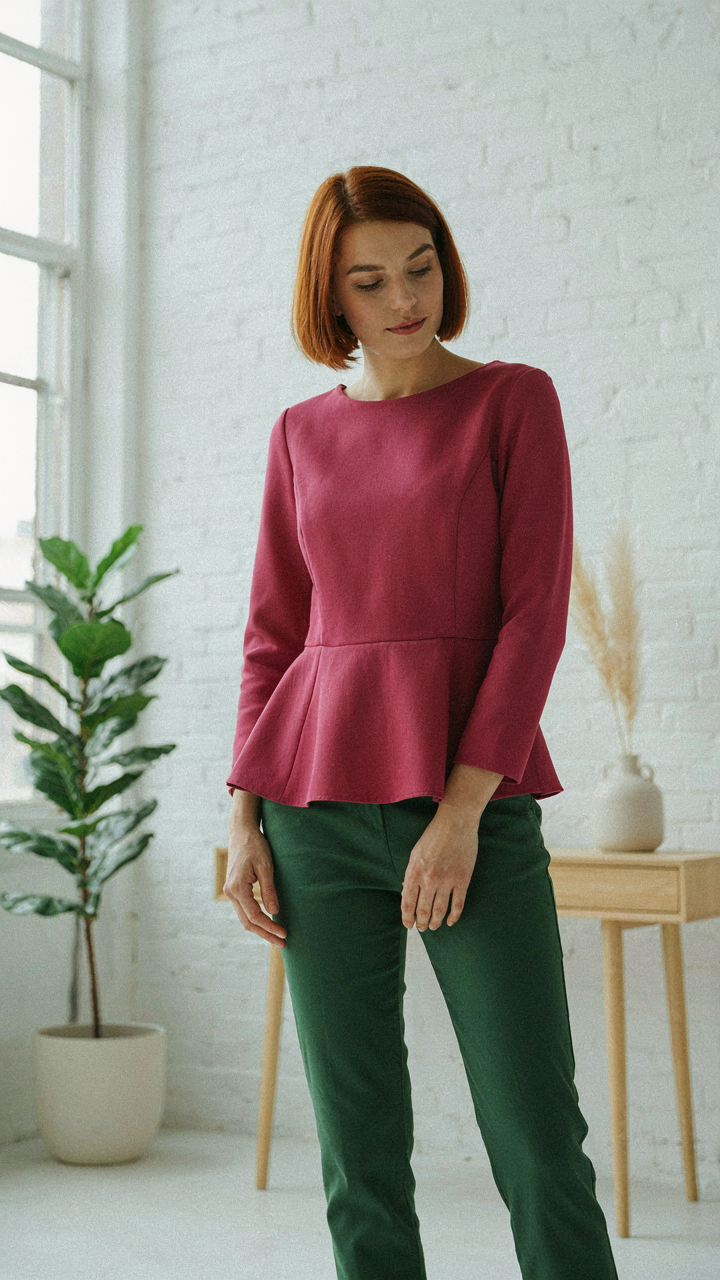
You want color blocking to work because you’re tired of looking invisible, but you’re scared it’ll backfire and make you look chaotic instead. The real mechanism is this: your silhouette is load-bearing wall. Color blocking fails when people treat it like decoration on top of nothing. The cut and proportion of your clothing must be strong enough to hold the color blocks without collapsing into visual noise. A boxy oversized blazer paired with fitted trousers creates clear planes. An A-line skirt with a cropped top does the same. The silhouette defines where color can live and breathe.
Weak silhouettes sabotage color blocking every time. Shapeless pieces paired with random color sections read as costume, not intention. Your job is to choose one dominant silhouette line per outfit, then assign colors to specific garment zones. A structured peplum top with monochromatic bottoms anchors color to the upper body. Wide-leg trousers with a tucked blouse locks color into distinct horizontal blocks. The geometry of your clothing determines whether color blocking reads as strategy or accident.
Visual Hierarchy Wins Through Contrast, Not Chaos
Textural interplay in color blocking works like visual weight distribution in architecture. One material must dominate. One must recede. Most advice tells you to “mix textures for interest,” which is lazy and wrong. What actually matters is that you establish a clear hierarchy so the eye knows where to land. Matte cotton reads heavier than silk. Rough linen demands attention more than smooth satin. Combine them intentionally.
Build outfits with a dominant texture carrying your primary color, a secondary texture at mid-weight for your accent color, and nothing else. A matte wool blazer in deep navy, a smooth silk shell in cream, structured trousers in neutral. The texture ladder creates visual order that makes color blocking readable from across a room. Ignore this and your outfit becomes a texture war that cancels out your color strategy.
The 3 Color Domination Protocol For Color Blocking Outfits
How To Pick Your Three Colors
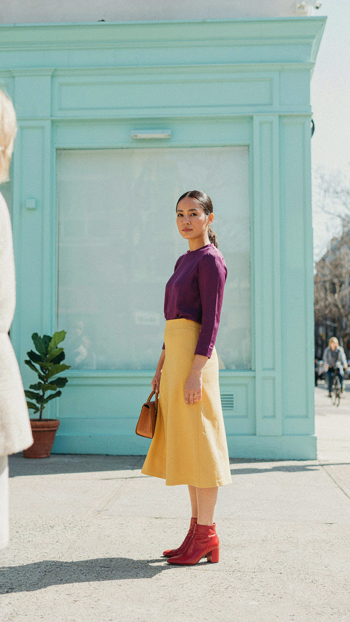
You want certainty that you won’t look broken. The mechanism is simple: three colors create visual stability because the human eye processes them as a complete statement instead of visual noise. Most people fail here by treating all three colors as equal weight, which collapses the tension you need.
Your dominant color occupies 50-60% of the outfit and anchors the look. Your secondary color takes 25-35% and creates the contrast pivot. Your accent color fills the remaining 10-15% and serves as the exclamation point that makes the combination deliberate instead of accidental. Pick based on undertone matching, not vibe matching.
Where Each Color Lives On Your Body
Placement matters because contrast reads differently depending on distance from the face. Put your dominant color in the lower half or as the base layer to ground the outfit, which forces the eye to travel upward. Secondary and accent colors perform better near the torso and shoulders, where they catch immediate attention without overwhelming the viewer before they register your outfit as intentional.
Strategic placement means the dominant color should rarely touch your face directly. Your secondary lives on the upper body or as a statement piece. Your accent arrives as a shoe, belt, or small layered piece. This sequence trains attention: ground, build, punctuate. The outfit reads as controlled, not chaotic.
The Art Of Intentional Contrast: Colourful Outfits Edition

Complementary And Analogous Palettes Work Because Of Optics
You want permission to dress boldly without looking fractured. That’s the real ask. Color theory gives you it. Borrowed from physics, the principle of complementary colors relies on how the human eye processes opposing wavelengths on the color wheel. Complementary pairs (red and green, blue and orange, yellow and purple) create maximum contrast and visual tension. Analogous colors sit adjacent on the wheel and create harmony instead. Both systems work because your brain processes them as intentional, not accidental.
The difference matters tactically. Complementary palettes grab attention and read as confident or editorial. Analogous palettes feel cohesive and safe. Most beginners choose analogous by default because it feels harder to fail. That’s backwards. You need both tools depending on what you’re actually trying to signal.
- Complementary blocking: Pair opposing colors in roughly equal visual weight. Red trousers with green top, or mustard jacket with navy base. The contrast reads as deliberate strategy, not luck.
- Analogous blocking: Stack colors three to four stops apart on the wheel. Navy, teal, and sage green together. Creates depth without visual noise.
- Split complementary: Use one color plus the two colors flanking its opposite. Less aggressive than straight complementary. Safer entry point for complex palettes.
- Triadic schemes: Three colors equally spaced on the wheel. Requires restraint. Use one as dominant, two as accents. More advanced execution.
- Monochromatic blocking: Single color family across multiple saturation levels. Light to dark versions of one hue. Builds dimension without palette risk.
The execution changes everything. Complementary works only when one color dominates by volume and the other punctuates. Equal 50/50 splits read chaotic. Analogous palettes need a clear hierarchy too, or they flatten into visual mush. The system isn’t the outfit. Your proportion choices are.
The Trap Of Playing It Safe
Everyone tells you to start with neutrals and add one pop of color. This advice is incomplete. It keeps you stuck at the beginner level indefinitely because you never practice reading contrast. The real work is learning what “too much” actually looks like on your frame, in your lighting, in the specific contexts where you move. You don’t learn that by adding a mustard belt to grey sweats.
The unexpected combinations work because they force your brain to process the outfit as a statement instead of a default. Navy and forest green shouldn’t work together by conventional rule. They do because the contrast is subtle enough to intrigue but deliberate enough to read as intentional. That’s the mechanism: making the viewer pause for half a second longer. Predictable combinations don’t earn that pause. They blend into the background noise of everyone else’s outfit algorithm.
Start by pairing two colors you think clash slightly. Not drastically. Slightly. Olive and terracotta. Burgundy and chocolate brown. Teal and cream. Wear it for a full day. Notice whether people respond differently. Notice whether you carry yourself differently. That discomfort you feel is the system working. That’s where learning happens. Repeat the combination three times before moving to the next experiment.
Mastering The Color Block Photoshoot Aesthetic

Environment As Your Fifth Color
You want the shot to look intentional, not like you stumbled into a lucky moment. That’s the real driver here. Color blocking in photos works because contrast reads instantly, but the background either amplifies that contrast or destroys it. Treat your environment like a design constraint, not decoration. A neutral wall behind a bold three-color block outfit strengthens each color’s presence. A busy or clashing background fragments your outfit into visual noise.
The mechanism is borrowed from graphic design’s principle of negative space. Your outfit needs breathing room to register as intentional. A solid-colored wall, a clear sky, or a single-tone floor surface acts as the negative space that makes your color choices pop. Position yourself so the background contains one dominant hue that doesn’t compete with your outfit’s palette. If your outfit uses navy, red, and cream, a white or off-white wall works. A red brick wall behind the same outfit cancels the impact.
Angles That Expose Your Color Choices
Straight-on photos flatten color blocking. You need angles that show the geometric relationship between your color sections. Shoot from a slight elevation above shoulder height, angled downward at roughly 35 degrees. This angle exposes the full torso and legs simultaneously, showing how your colors stack and transition. Turn your body 15 to 20 degrees away from the camera, not parallel. This rotation creates natural lines that guide the eye through each color block.
The pose itself should create separation between colors. If you’re wearing a color-blocked top and pants, position one arm down and one bent slightly at the elbow. This creates negative space between your body and arm, making the color transitions sharper. Keep your stance grounded with one foot forward, shoulders back. Never photograph color blocking head-on with arms flat at your sides, it reads as a mug shot, not a composition. The specifics matter because they determine whether viewers see intentional design or accident.
The Economies Of Scale In Color Combos Outfit Choices

Buy Pieces That Work Across Multiple Palettes
You’re hoping one purchase solves three problems at once. Here’s the mechanism: economies of scale in color blocking means treating your wardrobe like a system where each piece multiplies its value by pairing with multiple color families. Neutral bases don’t just look safe—they’re mathematically efficient. A charcoal gray blazer blocks with navy, burgundy, forest green, or cream. A cream sweater does the same work across warm and cool families. The math compounds fast.
Most advice stops at “buy neutrals,” which is lazy. The real move is identifying which neutrals anchor your natural color range without fighting your skin tone. If you run warm, a cool gray or stark white creates friction. If you run cool, warm beige wastes a slot. The constraint is the feature. Pick one neutral that genuinely multiplies across your existing pieces, not just in theory.
Rotate Strategically To Multiply Combinations
The real leverage isn’t buying more clothes—it’s rotating pieces into color combinations you haven’t tried yet. Strategic rotation means you’re tracking which items actually pair, which ones create dead zones, and which ones hit across multiple blocking patterns. A five-piece capsule with intentional color selection can generate twelve to fifteen distinct outfits just by moving one item.
- Dominant color anchor: One strong hue—navy, black, or forest green—that appears in multiple pieces. It creates recognition without repetition.
- Secondary bridge piece: A mid-tone item like khaki or gray that connects your dominant color to accent shades. It prevents clashing.
- High-contrast accent: One bold piece in a complementary color family. Rotate it with your other pieces systematically.
- Neutral layering item: A blazer or cardigan in white, cream, or gray that resets any combination and extends wear.
- Repeatable base: Solid-colored bottoms in your dominant or neutral color that pair with every top you own.
The protocol is simple: before buying a new piece, audit whether it blocks with at least three existing items in different color families. If it doesn’t, it’s not efficient—it’s clutter wearing efficiency’s costume. Track your successful combinations in a note or photo. Repeat them with rotating accent pieces.
From Boardroom To Bold: Colorful Formal Outfits

When Neutrals Stop Working For You
You want permission to wear color without losing authority. Here’s the mechanism: formal dress codes exist to reduce cognitive load on observers. Neutrals accomplish this through erasure. Color blocking accomplishes it through structure. The difference is contrast ratio and intentionality. A navy blazer paired with a cream blouse reads as formal because the contrast is controlled. A navy blazer with a jewel-tone emerald blouse reads as formal only if the emerald occupies a bounded zone—cuff, collar, pocket square. The brain registers the color as a deliberate addition, not chaos.
Strategic color blocking in professional settings follows one rule: the 60-30-10 framework from interior design. Sixty percent neutral base, thirty percent secondary color, ten percent accent. Wear charcoal suiting at sixty percent, white shirt at thirty percent, and a burgundy tie or blouse detail at ten percent. The eye expects this proportion in formal spaces. Deviation signals either ignorance or intentional disruption. Choose disruption only when you’ve already built credibility through conventional means. The outfit itself must do the work of making the statement legible, not vague.
Breaking The Unspoken Rule Without Breaking Trust
Dress codes aren’t laws, they’re predictions about what maintains social frictionlessness. Challenge them through layer strategy, not replacement. Most people advise dropping the blazer or swapping colors wholesale. Wrong approach. Keep the blazer. Keep the neutral foundation. Shift the secondary or tertiary piece into a bold hue—a jewel-toned dress under a structured blazer, or a saturated color in a structured coat worn over basics.
The mechanism at work here is permission by proxy. Tailoring grants authority. Structured silhouettes grant authority. Formal fabrics grant authority. When color arrives in a formal context wrapped in these signals, observers don’t perceive rule-breaking, they perceive evolution. Test this by starting with one formal setting where you have social capital already established. Then escalate. The outfit becomes proof that color intensity has nothing to do with professionalism. Professionalism lives in fit, finish, and intention.
Breaking Free From “Colorful Clothing Style” Dogma

Seasonal Rules Are Marketing Noise
You’re worried that ignoring color conventions will make you look wrong. The real mechanism is simpler: seasonal color theory was invented by the cosmetics industry in the 1980s to sell products, then fashion adopted it to create artificial scarcity. Your skin doesn’t actually reject colors outside your “season.” Contrast and undertone harmony do the work. Season rules are permission structure, not law.
Most people follow seasonal guidelines because they fear standing out, not because the rules have scientific backing. A deep winter can wear warm terracotta if the saturation and value match their contrast level. A soft autumn can wear cool jewel tones if they’re muted enough. The actual constraint is contrast matching and undertone coherence, not arbitrary calendar divisions. Strip the season label and test combinations against your own coloring instead.
Your Color Signature Replaces Trial And Error
Building a personal color system works like establishing a brand identity in economics: you create consistent recognition through repeated signal. Your color signature is the set of hues, saturations, and values that you deploy across outfits until they become your visual mark. This isn’t about “finding your colors.” It’s about choosing three to five color relationships you’ll use deliberately until they stick.
Start by identifying one base color you wear weekly. Then choose one accent color that creates the contrast you need. Finally, add one neutral that grounds the combination. Wear this trio for two weeks without rotation. Document what works. After thirty days, you know what actually functions for your life, not what theory says should work. Your color signature emerges from data, not from inspiration boards.
Your Fear Of Clashing Isn’t About Color; It’s About Your Fear Of Standing Out

Most people don’t avoid color blocking outfits because they lack taste. They avoid them because bold combinations demand attention, and attention feels risky. You’re not worried the colors clash. You’re worried you do. Pick two contrasting colors you actually like today. Wear them together tomorrow. You’ll realize the world doesn’t collapse when you stop blending in, and that’s when real style starts.