

The Myth Of The “Right” Colour Analysis: Why Most Advice Fails

Seasonal Systems Miss The Actual Mechanism
You want permission to stop guessing what looks good on you. The seasonal color analysis industry sells certainty it doesn’t have. Most systems split people into four buckets (Spring, Summer, Autumn, Winter) based on skin undertone, hair depth, and eye color. This framework borrows from color theory in graphic design, where hue, saturation, and value determine contrast and harmony. But seasonal analysis treats your coloring like a static property when it functions more like a range. Your skin doesn’t have one undertone. It has a depth, a saturation level, and a reflectivity that shifts with light source, time of year, and surrounding colors. The system doesn’t account for this variance.
The real mechanism at work is contrast matching, not seasonal matching. Your face works as a reference point. Colors that sit too close to your natural coloring flatten you. Colors that jump too far feel disconnected. The seasonal boxes pretend to solve this by assigning palettes, but they’re guessing based on demographic patterns, not your specific contrast ratio. A “Winter” person with low saturation skin gets labeled the same as a “Winter” person with high saturation skin, even though they need opposite color strategies. The system prioritizes consistency over accuracy.
What Online Quizzes Actually Measure

Generic “what are my colors” quizzes don’t measure your coloring. They measure how well you click buttons that match the quiz creator’s assumptions. Most online systems ask you to compare your skin to fabric swatches or answer vague questions like “Is your skin warm or cool?” This is circular reasoning. You’re testing the accuracy of your own color perception using a tool designed by someone who has no data on you. The quiz scores high on engagement and low on utility.
The real problem: these tools lack calibration. They don’t control for ambient light, monitor color accuracy, or individual variation in color perception. A swatch that reads as “cool” on your screen might display as “warm” on another device or in natural light. You’re making a permanent wardrobe decision based on a calibrated guess at best, a random color assignment at worst. The quiz feels authoritative because it delivers a clear answer. That’s marketing, not science. Your next step isn’t taking another quiz. It’s learning to test colors against your actual face in consistent lighting.

Beyond Pigment: Your Aura As A Personal Color Analysis Driver

Energy Signature Over Surface Reflection
You want to believe color theory is objective because that kills the work of self-knowledge. It’s not. Seasonal color analysis works because it maps your inherent contrast and luminosity, not your RGB values. Think of it like signal-to-noise ratio in information theory: your skin, hair, and eyes produce a specific ratio of reflectance. That ratio is your actual variable, not the individual hues. High contrast coloring demands certain color families to maintain clarity. Low contrast coloring demands others to avoid washing out entirely.
The mechanism is simple. Your body produces an electromagnetic signature through pigmentation density and undertone distribution. Colors either amplify or degrade that signal. A high-contrast person wearing muted pastels creates visual noise. A soft-contrast person wearing bold jewel tones creates the same noise. The goal isn’t beauty—it’s coherence. Your aura is the unified field your features project when they’re not fighting each other through your clothes.
Your Core Essence Determines Color Receivership
Most color advice assumes psychology flows one direction: you wear blue, you feel calm. Wrong. The real mechanism works backward. Your internal energy state determines which colors your body can actually receive and project without contradiction. This is why the same shade can energize one person and drain another—not metaphorically, but perceptually. Your nervous system recognizes alignment or misalignment between your inherent frequency and the wavelength hitting your skin.
Wear a color that contradicts your undertone contrast, and observers sense incongruence even without naming it. Wear a color that matches your chromatic reality, and your features read as intentional. The color doesn’t change who you are. It either removes interference or adds it. Your job is finding which colors let your actual presence come through without static. Start by testing two opposing colors—one warm, one cool—in direct sunlight. Notice which one makes your skin read as more defined, not which one you like better.
The “Color Season Analysis” Trap: Why Labels Limit You

The Cage Of Four Categories
You want permission to stop guessing. That’s the real reason seasonal color analysis appeals to you. The system promises a box. Four seasons. Done. But the mechanism here mirrors how biology handles phenotypes—the observable traits emerge from multiple variables interacting, not a single genetic switch. Your color season is not your color identity. It’s a starting reference point that most people mistake for a destination.
The original color analysis system emerged in the 1980s as a simplified framework to help people navigate retail options. It worked because anything beats random. But it worked too well—it calcified into doctrine. Practitioners began treating seasonal categories as immutable laws rather than useful approximations. The reality is messier. Most people occupy a spectrum between seasons or shift seasonally based on sun exposure, hair changes, or skin condition shifts. Treating your assignment as gospel wastes the entire point of the analysis.
What Works When Seasons Collide
Forget the advice that you’re purely one season and should police every garment against that identity. That’s incomplete. The real mechanism is contrast and saturation matching—how your natural coloring reflects light compared to the garment’s undertone and intensity. Someone with warm undertones but cool undertone hair (common in Mediterranean genetics) isn’t trapped in one category. They can wear both warm and cool colors if they adjust saturation levels correctly.
Start treating seasonal analysis as a diagnostic tool, not a classification. Identify which seasonal palette reflects your hair, skin, and eye undertones most accurately. Then systematically test colors outside that season by paying attention to how they sit next to your face—does the color make your skin look tired or alive? That data point matters more than the label. Build your actual color range through testing, not through obedience to a predetermined box.
The Dynamic Range Protocol: Engineering Your Optimal Palette
How Light Wavelengths Determine Wearability
You want this section to tell you exactly what to buy so you stop second-guessing yourself in the mirror. That’s the real ask. Physics explains why: wavelength is the distance between peaks in light energy, and your skin’s undertone either resonates with or dampens specific wavelengths before they reach an observer’s eye. When fabric color matches your undertone’s natural frequency, the light bounces clean. When it doesn’t, it gets absorbed or scattered, making you look fatigued.
Your seasonal color category exists because your skin, hair, and eyes transmit and reflect light within a predictable range. Cool undertones (blue, red, violet wavelengths dominant) clash with warm fabrics (yellow, orange wavelengths) because the reflected light creates visual noise. The mechanism isn’t opinion. It’s interference. You match fabric wavelengths to your undertone’s reflectance pattern, and your face gains definition without effort.
Contrast And Saturation As Calibration Tools
The generic advice says “wear your season’s colors” and leaves you guessing whether navy or black serves you better. That’s incomplete. Saturation and contrast are the actual power variables controlling how much visual weight a color carries against your face. Saturation measures how pure a hue is, contrast measures the difference between color value and your skin’s baseline brightness. High saturation, high contrast colors demand strong undertones to absorb them without looking garish. Low saturation, low contrast colors let weak undertones hide.
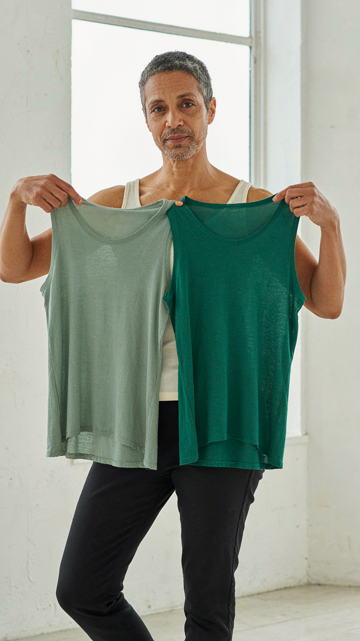
Start by testing saturation first, then contrast. A muted sage demands less undertone strength than a vivid emerald. A soft gray sits closer to your face than charcoal because the contrast load is lower. This is why seasons work differently for different people within the same category. Your specific undertone strength determines your saturation ceiling and contrast tolerance. Map these bounds, then build your palette within them, not outside them.
How To Find Your Color Season? Stop Looking, Start Observing

Measure What You Actually See
You want someone to tell you what to wear so you stop making mistakes. Here’s the mechanism: your eyes lie because they filter input through preference, not physics. Seasonal color analysis works only when you measure what’s objectively true about your coloring, not what feels right. Pull back your hair completely. Sit in natural daylight, not fluorescent or sunset. Look at your skin tone on a neutral background. Write down the undertone: does your skin read warm (yellow, peachy, golden) or cool (pink, red, blue)? This is data, not opinion.
Most color analysis advice skips this step and jumps straight to vague categories like “warm” or “light.” That’s incomplete. You also need saturation level and value depth. Hold a bright white and a cream fabric next to your face in the same light. Does white reflect harshly off your skin or blend seamlessly? Does cream wash you out or disappear into your complexion? Your answer determines whether you live in high-contrast or low-contrast territory. This single observation eliminates half the seasonal system immediately.
Collect Unfiltered Feedback
Strangers notice what you’ve trained yourself to ignore. When someone says “you look tired” or “that color makes you glow,” they’re not complimenting your outfit—they’re reporting a contrast shift between you and the fabric. This is the signal in the noise. You need reactions from people who have no stake in flattering you: baristas, colleagues you pass in hallways, family members who’ve seen you in a thousand outfits. Track which specific colors generate unsolicited comments about your skin, energy, or presence.
The common mistake is asking people directly. “Does this look good on me?” activates politeness. Instead, wear a color for a week and count the comments. Pay attention to tone—compliments about the outfit versus compliments about how you look in the outfit are completely different data points. The second one matters. You’re building a pattern, not collecting opinions. After four to six weeks of wearing test colors from different seasonal palettes, the feedback becomes statistical, not anecdotal. That’s when you’ll see which season’s palette actually aligns with how people perceive your presence.
The Capsule Wardrobe Planning Power Play: Intentional Color Choice

Build Your Foundation On Color Harmony
You want permission to buy less and look better without the nagging doubt you’re missing something. Here’s the mechanism: seasonal color analysis functions like a constraint in economics—it forces prioritization by eliminating options, which paradoxically increases purchasing power per dollar spent. Your seasonal palette is your budget. Every piece you add either multiplies the utility of existing items or sits unused.
Your core colors are the foundation. These are the 3-5 shades from your palette that appear in your natural coloring most prominently. They work with your skin, hair, and eye tone without creating visual static. Build your basics here first: neutrals, foundational tones, versatile textures. Every other piece you own should coordinate with these core colors, not compete against them.
- Core neutrals for your season: Spring might use warm beige or cream; Summer uses soft taupe or cool gray; Autumn uses warm brown or rust-adjacent neutrals; Winter uses true black, charcoal, or cool ivory. These anchor everything.
- Secondary accent colors: Choose 2-3 shades that recur in your palette. These become your statement pieces and layering options without requiring new neutral bases.
- Seasonal rotation colors: Pick 2-3 colors specific to each season that feel fresh but still match your palette. These refresh the capsule without bloating it.
- Texture and fabric priority: Within your palette, prioritize fabrics that suit your lifestyle first, then choose colors. A poorly-chosen fabric color is still a poorly-chosen fabric.
- The 80-20 split: Build 80 percent of your wardrobe in core and secondary colors. Reserve 20 percent for experimentation and trend-responsive pieces that still land in your palette.
The outcome is predictable mixing. You reach for any piece and it coordinates with most others because color consistency is the only variable that changes. This eliminates decision fatigue at the closet level and stops the accumulation of orphaned pieces that cost you money and mental space.
The Real Cost Of Mismatched Colors
Most advice on wardrobe building says to avoid “bad” colors. That’s incomplete and misses the actual mechanism. The problem isn’t that a color looks bad on you in isolation. The problem is that a mismatched color creates orphan items that only coordinate with 2-3 other pieces instead of 8-10. One sweater in the wrong undertone for your season becomes deadweight. It forces you to own more pieces to achieve the same outfit variety, and it trains you to keep buying.
The true drain is opportunity cost, not aesthetic failure. When a piece doesn’t match your palette, you unconsciously avoid it because combinations feel off, even if you can’t articulate why. This creates guilt, then justification (“I’ll wear it eventually”), then you buy similar pieces in the correct colors to fill the gap. The mismatched piece now occupies closet real estate and mental inventory while contributing nothing. Audit your current wardrobe by season and palette. Remove or donate anything that lands outside your color range. This single action forces you to replace items intentionally instead of accumulating around gaps.
Beyond The Color Analysis Chart: Intuition As Your Compass

When Color Rules Stop Working
You want permission to break the rules without looking stupid. That’s the real fear underneath this section. The truth is simpler: color charts are training wheels, not law. Your eye recognizes harmony through repetition and exposure, the same mechanism vision scientists call perceptual learning. After you’ve tested enough swatches against your skin, your brain builds an internal model of what works. The chart accelerates this process but doesn’t replace it.
Most people treat seasonal palettes as dogma because they crave certainty. Certainty feels safe. But color analysis is a framework for pattern recognition, not a prescription you memorize. Your undertone, lighting conditions, and the specific saturation of a garment all shift how a color lands on you. The chart gives you the starting coordinates. Your eye learns the terrain. Once you’ve worn twenty shirts in your seasonal palette, you’ll spot a compatible color without consulting anything.
Your Skin Knows Before Your Brain Does
Stop asking permission from color theory when you already have the answer written on your face. Your nervous system registers color harmony in microseconds before your rational mind catches up. This isn’t mysticism. It’s biology. When a color complements your undertone, it creates contrast that reads as intentional, not accidental. Your body recognizes this signal of coherence and flags it as worth noticing. The discomfort you feel in a “wrong” color is your visual system rejecting discord, not your insecurity talking.
The trap is overthinking this signal into oblivion. You try on a sweater. Something feels off. You immediately blame yourself for not following the palette rules strictly enough. You check the undertone again. You second-guess your seasonal assignment. You’ve now weaponized doubt against direct observation. Put the sweater back. The initial reaction was correct. Your next move: wear only the pieces that feel effortless when you put them on, and track which colors you reach for repeatedly in natural light.
Decoding “What Are My Colors?”: The Subtlety Of Nuance

Undertone Hierarchy Over Surface Color
You want a clean answer because you’re afraid you’ll waste money on the wrong clothes. The mechanism is this: undertone is the wavelength beneath the surface color, and it either matches or clashes with your skin’s natural reflectance. Most people ignore undertone entirely and buy based on what they see in the store mirror under fluorescent lights, which is why their closet feels chaotic.
Undertone sits in three camps: warm, cool, or neutral. Warm undertones absorb longer wavelengths and reflect yellow and red frequencies. Cool undertones absorb those and reflect blue and violet. Your skin either leans one direction or exists in the middle. A color can look expensive or cheap depending on whether its undertone matches yours, not because of the fabric’s cost. The match determines whether the color makes your skin read as clear or muddied.
Hair And Eye Tone Set The Actual Constraint
Eye and hair color don’t determine your season—this is wrong advice that circulates constantly. They function as data points that correlate with undertone density and saturation level. Dark eyes and dark hair often signal cool undertones with high contrast, but not always. A person with black hair and warm undertones exists and gets misclassified all the time by this reductive logic.
The real constraint is that certain hair and eye combinations narrow your effective color range. If you have ash blonde hair and blue eyes, saturated warm oranges will compete visually with your natural coloring instead of complement it. If you have deep brown hair and warm brown eyes, muted cool colors flatten your features. The mechanism: colors that share your natural saturation level and temperature disappear into you, while contrasting colors create visual tension. Match or contrast strategically, never by accident.
Soft Summer Color Palette & Other Archetypes: Blueprint, Not Prison

Starting Points, Not Destinations
You want the archetype to do the thinking for you. Here’s the mechanism: seasonal color analysis works like a constraint-based design system. In graphic design, constraints force better decisions because they eliminate noise. A Soft Summer palette gives you bounds—muted, cool undertones, low saturation. You work inside those bounds, not because they’re rules, but because they’re where your skin’s undertone creates the least visual friction. The archetype accelerates discovery. It doesn’t lock you in.
Most people misuse archetypes by treating them as permission structures. They find “Soft Summer” and assume every color outside it fails them. That’s backwards. The archetype is a starting coordinate, not a perimeter. Test colors adjacent to the palette. Test warm undertones if you’re curious. The palette tells you where the sweet spot sits, not where the walls are. You learn faster by knowing where to begin, then expanding deliberately from there.
Breaking The Framework When It Fits
The common advice says “stick to your palette.” That’s incomplete. Your actual constraint is harmony between your skin’s undertone and the color’s undertone. The palette is just a pre-vetted map of colors that already have that harmony. But harmony itself is contextual. A Soft Summer wearing a saturated jewel tone at an event where everyone else wears muted colors creates visual separation through contrast, not disharmony. The rule serves a purpose until it doesn’t.
Customization means testing the mechanism, not ignoring it. Wear a color outside your palette and observe the friction. Does it make you look tired, or does it create intentional visual weight? Does it clash with your skin or with your expectations of what you should wear? These are different problems. One is technical. One is psychological. When you separate them, you stop using archetypes as prisons and start using them as leverage points for informed deviation.
The Unseen Advantage: How Engineered Color Commands Attention

Confidence Built On Visual Alignment
You want people to take you seriously without having to prove yourself every time you walk into a room. That’s the real motive here, and seasonal color analysis delivers it through one mechanism: reducing cognitive friction between how you look and how your face reads.
Skin undertone, hair depth, and eye saturation exist on a spectrum. When your clothing color matches your natural contrast level, your face doesn’t have to work against your wardrobe. Your features land clearly. This isn’t mysticism. It’s signal clarity. A Winter person in a Winter palette creates sharp contrast that amplifies facial definition. A Spring person in muted, warm tones lets skin appear more luminous without competition. The brain processes this instantly and codes it as intentionality, not accident.
The Grammar Of What You Wear
Most advice tells you to “wear what makes you feel good,” which is useless. Clothing color is a language. Speak it wrong and people interpret you as unsure, even if you feel confident internally.
Your seasonal palette is your grammar. It’s the rule set that makes every sentence readable. When you violate it, you create noise. A Cool Summer wearing warm orange doesn’t just look “off”—it pulls attention away from your face and toward the color clash itself. Your appearance becomes about the clothes, not about you. Intentional appearance means the color disappears into competence. People remember you, not your outfit.
The Real Obstacle Isn’t Finding Your Colors; It’s Accepting That Superficial Rules Won’t Engineer Your Genuine Presence

Most people chase seasonal color analysis like it’s a cheat code for confidence. It’s not. The real work happens after you know your palette. You have to actually wear what works instead of what trends demand. That friction between the system and your ego? That’s where presence gets built. Stop treating color theory as permission to hide. Use it as permission to stop apologizing. Your best color isn’t the one that matches a chart. It’s the one you wear with conviction.