

The Neutrality Fallacy: Grey Is Never Just Grey

Warm Versus Cool Undertones
You think grey is safe because you believe it’s neutral. It isn’t. The real mechanism here borrowed from color theory: undertones function like the base frequency in sound. Grey contains either warm (red, yellow, or brown) or cool (blue or green) undertones, and they shift how every color adjacent to it reads. Most people ignore this and wonder why their outfit feels off despite matching colors that should work together.
Warm greys lean toward taupe, greige, or stone. They come alive next to rust, terracotta, gold, warm whites, and earthy tones. Cool greys skew toward silver, slate, or ash. They pair with navy, charcoal, black, white, jewel tones, and jewel-inflected colors. The undertone determines compatibility, not the grey itself. Nail your grey’s temperature first. Everything else cascades from that choice.
The Real Cost Of Missing Undertones

Common advice says grey goes with anything. Wrong. Mismatched undertones create visual noise even when individual colors look fine separately. Pairing cool grey with warm gold creates tension that reads as muddy or dated. The opposite pairing—warm grey with cool silver—feels fragmented and cheap. Your brain registers the clash before you can name it.
The protocol is mechanical: identify your grey’s undertone by placing it next to pure white and pure cream. If it reads more silvery or steel next to white, it’s cool. If it pulls toward beige or warmer next to cream, it’s warm. Then restrict your color palette to that same temperature family. This eliminates 70 percent of combination failures before you ever get dressed.

The Contrast Command: Why Bold Hues Dominate Grey Outfits

How Contrast Creates Visual Hierarchy
You want people to notice you, not your outfit. That’s the real reason contrast matters. Grey is a neutral that absorbs attention. Bold hues act like contrast in visual design: they create focal points. Think of contrast as signal strength. High contrast between grey and another color forces the eye to register the pairing as intentional rather than default.
Weak pairings vanish. A light grey shirt with beige pants reads as accidental blandness. The same grey with navy, black, or deep jewel tones reads as chosen. The mechanism is simple: your brain processes high contrast faster than low contrast. It perceives high contrast as deliberate. This is why professional wardrobes lean hard into bold accents against neutral bases.
Why Muted Palettes Fail Where Bold Ones Work
The conventional wisdom says “go soft with muted tones.” It’s incomplete advice that tanks most outfits. Two muted colors together create visual mud. Grey plus taupe plus dusty rose doesn’t pop. It collapses into one flat register. Bold hues work because they create separation while keeping grey functional as the anchor.
The strategy is strict: one bold element per outfit when grey is your base. Black shoes, charcoal socks, grey pants. Then a saturated colour on top—burgundy, forest green, or cobalt. This follows the principle of restraint with impact. Adding a second bold color competes for attention and dilutes the effect. Keep the bold singular, positioned where it matters most for your frame and context.
The Energy Exchange Protocol: Activating Grey With Dynamic Colors
Color As Movement, Not Decoration
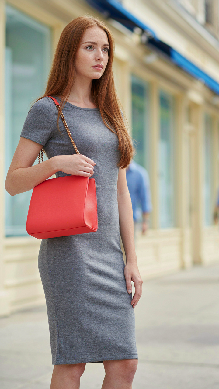
You’re reading this because you sense grey feels dead on you, and you want permission to fix it without looking wrong. The real mechanism is physics: color wavelengths travel at different speeds through air and hit your eye with measurable energy. Shorter wavelengths (blues, violets) compress space visually. Longer wavelengths (reds, oranges, yellows) expand it. Grey has no wavelength dominance, so it sits neutral until you introduce a color that does.
Think of grey as a conductor waiting for current. The Bauhaus movement understood this in the 1920s—they paired neutral backgrounds with high-saturation accents not for aesthetics but for visual contrast that creates perceived motion. When you wear grey with a saturated color nearby, that color’s wavelength doesn’t diffuse into the grey. It lands harder. Grey amplifies whatever energy you give it because it refuses to compete. The contrast is the mechanism, not the color itself.
Saturation Transfers The Actual Signal
Everyone says “pair grey with jewel tones” or “add a pop of color.” This is incomplete. The real variable is saturation level, not color name. A muted sage green next to grey reads as quiet. A saturated emerald green reads as kinetic because the human eye detects the chromatic intensity gap between the two surfaces. Your brain interprets that gap as movement or energy transfer.
Saturation works because it’s measurable: it’s the distance between a hue and grey on the color spectrum. The larger that distance, the more visual energy you perceive. A pale blush pink against grey creates minimal contrast. A hot coral against grey creates maximum signal. Your outfit’s visual weight depends on saturation distance, not on whether the color is “bold” or “trendy.” Choose your second color’s saturation level first, then the hue.
Monochromatic Mastery: The Grey Color Combo Of Subtle Power

Layering Shades For Actual Depth
You want monochromatic to work because it signals restraint and control, which you believe communicates status. The mechanism is simple: your brain perceives depth through contrast, not through the number of colors present. Grey with grey works only when you stack different values—light grey, medium grey, charcoal—forcing your eye to move through the layers instead of stopping flat at the surface.
The common advice here is wrong. People say monochromatic is “sophisticated” or “minimal.” That’s backwards. You’re not being minimal—you’re being strategic with one variable so contrast becomes the job of value alone. Wear a charcoal sweater over a heather grey shirt under a dove grey blazer and you’ve built visual architecture. Skip the value separation and you look like you got dressed in the dark.
Texture Replaces What Color Cannot
Design borrows from architecture: load-bearing walls versus decorative ones. In monochromatic grey dressing, texture becomes your load-bearing element—it does the work that hue contrast normally handles. Linen, wool, cotton knit, silk, suede each catch light differently. A grey wool coat and grey cotton tee read as two separate pieces because the material structure interrupts visual sameness, not because color does.
Texture as substitution works because your eye processes surface differently than pigment. Matte cotton against a satin grey blouse creates separation without needing color. A knit texture against smooth fabric does the same job. This is why monochromatic grey works at all—it forces you to master material combinations instead of hiding behind multiple colors. Stack your textures first, then check your values, then get dressed.
The Accent Architect: Strategic Placement Of Colors That Go With Grey

Constraint Creates Contrast
You want permission to wear color without looking chaotic. That’s the real question. Constraint is borrowed from graphic design, where negative space amplifies signal instead of diluting it. One strategic color placement beats scattered color everywhere. Grey absorbs visual noise, which means a single accent color gains authority instead of competing for attention.
The mechanism is simple: limit your accent to one zone. A burnt orange scarf against a grey sweater commands the eye. A navy shoe with a grey pant does the same. The brain reads focused color as intentional, not accidental. Diffuse color across multiple pieces reads as indecision.
Accessories Anchor The Narrative
What you hang on your body tells the real story. Scarves, belts, bags, and shoes aren’t decoration—they’re the only color variables that work without rebuilding your entire outfit. Grey clothes are the canvas. Accessories are the brush. A cognac leather belt functions as a color statement that grey alone cannot make.
Leather durability matters here because you’ll wear that belt across dozens of outfits. A cognac, burgundy, or deep taupe accessory becomes your color system. Rotate one or two quality pieces instead of chasing new colors constantly. The accessories stay consistent while the grey base adapts to seasons and contexts. This is how you build a coherent wardrobe instead of a pile of random combinations.
Beyond Black & White: The Underrated Grey Color Palette Combination

Deep Jewel Tones Elevate Grey
You want permission to wear color without looking like you’re trying too hard. That’s the real ask. The mechanism is contrast and saturation. Jewel tones work with grey because they operate on opposite ends of the intensity spectrum. Grey is desaturated and neutral. Sapphire, emerald, and burgundy are fully saturated and demand attention. This gap forces your eye to process them as intentional, not accidental.
The mistake most people make is pairing grey with muted versions of jewel tones, which defeats the purpose. Wear true jewel tones at full saturation. A charcoal grey blazer with a deep emerald shirt creates visual hierarchy because the emerald claims dominance. The grey becomes the supporting player, which is exactly what you want. This pairing works across all grey shades, from light to charcoal, because saturation is the variable doing the work.
Earthy Neutrals For Sophisticated Grounding
The conventional advice says to pair grey with beige and tan. That’s incomplete. Earthy neutrals anchor grey without competing for attention, but only when you use them with strategic intention. Taupe, olive, rust, and warm camel create a cohesive system because they share undertones with grey while maintaining their own identity. The key is matching undertone families, not just picking any brown.
Cool greys pair with olive and muted greens. Warm greys pair with rust, terracotta, and camel. Mix undertone families and the outfit feels broken, even if you can’t name why. Test this by laying out pieces side by side under natural light. If the grey and earthy neutral look like they belong in the same era and palette, the undertones align. If one looks cold and one looks warm, separate them. Move each piece into a different outfit.
The Seasonal Spectrum: Adapting What Colors Go With Gray Outfits

Warm Weather Brights And Pastels
You’re worried that grey looks boring in summer, so you reach for safe pastels instead of testing what actually works. Here’s the mechanism: warm seasons shift color perception through light intensity. More direct sunlight amplifies saturation and contrast. Pastels work in summer not because they’re trendy, but because low saturation reads cleaner under harsh UV. Grey stays neutral, so bright complementary colors—coral, lime, golden yellow—don’t compete with it. They anchor against it.
The mistake most people make is confusing pastels with pale versions of every color. Pale blue with grey reads washed out. Saturated turquoise with grey reads intentional. Summer’s light does the work for you. Pick colors with actual pigment. Soft doesn’t mean desaturated. A peachy tone or soft gold still carries warmth and presence. Grey becomes the canvas, not the focus.
Cool Weather Depths And Rich Tones
Winter light is diffused and flat, so color saturation matters less than depth. The physics principle here is luminosity contrast—objects need visual separation in low-light conditions. Deep burgundy, forest green, and charcoal brown don’t compete with grey. They anchor into it, creating dimension through tone rather than brightness. This is why winter wardrobes feel richer when paired with grey. The colors work harder because the sun works less.
Leather, wool, and dense fabrics compound this effect. Material texture replaces light as the contrast mechanism. A charcoal grey sweater with deep navy creates depth that a bright navy and light grey cannot match. The action step: in cool months, prioritize colors at least two shades darker than your grey piece. Measure against the fabric itself, not a swatch. This is how you build outfits that read as deliberate instead of safe.
What Colors Go With Gray Walls: Applying Principles Beyond Apparel
How Gray Changes A Room’s Actual Size
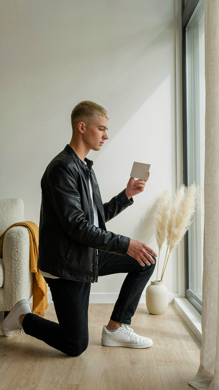
You want to know this because you’re afraid you’ll waste money painting a room that ends up feeling like a cave. The mechanism is simple: gray functions like a neutral value anchor in physics, where value refers to the lightness or darkness of a color. Light grays recede visually, making walls feel farther away and rooms larger. Dark grays advance, compressing perceived space. The undertone matters more than people admit. Cool grays with blue undertones feel clinical and distant. Warm grays with brown or taupe undertones feel grounded and contained.
The practical move is testing paint samples at three times of day in your actual room before committing. Morning light, afternoon light, and artificial lighting all shift gray’s appearance dramatically. A gray that looks sophisticated at noon can read dull or greenish at 6 PM. Spend two days observing the same swatch before rolling out a gallon. This isn’t perfectionism. It’s acknowledging that gray has no inherent personality until environment and lighting assign it one.
Furniture And Decor Anchor Color Intent
Gray walls need furniture or decor that states what the room actually is. Without anchors, gray reads as indecision. This principle comes from visual hierarchy in design, where anchors are the primary elements that organize subordinate elements around them. A room’s color story lives in what you place against gray, not in the gray itself. Wood furniture establishes warmth. Metal frames establish modernity. Textiles and art establish personality.
- Warm wood tones: Oak, walnut, or cedar furniture pairs naturally with warm grays, creating visual continuity without blandness. The grain adds texture that gray alone cannot provide.
- Deep jewel tones: Navy, emerald, or burgundy accents via upholstery or large decor pieces create contrast that makes gray feel intentional rather than default.
- Black metal frames: Shelving, lighting, or chair frames in matte black provide graphic definition against gray and anchor contemporary aesthetics clearly.
- Warm whites and creams: Bedding, curtains, or cabinetry in off-white or cream create subtle layering that prevents the room from flattening into one tone.
- Earth tones and terracotta: Accent furniture or pottery in rust, clay, or ochre grounds a space and signals intentional curation rather than decorator default.
The test is simple: stand in the room and identify what draws your eye first. If it’s the gray wall itself, you need stronger anchors. If your eye lands on furniture, textiles, or art, the color strategy is working. Gray succeeds only when it recedes and lets the room’s actual function and character come forward.
The Anti Trend: How To Make Grey Outfits Timeless, Not Trendy

Build Around Neutral Anchors, Not Seasonal Shifts
You’re worried that what you wear today will look dated in two years. That fear drives you to chase trends instead of building something stable. The mechanism is simple: trends move because the fashion industry needs to sell new inventory. Your job is to reject that cycle by anchoring your grey pieces to colors that survive trend death.
Navy, white, black, and cream are not trendy because they have no expiration date. They work with grey across different decades and contexts because they exist outside the trend timeline. Grey plus navy creates contrast without jarring the eye. Grey plus white reads as sophisticated minimalism. Grey plus black reads as intentional, not accidental. These combinations work because they rely on value contrast and saturation alignment, not on what Instagram decided last month.
Ignore The Algorithm, Commit To Repetition
The common advice says to refresh your palette seasonally and experiment with unexpected combinations. That’s wrong. Seasonal refreshes keep you trapped in novelty mode, buying new pieces constantly. The real move is to identify three to four color combinations that work with your grey pieces and repeat them until they become your signature.
When you wear the same grey and navy combination forty times, you stop thinking about whether it works. You build confidence in the outfit instead of confidence in the trend. Repetition also teaches you how those colors behave in different lighting, across different fabrics, and in different contexts. Pick your colors, buy pieces in those colors, and wear them until the combinations feel automatic. That’s when you’ve actually built a timeless wardrobe, not just another closet full of options.
Strategic Saturation: Maximizing Impact With Colors That Go Well With Gray

How Intensity Controls Where Eyes Land
You want people to notice you without looking like you’re trying. That’s the real problem here. Borrow a term from physics: contrast is how light behaves when it hits surfaces of different values. A bright color next to gray creates high contrast. A muted color next to gray creates low contrast. Your eye goes where contrast is highest. That’s not preference. That’s biology.
Gray is a neutral—it has no chromatic intensity of its own. This makes it a perfect stage for whatever you pair with it. Bright white, navy, or jewel tones pull attention immediately. Soft pastels or earth tones distribute attention evenly across your outfit. Choose high-saturation colors when you want a specific piece to dominate. Choose low-saturation colors when you want the gray itself to breathe and carry the visual weight.
Restraint Versus Declaration
The common advice says “add a pop of color.” That’s lazy. A pop implies randomness. Real strategy means deciding whether your outfit speaks or whispers, then choosing saturation that matches that intention. An overt statement uses pure, high-saturation colors: true red, cobalt, emerald. These demand attention. A whisper uses desaturated versions: dusty rose, slate blue, sage. Same hue family. Different message.
Gray absorbs whatever temperature you feed it. Warm grays pair with warm colors like rust, terracotta, or warm gold. Cool grays pair with cool colors like teal, plum, or silver. But temperature is secondary to saturation. You control whether people register your outfit as intentional or accidental through how much color you actually use. Black paired with gray reads as deliberate. Charcoal paired with gray reads as layered. The mechanism: saturation determines perceived intentionality, and perceived intentionality determines social reading.
The Real Obstacle Isn’t Color Theory; It’s Your Fear Of Standing Out

You already know what colors work with grey. The real problem? You’re scared to actually wear them. You hide behind “safe” combinations because boring feels invisible. But invisible people don’t get remembered. Pick one color from this article today. Wear it with grey tomorrow. Watch what happens when you stop playing small with your wardrobe. The world doesn’t reward people who dress like everyone else.