

The Unspoken Truth About What Colors Go With Burgundy

Why Generic Color Advice Fails You
You want to know what colors work with burgundy because you’re tired of outfits that feel off, and you think the answer is a simple list. The real mechanism is this: most advice treats color matching like a rulebook when it’s actually about contrast ratios and how your eye processes saturation levels against skin tone. Generic guidance ignores the actual variable that matters.
Mainstream sources peddle tired combinations without explaining why they work. They say “pair burgundy with navy” or “add gold accents” as if these rules apply to every body type and context. They don’t acknowledge that burgundy sits in a specific position on the color wheel, and what harmonizes with it depends entirely on whether you’re building warmth, creating visual tension, or neutralizing saturation. The mechanism they skip: value contrast and undertone alignment.
The Real Psychology Behind Bold Colors

Color choice operates on the same principle as signal theory in communication: what you wear broadcasts information before you speak. Burgundy is a compressed red, lower in brightness, so it reads as controlled authority rather than alarm. When you pair it with other colors, you’re either reinforcing that signal or contradicting it intentionally. Most people default to safe pairings because they haven’t mapped their own color intention.
The psychology isn’t about what feels pretty. It’s about what your nervous system reads as coherent. Burgundy with cream creates visual rest because both colors have muted intensity. Burgundy with charcoal creates hierarchy because one recedes while the other advances. Burgundy with rust creates tension because both fight for dominance in the warm spectrum. Your job is deciding which tension or harmony serves your actual goal, not copying what influencers post.

Burgundy Color Combinations Clothes: The Contrast Principle

Warm And Cool Undertones In Strategic Pairing
You’re really asking whether your outfit will read as intentional or accidental. The mechanism is simple: burgundy sits on the warm side of the color spectrum, so pairing it with cool undertones creates tension that reads as design rather than chance. Think of it like contrast in photography—the eye moves toward difference, not similarity.
Cream, ivory, and soft grays work because they carry cool undertones without competing for attention. Navy and forest green pair cleanly with burgundy because both share warmth but operate at different intensities. Blush pink creates visual interest by introducing a cool undertone while staying in the warm family. The rule: identify whether your second color leans warm or cool, then decide if you want harmony (same direction) or contrast (opposite direction). Most people default to harmony because it feels safer. That’s why contrast outfits stand out.
Intensity Levels Create The Visual Hierarchy
Saturation works like volume in design—muted burgundy next to a bright jewel tone looks chaotic; muted burgundy next to muted cream looks coherent. The principle comes from color theory in visual hierarchy: your eye follows intensity before anything else. When both colors shout equally, neither commands attention.
Pair deep, saturated burgundy with desaturated neutrals like taupe, beige, or greige to let the burgundy dominate. If you want a secondary color to hold its own, drop the burgundy saturation slightly and match it with an equally muted tone like dusty rose or soft olive. The mechanism is direct: control saturation levels first, then build around that decision. Skip this and you’ll have an outfit that feels off without knowing why.
Colors With Burgundy: Beyond The Obvious Neutrals

Stop Defaulting To Gray
You want permission to wear color without looking reckless. That’s the real reason you’re reading this. The mechanism is simple: your brain treats neutrals as safe because they’re invisible. Beige and gray don’t demand anything from you. But burgundy isn’t a neutral. It’s a statement that asks for company. The wrong company makes it scream. The right company makes it speak.
Pairing burgundy exclusively with beige or gray is the equivalent of wearing a tuxedo to a coffee shop. It overcompensates. It says you’re afraid of the color itself. Burgundy has enough density and warmth that it can handle texture, depth, and other colors without collapsing. The real skill isn’t finding colors that “go with” burgundy. It’s finding colors that pull weight equally, so burgundy isn’t the only thing working in the outfit.
The Chromatic Hierarchy That Actually Works
Think of color pairing like economics: every color has a value in the visual marketplace. Burgundy holds significant real estate because of its saturation and depth. When you add another saturated color next to it, one of two things happens. Either they compete and neither wins, or they establish a hierarchy where one dominates. Most people avoid this conflict entirely by defaulting to neutrals.
Charcoal works beside burgundy not because it’s “safe” but because it creates contrast without stealing focus. Forest green works because it operates in a similar temperature range and saturation level, creating rhythm instead of chaos. Rust and terracotta work for the same reason. The rule isn’t about safety. It’s about visual weight distribution. Start by choosing your second color based on saturation level, not tradition, then test it against burgundy in natural light before committing.
The Bordeaux Color Combination Playbook: Power Accents

Small Doses, Maximum Impact
You want permission to stand out without looking like you’re trying. That’s the real question here. The mechanism is contrast ratios: accessories work because they occupy minimal visual real estate while commanding attention through saturation or hue shift. Burgundy is already a statement color, so accessories don’t amplify it—they redirect focus. Gold, silver, deep emerald, or charcoal work because they don’t compete with burgundy’s density. They punctuate it instead.
A leather belt in cognac or black worn over a burgundy sweater creates visual hierarchy without chaos. A silk scarf in ivory or forest green tied at the neck breaks up the mass of color and prevents the outfit from reading as a single block. The rule: if your base is burgundy, keep accessories either much lighter, much darker, or in a completely different color family. Mixing burgundy with rust or terracotta fails because the saturation levels are too similar—your eye doesn’t know where to land.
Footwear And Outerwear As Statement
Shoes and coats aren’t accessories in the traditional sense. They’re foundational pieces that anchor or contrast the entire outfit. Black leather boots with burgundy almost always works because darkness grounds the richness of burgundy without stealing its authority. Camel or tan outerwear over burgundy creates a classic fall combination rooted in how natural fibers layer—the warmth of tan echoes the warmth of burgundy without matching it.
Burgundy outerwear paired with charcoal or navy underneath flips the dynamic entirely. The coat becomes the focal point, and the supporting layer recedes. When you reverse this with a burgundy base and a camel coat on top, you’re using the coat to soften rather than intensify. White or cream footwear with burgundy reads modern and intentional, not accidental. The decision moves from matching to contrasting, which signals deliberation to anyone looking.
Colors That Match Burgundy: The “Disruptive Palette” Method

Camouflage Versus High Visibility
You want to know which colors work with burgundy because you’re terrified of looking like you don’t know what you’re doing. Military strategy calls this tension “concealment versus detection,” and it maps directly onto your color choices. Burgundy is already a statement color—it doesn’t hide. The question isn’t whether to blend in, but whether your supporting colors amplify the signal or dilute it. Most people choose wrong because they default to safe instead of intentional.
Camouflage thinking says pair burgundy with muted earth tones: taupe, olive, charcoal, cream. This approach works when you want burgundy to read as refined and controlled. Cream, specifically, creates visual rest and lets burgundy own the space without competition. High-visibility thinking flips the logic. You pair burgundy with deep jewel tones like forest green, navy, or even mustard yellow. These combinations don’t blend. They create rhythm. Pick one approach and commit to it. Mixing both strategies in one outfit produces visual noise, not sophistication.
Intentional Clashing For Unforgettable Presence
The conventional wisdom says never clash. That’s incomplete advice that keeps you invisible. Clashing works when you understand the mechanism: colors from opposite sides of the color wheel create tension, but tension reads as confidence if the saturation levels match. Burgundy paired with teal or deep coral isn’t a mistake. It’s a deliberate choice that signals you didn’t assemble your outfit from a fear-based checklist.
The real constraint isn’t whether to clash. It’s whether the clash reads as intentional or accidental. Burgundy with soft pink looks like you grabbed whatever was clean. Burgundy with hot pink and sharp black accessories reads like a decision. The saturation, the proportion, and the secondary accent colors determine perception. When you introduce a third element—usually black or cream—you give the eye a landing point, which transforms chaos into composition. Your outfit should provoke a reaction, not a question.
Colours That Go With Wine Red: Texture As A Color

Velvet, Leather, Knit: Each Adds A Color
You’re worried that burgundy alone won’t read as intentional. You think the outfit needs more colors to work. The real problem is that you’re treating texture as invisible. Texture changes how light hits fabric, which changes how your brain processes the color itself. Velvet burgundy absorbs light differently than matte wool burgundy. This isn’t a minor detail. It’s the mechanism that separates a flat outfit from one with presence.
Leather next to burgundy shifts the visual weight toward luxury and structure. The surface tension changes the perception of the burgundy’s depth. Knit adds softness and casual ease, making burgundy feel wearable instead of formal. Each material creates a distinct visual story without introducing a new color. This is why texture-layering works when color-layering fails. You’re not fighting against the burgundy. You’re amplifying it through how light interacts with the fabrics around it.
How Varied Textures Amplify Visual Depth
Texture functions like contrast in design. The more varied your textures, the more dimensionality your outfit gains. A burgundy velvet blazer over a wool knit creates immediate depth because light behaves differently on each surface. The eye has something to track. Matte, shiny, rough, and smooth read as different visual weights even when the colors stay similar. This is why monochromatic outfits with texture variation outperform multi-colored outfits with flat materials.
The protocol is simple. Pick your burgundy piece. Identify its texture. Then add at least one contrasting texture in a neutral or analogous tone. Leather with knit. Velvet with linen. Suede with cotton. The textures do the visual work. Burgundy stays the anchor. Your eye processes the outfit as complex and intentional because the surfaces themselves create movement and shadow. This approach eliminates the need to force unrelated colors into the composition.
What To Wear With Burgundy: The “Investment Piece” Strategy

Build Core Burgundy Pieces For Rotation
You want to feel like you have your life together without actually buying new clothes every season. The mechanism is simple: a burgundy investment piece works like a financial portfolio in fashion. You’re buying something that compounds in value the more you wear it. A burgundy wool blazer or structured coat becomes the anchor. Everything else rotates around it. Cream, navy, black, gray, and white are the currencies that make it liquid. You’re not chasing trends. You’re building a system.
The math works against buying multiple burgundy items at once. One quality piece worn two hundred times beats five mediocre pieces worn thirty times each. Burgundy’s saturation is high enough that it commands respect on its own. Pair it with neutral bottoms and tops. The piece does the work. When you buy the second burgundy item, it should solve a different problem: a sweater for layering indoors, a scarf for texture, a dress for events. Each serves a function that the first piece doesn’t. This is how you avoid owning a closet that looks like a wine spill.
Fabric Quality Determines Staying Power
The common advice says “buy basics and add color.” That’s backward. Buy quality in color, basics in quantity. A burgundy piece in cheap fabric fades, pills, and loses shape by spring. A burgundy piece in merino wool, silk blend, or structured cotton holds its color and form for years. The investment isn’t the price tag. It’s the wear-per-wash ratio. You wear quality pieces more because they look good. Worn pieces get photographed, styled, and worn again. Cheap pieces get hidden.
Pair a high-quality burgundy knit with basics in natural fibers. Cream linen, ivory cotton, charcoal wool. The burgundy carries the visual weight while the basics fade into a support structure. This combination works in September and November. Texture matters more than newness. When your burgundy piece has density and body, it doesn’t need backup colors or patterns. It doesn’t need rescue. A single quality burgundy blazer worn with black pants and a white shirt solves more outfit problems than ten burgundy basics in synthetic blends ever will.
Burgundy Color Outfits: The 3 Layer Visual Hierarchy
The Foundation, Bridge, And Stop
You want to know this because a chaotic outfit makes you look indecisive, and indecision reads as low status. The mechanism is borrowed from graphic design’s contrast hierarchy: every outfit needs a dominant layer that holds attention, a transitional layer that creates coherence, and an accent layer that prevents monotony. Burgundy works as any of these, but most people misuse it by treating every piece equally, which collapses the hierarchy entirely.
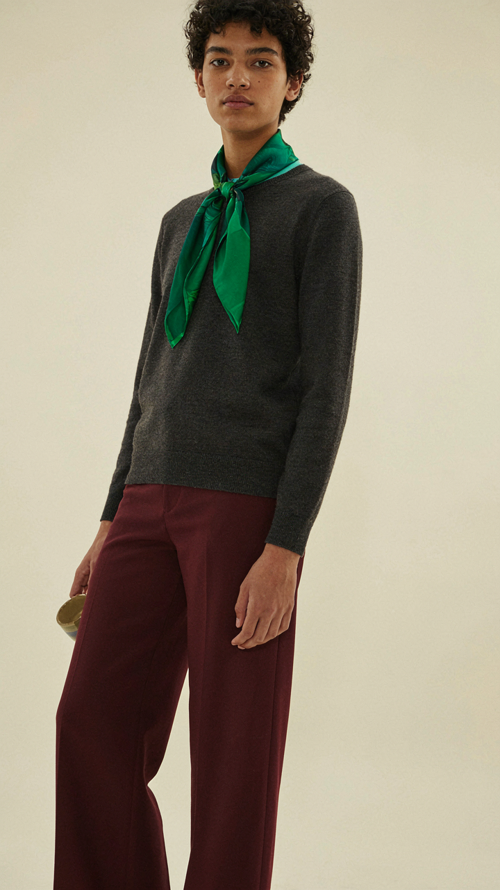
The foundational layer is your largest surface area, usually pants or a skirt. This anchors the outfit and determines what the eye processes first. If burgundy is your foundation, neutral bridges like cream, grey, or taupe prevent visual chaos. If burgundy sits in the transitional layer (a sweater or blazer), it connects your foundation to your accent. The accent layer is your smallest piece: a scarf, shoes, or jewelry that creates the final punctuation mark.
Building Visual Flow Without Confusion
Visual flow means the eye moves through your outfit in a logical sequence, not bouncing randomly. Think of it like typography hierarchy: the largest element dominates, medium elements support, and small elements add refinement. With burgundy as your dominant piece, pair it with one supporting neutral and one complementary accent. Too many competing colors fragment attention and make the outfit feel scattered.
The practical move is this: choose your burgundy piece, identify its size relative to the outfit, then assign roles to the remaining two pieces. If burgundy is your jacket, your base stays neutral and your accent is restrained. If burgundy is your pants, your top can handle more color because the lower half anchors stability. Test this by photographing the outfit in natural light before wearing it. If your eye doesn’t have a clear path through the colors, neither will anyone else.
Colors That Go With Burgundy Outfits: The Unconventional Power Plays

The Real Cost Of Playing It Safe
You’re scared of clashing. That’s the real reason you’re looking for permission to pair burgundy with navy or camel. The mechanism is simple: most people mistake “matching” for “working.” They confuse harmony with invisibility. Traditional color rules exist because they’re safe, not because they’re the only way to build a compelling outfit. Burgundy doesn’t need babying. It needs opposition.
The fashion industry sells matching as sophistication when it’s actually fear dressed up as taste. Burgundy is a statement color—dark, warm, assertive. Pairing it with another safe neutral just neutralizes the whole outfit. You get a silhouette nobody remembers. The rule everyone follows is that burgundy goes with cream, grey, or taupe because those colors don’t threaten anyone. That’s exactly why you should break it.
Combinations That Stop People In Their Tracks
Burgundy operates like contrast in design theory—the visual principle that makes elements pop through difference, not similarity. The strongest outfits don’t whisper. They announce.
- Burgundy and deep forest green: Both are jewel tones. The cool undertones in forest green create tension against burgundy’s warmth, making both colors appear richer and more intentional than if worn separately.
- Burgundy and burnt orange: A monochromatic heat play. Burnt orange shares burgundy’s warmth but sits on the opposite end of the color wheel’s red spectrum, creating visual depth without clashing.
- Burgundy and mustard yellow: High contrast. Mustard’s golden undertones complement burgundy’s depth while the brightness stops the outfit from feeling heavy, ideal for transitional fall pieces.
- Burgundy and black: Maximum drama. Black isn’t neutral here—it’s a deliberate anchor that lets burgundy dominate without apology, creating clean visual hierarchy in any garment combination.
- Burgundy and cream or ivory: The only “safe” option worth mentioning because it works through clarity, not timidity. The brightness of cream makes burgundy appear more saturated and intentional than grey or beige ever could.
The execution matters more than the pairing itself. Burgundy with forest green reads different depending on whether green is your dominant piece or an accent. If green dominates and burgundy appears in a scarf or shoes, you’ve created visual tension. If burgundy dominates with green accents, you’ve created sophistication through restraint. Test the proportion before committing the full outfit.
Your Fear Isn’t Mispairing Burgundy; It’s The Quiet Dread Of Being Forgettable

You don’t actually care if burgundy works with cream or camel. You care that people notice you exist. The color combinations we discussed work because they signal intention. They say you made a choice. Pick one pairing today and wear it without second-guessing yourself for a full week. Confidence moves faster than any color theory ever will. People remember how you carried yourself, not whether your palette was technically correct.