

The Subtlety Of Coordinated: Not Matching Outfits Family

Why Direct Matching Screams Amateur Hour
You want people to think you planned this without looking like you spent three hours planning it. That’s the real fear underneath the question. The mechanism is simple: identical outfits trigger recognition as a deliberate choice, which signals effort, which reads as trying. Your brain registers it as staged rather than intentional. Matching sets your family apart as a unit in a way that feels forced to the viewer, even if the photo looks polished.
The fashion industry abandoned uniformity decades ago. High-end family portraits coordinate through color palette and fabric weight, not duplication. When everyone wears the same thing, you create visual monotony. The eye has nowhere to land except the composition itself, which removes personality from the image. Matching also dates photos faster because trends shift, and a coordinated approach using neutral anchors survives five years in your photo album.
The Spectrum Of Visual Unity From Identical To Complementary

Think of this like resonance in physics. Identical outfits are locked in perfect sync, but perfect sync creates dead space. Complementary colors and tonal ranges create tension and movement without conflict. The spectrum runs from one anchor color worn by all, to analogous colors in the same temperature, to intentional contrast between warm and cool tones that still feel unified through fabric choice and silhouette.
Most advice stops at “wear neutral colors” and calls it done. That’s incomplete. Visual unity actually comes from three mechanisms working together: repeating one design element across all outfits, keeping skin tone and hair into account as part of the palette, and using similar sleeve length or formality level to signal you’re a cohesive group. The protocol is this: pick one constraint (color, formality, or texture), apply it across everyone, then let individual style vary within that frame.

Color Theory For The Cynic: Beyond The Color Wheel

The Three Layer System
You want permission to stop overthinking this. Here’s the mechanism: your brain processes outfit harmony through dominance hierarchy, not aesthetic rules. The real work happens when you establish which color controls the visual weight, which one supports it, and which one disappears into the background. This is dominance in action. One color takes up roughly 60 percent of the combined outfit space, one takes 30 percent, and the remaining 10 percent acts as a circuit breaker between them.
The 60-30-10 ratio isn’t arbitrary. It comes from how human vision processes competing signals. Your eye lands on the dominant color first, then finds the accent, then uses the neutral to reset before cycling back. In family photos, the dominant color is typically the largest piece of clothing worn by the most central person. The accent supports without competing. The neutral prevents visual fatigue by giving the eye a place to rest. Build your palette around these three positions, not around matching or clashing.
When Harmony Becomes A Trap
Most advice says “choose colors that go together.” That’s incomplete. The real problem is accidental color repetition that creates confusion instead of coordination. If two people wear colors from the same family at different saturation levels, your eye can’t decide which is primary, and the photo reads as disorganized. Forced harmony through analogous colors or pastel sameness produces the opposite problem: blandness that reads as no decision at all.
The fix is intentional contrast within control. Pick your dominant color with zero compromise. Pick your accent by choosing something genuinely different from the dominant color’s temperature or value. Use saturated colors strategically instead of muting everything down. Neutral tones like charcoal, cream, or soft gray exist to separate competing signals, not to soften every choice. Photograph a test frame on your phone before the session. If you squint and can still distinguish each person’s outfit region, your palette works.
Texture As The Silent Narrator For Family Photoshoot Outfit Ideas

Tactile Variations Add Depth Without Shouting
You want people to see your family as intentional and put-together without looking like you tried too hard, which is really just fear of appearing desperate. The mechanism is contrast through material opposition. Photography captures light and shadow, but texture is what your eye reads as dimensional even in a flat image. Cotton reads flat. Linen reads structured. Corduroy reads substantial. Velvet reads soft. When you layer different textures across family members, the camera separates each person visually even when your color palette stays tight.
The mistake people make is thinking texture variation only works with contrasting colors. Wrong. A cream linen shirt next to a cream cotton sweater next to cream cable knit creates visual hierarchy through surface alone. Your eye travels across the frame because it’s following texture, not color. This is why monochromatic family photos with varied textures often outperform colorful ones with flat fabrics. The texture does the work your brain expects color to do.
Layering For Visual Interest And Dynamic Composition
Layering isn’t about adding more clothes to look fancy. It’s borrowed from architecture, where depth perception comes from foreground, middle ground, and background elements. In family photos, layering creates that same spatial separation on a flat plane. A grandmother in a textured blazer over a smooth base creates more visual interest than a grandmother in just a blazer. The eye registers two distinct materials occupying the same space, which reads as complexity and intentionality.
The protocol: assign each person a base layer, a middle layer, and optionally a top layer. Base layers should be smooth (cotton tee, silk camisole, fitted turtleneck). Middle layers should have more structure or texture (cardigans, overshirts, structured jackets). Top layers should create a frame (open blazer, denim jacket, linen overshirt). When you layer consistently across the family with texture variety, the photo reads as composed, not coincidental. Photograph the family with jackets first, then remove one layer and shoot again. You now have two distinct compositions from one outfit plan.
The Unspoken Language Of Style: Family Outfit Archetypes

Define Your Family’s Visual Signature
You want the photo to signal something about who you are. That fear drives most people to copy what they see online, which defeats the actual purpose. Your family’s visual identity isn’t about matching or even coordinating in the traditional sense. It’s about establishing a recognizable visual language that works across different body types, ages, and personalities without looking forced or costumey.
Think of this as branding from design thinking: you’re establishing visual consistency through constraint, not uniformity. The constraint becomes your repeatable anchor. One family uses neutral earth tones as their foundation. Another commits to a specific decade’s silhouette. A third builds around a single textile or pattern family. The mechanism isn’t style expertise. It’s decision limitation that creates coherence by default.
Escape The Trend Graveyard
The generic advice says coordinate colors and call it done. That’s incomplete. Trends in family photography cycle every eighteen to twenty-four months. Matching denim, the flannel shirt look, the neutrals-and-denim combo, the muted jewel tones. Each one dates your photos the moment it peaks. You’re building something that reads the same way in five years, not something that screams 2024.
Timeless appeal comes from picking elements that predate current social media cycles and operate independently of them. Classic menswear silhouettes work because they’ve worked for generations. Quality fabrics and proper fit matter more than what color is trending. Avoid logo visibility, graphics with expiration dates, and anything designed to look “aesthetic.” The protocol: choose three color families your family defaults to anyway, then build outfits inside that system for this shoot and every shoot after.
Fall Family Photo Outfits: Leveraging Seasonal Palettes

Warm Earth Tones Versus Stark Contrasts
You want fall photos to look intentional, not like you grabbed whatever was clean. The real mechanism here is visual hierarchy through temperature. Warm earth tones create cohesion because they share the same color temperature, even when the specific hues differ. Your brain registers them as a unified group. Stark contrasts work the opposite way: they demand attention to each individual piece instead of the family unit as a whole.
Warm palettes win for family photos because they compress visual noise. Rust, caramel, olive, terracotta, and deep gold sit on the same spectrum. Layer these and the eye moves through the frame as one story, not five competing focal points. Stark contrasts like black next to cream or navy next to white create visual breaks that fragment the composition. Save those for individual portraits where you want someone to stand alone.
Natural Elements Into Wardrobe
This isn’t about literal leaves and twigs. Think of clothing layers like botanical structure: base plants, mid-story plants, canopy. A linen base is your foundation layer. A flannel shirt or knit overlay becomes your mid-range depth. A jacket or sweater completes the canopy. Texture variation within the warm palette tricks the camera into reading dimension without creating visual chaos.
Natural fibers photograph better in fall because they interact with light like leaves do: they diffuse and absorb rather than bounce harshly. Cotton, linen, and wool create matte surfaces that fall light loves. Avoid high-shine synthetic fabrics that flatten under autumn sun. Incorporate cable knits, waffle weaves, and corduroy textures deliberately. These materials already belong to the season, so they don’t read as costume choices. Stick to one primary texture per person to avoid looking patchwork.
The Chaos Theory Of Accessories: Micro Variations, Macro Impact
When One Person Changes Everything
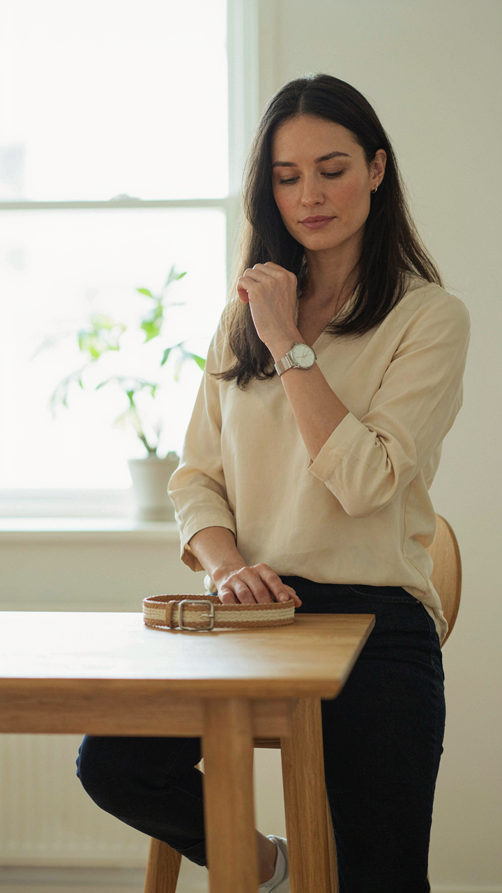
You care about this section because you’re terrified of looking like you tried too hard. Cybernetics calls this a feedback loop: each person’s accessory choice triggers a response in the next person’s choice, creating either harmony or visual noise. In family photos, one person wearing a bold watch or statement necklace doesn’t ruin the image. It anchors it. The mechanism works because your eye needs a reference point. Without variation, coordinated outfits flatten into corporate uniformity. With it, they read as intentional.
Small deviations in metal finishes, textures, or jewelry scale create the loop that keeps photos dynamic instead of sterile. When one family member wears gold jewelry while another chooses silver, that contrast makes both choices visible. Your brain registers the difference as sophistication, not chaos. The common advice says to match everything. That’s wrong. Matching creates visual drag. Coordinating with intentional micro-variations creates visual tension that reads as polish.
The Texture Escalation Protocol
Most people add texture randomly and wonder why photos still look flat. Texture works the opposite way you think: one person should introduce it deliberately, then others respond with their own texture in different materials. A linen shirt on one family member invites someone else to wear a knit or corduroy. Not everyone in linen. Not everyone in cotton. The cascade creates depth because your eye moves through the image tracking surface variation, not color alone.
The protocol is straightforward: decide who introduces the first textural element, then have each subsequent person choose a different material in the same color family. One person wears matte cotton, the next adds a woven belt, the next introduces a brushed metal accessory. Accessories compound the effect because they’re small enough to control but visible enough to register. Execute this deliberately during outfit selection, not by accident on photo day.
Casual Family Photoshoot Outfits: Effortless Vs. Careless

The Tension Between Relaxed And Disheveled
You want the photo to say you don’t try too hard, which is really about proving you have enough status that you don’t need to. The mechanism is simple: casual fails when fabric loses structure or color loses intention. Wrinkles, pilling, or faded prints read as neglect, not ease. The difference between effortless and careless is a single decision per garment—does this piece hold its shape and color, or does it collapse under its own weight?
Cotton blends outperform pure cotton in family photos because they retain form through the shoot. Linen wrinkles by design, which works if wrinkles are uniform and intentional. A faded tee reads careless. A tee in a current neutral read as deliberate. Casual outfits fail when you treat them like a permission slip to lower standards. They require more editing precision, not less.
Comfort That Holds Its Own Against The Camera
Sophistication in casual wear isn’t about layers or patterns. It’s about fit that doesn’t shift when you sit or move. When fabric pulls, puckers, or sags during the shoot, the camera documents every adjustment. Fit matters more in casual outfits than formal ones because formal clothes already signal intentionality. Casual clothes have to earn it through proportion alone.
A well-fitted henley in navy reads composed. The same henley oversized reads like you grabbed it from the floor. Choose pieces that skim the body without clinging. Avoid anything loose enough to bunch when seated. Finish each casual look with one anchoring piece—a belt, a structured cardigan, or fitted denim—that prevents the entire outfit from reading as accident. This single anchor point shifts the entire visual perception from thrown-together to considered.
Posing Beyond Outfits: Composing The Family Story

How Bodies Anchor Coordinated Clothes
You want posing to make your outfits look intentional instead of accidental. Here’s the mechanism: posing is leverage applied to fabric. The way bodies arrange themselves in space either compresses or stretches the visual weight of what you’re wearing, which either amplifies or dilutes the coordination you built. Bad posing makes coordinated outfits look scattered. Good posing frames them as a unified composition.
Depth positioning matters more than pose variety. Place people at staggered distances from the camera rather than all on one plane. Closer subjects naturally appear larger and anchor the frame, while those further back layer into negative space. This spatial arrangement lets coordinated colors and neutrals create rhythm instead of just sitting flat. The outfit coordination becomes part of a three-dimensional story rather than a two-dimensional lineup.
Interaction And Emotion Make Outfits Coherent
Connection is the visual glue that ties coordinated outfits into one moment instead of four separate people wearing clothes. Most advice tells you to smile and look at the camera. That’s incomplete. Real coherence comes from genuine interaction between family members. When people engage with each other rather than the lens, their bodies naturally orient toward each other, their postures relax into authentic shapes, and the clothing moves with purpose instead of hanging static.
- Parent-child physical contact: Hands on shoulders or linked arms create natural grouping that makes outfit coordination feel intentional rather than forced or styled.
- Sibling proximity and gaze: Positioning siblings close enough to see each other, even mid-laugh or conversation, activates the frame and prevents the “everyone scattered” look.
- Multi-generational layering: Grandparents positioned slightly elevated or centered while others face inward creates hierarchy that outfit coordination can then emphasize through color placement.
- Genuine reaction timing: Capture moments right after someone says something funny rather than asking people to hold a smile. Movement carries coordinated clothes forward visually.
- Hand placement and gesture: Hands in pockets, on laps, or mid-gesture reveal fabric movement and color distribution that static poses hide, making coordination readable.
When family members focus on each other instead of the camera, their energy becomes the actual subject. The outfits stop competing for attention and start supporting the narrative. The photographer’s job then shifts to timing the peak moment of genuine connection, not directing artificial poses. That single discipline transforms coordinated family photo outfits from “we planned this” into “this is who we are together.”
Family Holiday Outfit Ideas: Ditching The Clichés

Beyond Red And Green
You want to look intentional, not like you followed a Pinterest board from 2015. The real mechanism at work here is color psychology borrowed from graphic design: saturation and temperature control the emotional weight of an image. High saturation red and green flatten family photos because they compete for attention instead of anchoring the frame. The solution isn’t finding better reds. It’s abandoning the palette entirely.
Jewel tones work because they hold visual weight without screaming. Emerald, sapphire, and burgundy read as sophisticated because they reflect light differently than primary colors. Pair one jewel tone across family members rather than matching it identically. Add neutrals like cream, charcoal, or warm gray to ground the composition. This approach works across skin tones and age ranges because you’re using value contrast, not color matching. The photo stays cohesive without looking coordinated by accident.
Cultural Context Changes The Rules
Holiday outfit advice ignores the fact that different traditions carry different visual codes, and wearing someone else’s code without understanding it reads as costume, not respect. Lunar New Year red carries specific meaning tied to luck and prosperity. Kwanzaa emphasizes black, red, and green with intentional symbolism. Diwali invites jewel tones and metallics tied to celebration and light. Christmas in some cultures emphasizes white or gold, not red. The mechanism is semantic: color means something to your family’s tradition, and that meaning shapes what works in the photo.
Research your specific tradition’s context before defaulting to American holiday clichés. If your family observes multiple holidays, choose one tradition’s palette and commit to it for that photo session. Integrate cultural dress pieces like specific fabrics, draping styles, or jewelry that hold meaning rather than treating them as accessories. The photo becomes documentation of identity, not a generic holiday card. This precision beats forced coordination every time.
The Real Obstacle Isn’t Finding Outfits; It’s Your Fear Of Authentic Expression In A Curated World

You’re not stuck because coordinating colors is hard. You’re stuck because you’re performing someone else’s version of “family.” Stop asking what looks good and start asking what feels true. Your kids won’t remember the outfit. They’ll remember if you looked like yourself. Pick one piece today that actually reflects you, not Instagram. Build from there. A family photo where everyone breathes easy beats a perfect aesthetic every time.