
The Story First Protocol: Your Outfits As Narrative Tools
What Your Relationship Actually Is
You want your photos to look effortless and connected because you’re afraid they’ll expose the gap between how you see yourselves and how you actually function together. That fear is the entry point. The mechanism is narrative constraint: every coordinated couple outfit works because it tells one specific story about your dynamic, not because colors match or fabrics blend. Without a story, coordination looks like accident. With one, it looks intentional.
Think of narrative as the skeleton in biology. The skeleton doesn’t make the body beautiful, but without it, everything collapses into formlessness. Your outfit narrative does the same work. It’s the invisible structure that makes fabric, color, and styling decisions cohere instead of compete. Most couples pick outfits by surface rules (complementary colors, similar silhouettes) and wonder why the photos still feel disconnected. They’re building the body without the skeleton. Define the story first. Everything else hangs on it.
Visual Language Built From Your Dynamic

The common advice says to match energy levels or pick a theme. That’s incomplete. You need to translate your actual relationship mechanics into visual form. If one of you leads decisions and the other supports, that’s not something to hide—it’s material. A grounded partner in structured neutrals next to an experimental partner in texture and pattern tells that story honestly. The photos work because they’re true, not because someone aestheticized a false version of togetherness.
Start by asking what role each of you plays in the relationship’s momentum. Who initiates? Who stabilizes? Who takes risks? Who creates boundaries? Then assign visual weight to those functions. The person who creates structure wears it—tailored cuts, defined silhouettes, minimal pattern. The person who brings fluidity wears it—relaxed fits, layering, mixed textures or tones. When you shoot together, the contrast reads as harmony instead of mismatch because it maps to something real about how you operate.

Deconstructing “Coordinated”: It’s Not About Matching
Theme Over Palette
You want to look intentional without looking like you planned this together for three hours. Here’s the mechanism: your brain reads coherence through narrative, not through matching hex codes. Two people wearing unrelated colors still read as a unit when they share a visual story—era, formality level, texture weight, or vibe.
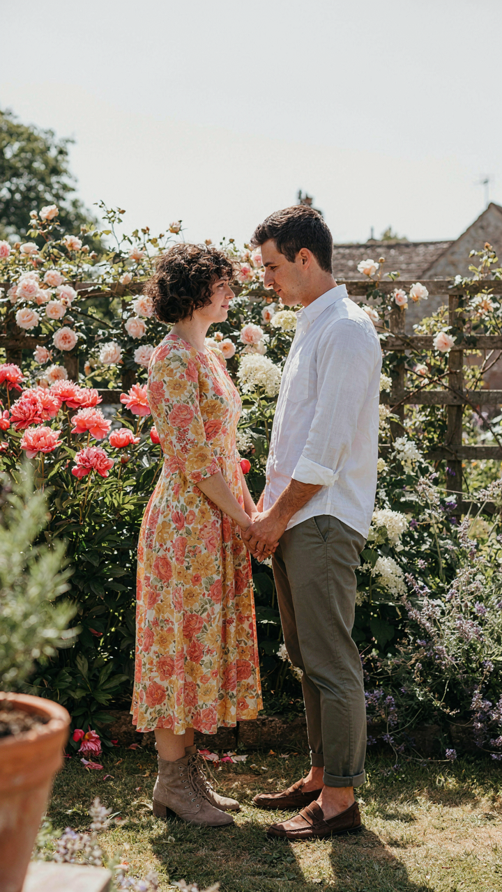
The mistake everyone makes is treating coordination as a color problem. It isn’t. A linen shirt and tailored trousers communicate the same era as a vintage dress and suede boots, even if one outfit is cream and the other is rust. The moment you lock onto a theme—preppy, workwear, vintage, minimalist—the color palette becomes secondary. Your outfits align because they’re speaking the same language.
Contrast As Composition
Contrast in photography comes from design, not accident. One person slightly more formal, one slightly less. One in warm tones, one in cool. One textured, one smooth. This isn’t about balance in an abstract sense—it’s about giving the camera something to read.
When both partners dress identically formal or identically casual, the image flattens. The eye has nowhere to move. Strategic difference—a blazer paired with rolled sleeves, structured fabric against fluid fabric—creates visual depth and makes both people sharper in the frame. The protocol: one person leads in formality or texture, the other complements without competing.
The Unseen Influencers: Environment And Mood Mapping

Location Sets The Outfit’s Constraints
You care about this because you don’t want to show up wrong. A location isn’t just a backdrop—it’s a set of hard requirements that determine what fabrics, colors, and silhouettes will actually read on camera. Architectural environments function like a visual container in design theory: they establish the perimeter within which your outfit either harmonizes or clashes. Ignore the location’s implicit code and your coordination vanishes the moment the photos render.
Urban settings demand different fabric weights than forests. Concrete reflects light harshly and flattens soft textures, so structured pieces in jewel tones or neutrals photograph cleanly. Natural settings absorb light and reward organic fabrics—linen, cotton, suede—that show dimension. The location determines color saturation too. A beach location bleaches out pastels but punches up deep jewel tones. You assess the shoot location first, then build outfits around what that environment will do to fabric, fit, and pigment.
Emotional Tone Determines Outfit Language
The common advice is to just “pick a vibe.” That’s lazy. Your outfits must signal a specific emotional register through silhouette and formality level, not vibes. A playful shoot demands fitted pieces and movement in fabric—think tailored jeans and tucked tops that let your body move in frame. A romantic shoot requires drape and softness—loose linen, flowing fabrics that suggest intimacy rather than energy.
Match your outfit’s formality and construction to the feeling you’re selling. Structured blazers read authoritative and modern. Oversized knits read intimate and vulnerable. Matching silhouettes—both in tailored cuts or both in relaxed drape—creates visual cohesion that the camera recognizes as intentional coordination. Before you pick pieces, write down the single word that describes the shoot’s mood, then map every fabric choice to that word’s physical language.
The Fall Engagement Session Outfits Myth: Seasonality As A Prop

When Seasonal Cues Actually Work
You want fall colors because you think they signal taste and intention. What actually happens: seasonal clothing becomes visual noise when everyone else in your city shoots the same session in the same three weeks. The real mechanism comes from design thinking. In design, contrast is signal. In couple photoshoots, seasonal elements work only when they create intentional friction with your outfit choice, not when they blend into the expected backdrop.
Fall photoshoots fail because people treat the season as permission to wear what they already own. A burnt orange sweater against burnt orange foliage reads as camouflage, not coordination. The photographer’s eye finds nothing to lock onto. Your outfits need to push against the environment, not dissolve into it. This is why restraint matters more than theme adherence during peak season shooting.
Move Against The Aesthetic, Not With It
Everyone says wear warm tones in fall. That’s incomplete advice dressed up as strategy. Warm tones work only when they contrast the scene. If your location is a golden field or red barn, warm neutrals bury your couple. Cool tones, muted jewel tones, or even stark black create separation where the eye actually travels. The outfit becomes the frame, not part of the frame.
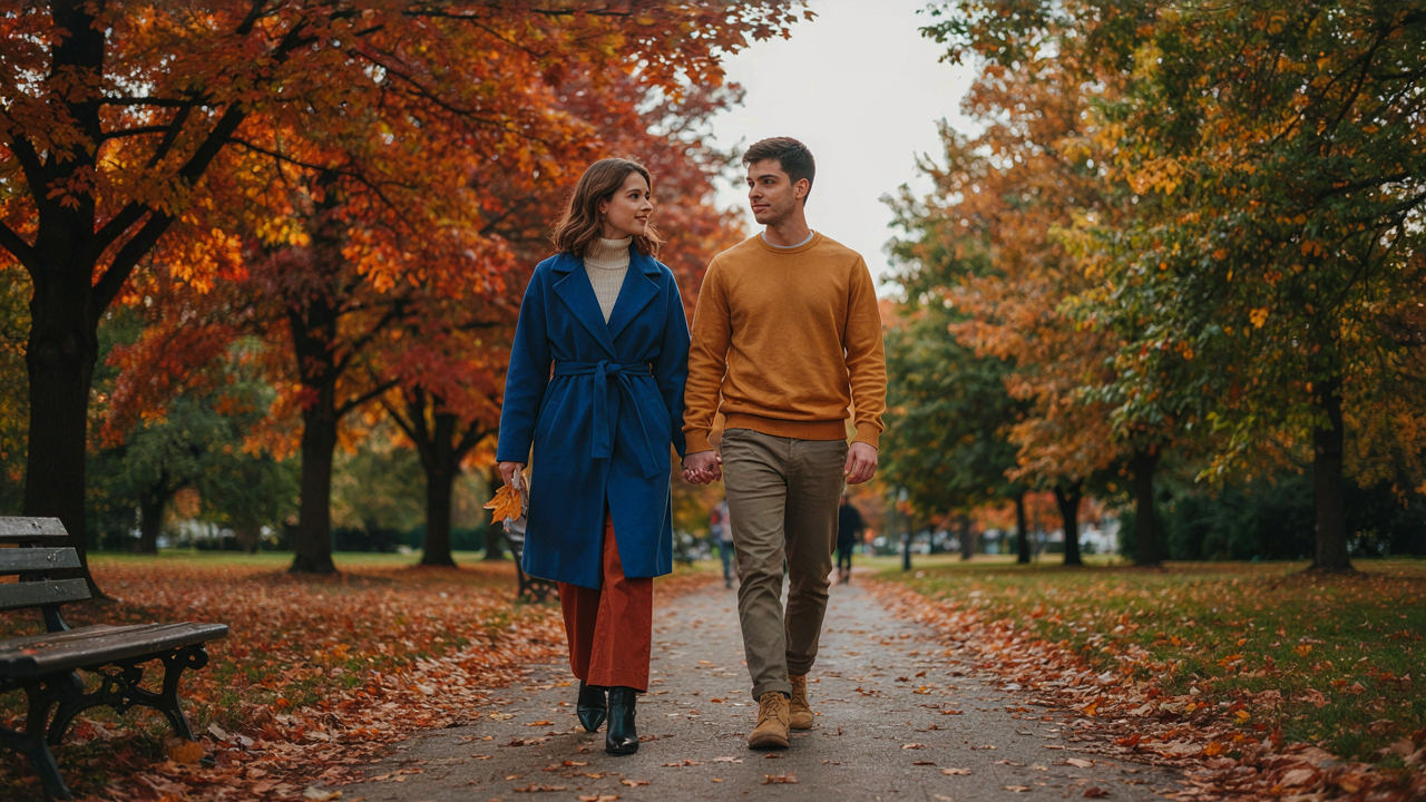
Genuine impact in seasonal shoots comes from denying the obvious choice. Wear cream or deep charcoal when surrounded by amber trees. Wear structured, tailored pieces when the season begs for texture. When you photograph, ask what the season already provides, then coordinate outfits that work against that, not with it. That’s when couples read as intentional instead of thematic.
The Authenticity Algorithm: Dressing For Yourselves, Not The Camera
Wear What You Actually Own
You’re worried the photos won’t look “couple-y” enough, so you think buying matching sets will solve it. It won’t. The mechanism is simple: tension shows in your body language when you’re wearing something unfamiliar. Cameras capture that instantly. Wear pieces you already reach for on regular days. Your comfort level determines how natural you look, and natural is what reads as coordinated in photos. Forced matching looks exactly like what it is.
When you wear familiar garments, your posture relaxes. You move without thinking about the fit or feel. This freedom translates into genuine expressions and unguarded moments. The photographer captures who you actually are, not who you’re pretending to be for two hours. Coordination comes from shared style values, not identical items. Choose garments that reflect how each of you naturally dress.
Movement Creates Connection, Not Stillness
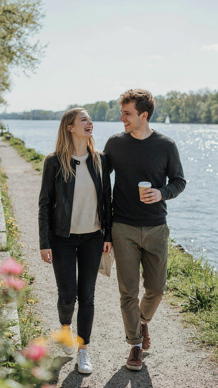
The common advice says to pose together and hold it. That’s backward. Think of choreography: movement is the constraint that forces precision. In dance, dancers synchronize through motion, not through freezing in frame. The same applies to couple photos. When you move naturally—walking, adjusting each other’s hair, laughing mid-conversation—the photographer catches genuine interaction. Stillness reveals awkwardness. Motion hides it and builds real rapport in real time.
Your clothes need to allow full range of motion without distraction. Tight fabrics, restrictive cuts, or unfamiliar silhouettes pull focus inward. You start thinking about your body instead of your partner. Prioritize garments with enough give to sit, turn, walk, and lean without constraint. The photographer works around your natural movement rather than forcing you into rigid poses. This is how couples actually look coordinated: they move together because they’re comfortable, not because they matched their sweaters.
The Signal To Noise Ratio: Minimizing Distraction, Maximizing Impact
Eliminate Visual Clutter First
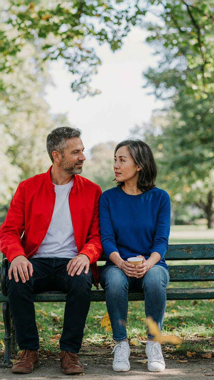
You want the photo to prove something about you both. That’s the real reason you care about this. Here’s the mechanism: cybernetics teaches us that every system has signal and noise. In couple photoshoots, signal is the two of you. Noise is everything else competing for the viewer’s eye. Busy patterns, conflicting colors, visible logos, dangling accessories, wrinkled fabric, and unfitted garments all degrade signal strength. Remove them systematically before you shoot.
The common advice says “dress nicely together.” That’s incomplete. You need negative space in your outfit choices. Solid colors, clean lines, and fitted silhouettes reduce cognitive load on the viewer. Your brain processes the couple faster when there’s less visual information to decode. Wear fabrics that don’t demand attention. Avoid large graphic prints, multiple competing patterns, or high-contrast color blocking that pulls focus away from your faces and connection.
Anchor One Central Message Only
Every outfit choice broadcasts something. The mechanism here is attention economy. You have limited bandwidth to communicate in a static image. Most couples broadcast three things at once: their style, their personalities, their relationship status. That’s noise layered on noise. Pick one message and build around it.
If you’re going for “polished and intentional,” every piece supports that. Coordinated neutrals, premium fabrics, tailored fit. If you’re going for “relaxed and genuine,” everything aligns with that too. Worn denim, simple tees, natural textures. The couples whose photos stop scrollers aren’t the ones saying everything. They’re the ones who communicate one thing so clearly that it becomes undeniable. Build your outfit architecture around a single focal point, then strip everything else away.
Couples Fall Outfits: Beyond The Flannel & Pumpkin Spice

Texture Layering Over Color Matching
You’re worried matching outfits will make you look like you’re trying too hard. The real mechanism is contrast. In materials science, tactile differentiation creates visual interest without relying on identical pieces. Knit against linen against leather reads as intentional coordination, not costume. Fall fabrics work because they already pile up naturally: corduroy, wool, canvas, suede. Use this to your advantage instead of fighting it with flat basics.
The mistake most couples make is assuming “coordinated” means “same colors.” It doesn’t. A charcoal sweater knit with a cream cable texture next to rust corduroy pants creates cohesion through material interplay, not palette replication. The photographer captures dimension. Your eye travels. This is why couples who dress this way photograph sharper than couples in matching cardigans and jeans.
Thematic Accessories As Visual Anchors
Accessories aren’t decoration. They’re the second layer of intentionality that signals you planned this together without looking rigid. A shared palette emerges through smaller pieces: a vintage watch, a leather belt, a wool scarf, a hat style. Fall creates permission for this because the season demands layers anyway. Make one accessory category the tether between both outfits. The watch on his wrist. The bag on her shoulder. Same maker. Same color family. Different pieces, same intention.
Pick accessories before picking tops and bottoms. Start with what ties the look together, then build outfits around that constraint. This flips the normal process and prevents the generic result. When the photographer zooms in on details—hands, wrists, shoulders—those shared touches land harder than any color coordination ever could. The specificity reads as authentic rather than calculated.
Strategic Un Coordination: When Breaking Rules Elevates The Shot
Where Intentional Disharmony Serves The Story
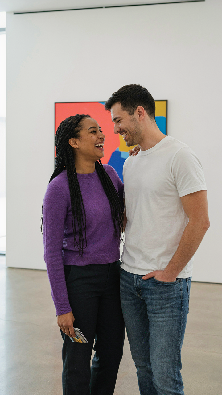
You want permission to break the rules without looking like a mistake. Here’s the mechanism: perfect coordination reads as safe. It signals you followed a template. The photographer who knows when to interrupt visual harmony controls whether the image feels alive or constructed. Disharmony works when it’s chosen, not accidental. One partner in a complementary color, the other in neutrals. One dressed up, one deliberately casual. This creates visual tension that draws the eye and tells a real story instead of a generic one.
The camera sees contrast before it sees cohesion. Fashion photography and editorial work have long used asymmetrical styling to communicate narrative and movement. A couple where both partners match exactly becomes wallpaper. A couple where one breaks pattern becomes a moment with stakes. The break must align with the couple’s actual dynamic or the disconnect reads as sloppy. When intentional, disharmony becomes the most coordinated choice you can make because it proves the couple understands themselves well enough to step outside the obvious.
How Asymmetry Creates Visual Movement
Borrowed from composition theory, visual weight is the gravitational pull an element exerts on a frame. In couple styling, asymmetry distributes that weight unevenly, forcing the viewer’s eye to move and engage. A symmetrical outfit combination is static. Asymmetrical pairing is kinetic. One person in dark tones anchors the frame while the other in lighter fabric floats forward. The eye must reconcile the difference, which makes the image memorable instead of forgettable.
- Color Inversion: One partner wears the darker shade of your chosen palette while the other goes light. The contrast creates visual separation and makes both figures pop independently from the background instead of reading as a single unit.
- Texture Layering Mismatch: Pair smooth fabrics on one person with rough or patterned textures on the other. This creates depth within the frame and prevents the couple from blending into a flat, unified shape.
- Silhouette Opposition: One fitted, one relaxed. One structured jacket, one flowing fabric. Opposing shapes create movement and prevent the couple from appearing as mirror images, which reads as costume rather than personality.
- Formality Gradient: Dress one partner noticeably more formal than the other. This works when it reflects their actual dynamic and creates visual intrigue because it challenges the expectation that couples present identically.
- Pattern to Solid Ratio: One person holds all the visual pattern while the other stays neutral. This prevents competing visual noise and keeps the frame organized despite the asymmetry.
The execution depends on intentionality. Calculate the asymmetry before the shoot. Discuss with the couple why each piece breaks the pattern and how it reflects who they actually are together. This prevents the look from collapsing into confusion. The photographer frames the asymmetry as an asset, not a flaw, which signals to the couple that their differences are the content worth capturing.
The Post Shoot Edit: Enhancing Cohesion, Not Fixing Flaws
Amplify What You Built, Don’t Manufacture It
You want editing to save an outfit choice that wasn’t thought through. It won’t. Editing works on the same principle as contrast in graphic design: it amplifies existing signal, it doesn’t create new information. If your outfits lacked coordination on set, no amount of color grading resurrects that. What editing does is push the thematic elements you already built into sharper focus. If you chose complementary tones, editing deepens that relationship. If you picked clashing patterns, editing makes that worse.
The real mechanism is saturation control and selective desaturation. Pull down the saturation on competing colors slightly while keeping your coordinated elements at full saturation. This creates visual hierarchy without looking edited. Your eye lands on what matters because that’s where the color lives. The couple’s connection strengthens because the viewer’s attention follows the path you deliberately built during the shoot, not the path the camera randomly captured.
Color Grading Locks The Narrative
Most photographers grade couple shoots with a one size fits all filter. Wrong approach. Your outfit coordination is a narrative choice, and color grading either supports that story or undermines it. If you dressed them in warm earth tones, a cool blue grade fights your coordination. If you chose jewel tones, desaturate the environment slightly so the couple becomes the color focal point, not background competition.
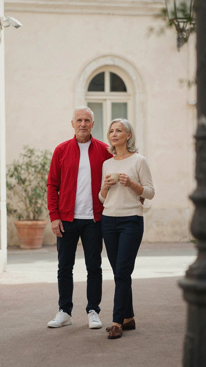
Start with your outfit colors before you open Lightroom. If they wore navy and cream, your whites should stay clean and your darks should stay true. Lift shadows evenly across both subjects so neither person gets washed out or overexposed relative to the other. Consistency between the two people in the frame is what reads as coordinated to the viewer’s brain. The edit should disappear. Only the harmony should remain.
Outdoors Couple Photoshoot Dynamic: Movement And Flow

Fabrics That Let Your Body Speak
You want the outfit to disappear so people focus on how you two actually relate to each other. That’s the real mechanism here. Natural fabrics with weight and drape—linen, cotton blends, silk—move with your body instead of fighting it. Stiff materials kill the dynamic because they lock you into poses. Your shoulders, arms, and torso need freedom to show genuine proximity and ease.
Test the fabric by moving your arms in circles, reaching toward your partner, and shifting your weight. Lightweight cotton and linen blend wrinkles intentionally, which reads as relaxed rather than sloppy in photos. Heavy silk holds shape through movement and photographs cleanly. Avoid polyester blends and rigid structured fabrics that maintain their form regardless of what your body does underneath. The outfit should respond to you, not constrain you.
Natural Elements As Your Wardrobe Anchor
Wind, light, and texture interact with certain fabrics in ways that amplify coordination without making it obvious. This is physics applied to clothing: fabric density and weight determine how air moves through it. Lighter materials billow and catch movement, creating visual connection. Heavier fabrics stay settled, grounding the frame. Choose one anchor material for both outfits, then vary the cut or color.
When you stand near water, sand, or tall grass, textured fabrics catch light differently than smooth ones. A linen shirt and canvas pants will photograph together naturally because they share visual weight. Avoid mixing delicate silks with heavy denim in the same frame—the visual hierarchy breaks and reads as mismatched rather than coordinated. Scout the location beforehand and dress for how materials will interact with that specific environment.
The Real Obstacle Isn’t Finding Outfits; It’s Your Inability To Define Your Shared Identity Visually

Most couples fail at coordinated photoshoot outfits because they never asked themselves the actual question: who are we together? You can’t dress the part until you know the part. Stop scrolling Pinterest for inspiration. Instead, spend thirty minutes answering this: what single word describes how you want the world to see your relationship? Write it down. Then build your outfit around that one idea. The clothes won’t matter until your identity does.