
The Myth Of Effortless “Pop”

Why Random Color Choices Backfire
You want the outfit to do the work so people notice you without you having to think about it. That’s not how color operates. Most people treat accent colors like seasoning: throw it on and hope something tastes right. The mechanism is contrast, borrowed from graphic design and visual hierarchy. Without contrast, an accent color doesn’t pop—it disappears. Most neutrals sit in the mid-to-low saturation range. A random bright color placed against them creates visual noise, not intentional emphasis. Your eye doesn’t know where to land because the color has no relationship to the surrounding palette.
The common advice says “just pick a color you love.” This is incomplete. A color you love in isolation has no power in context. Saturation, temperature, and undertone all shift depending on what surrounds them. A coral that looks energetic next to navy looks muddy next to gray. The accent fails not because the color is bad, but because you skipped the relationship between the neutral base and the accent. Test every accent color against your specific neutral pieces before wearing it. This step determines success or failure before you leave the house.
The Subtle Signals Of Accidental Clashes

Clashing happens quietly. People don’t point it out—they just feel something is off. Your outfit reads as low-effort or unfinished, even if you spent money on every piece. Color clash operates like cognitive dissonance: the eye expects coherence and gets conflict instead. A warm beige base with a cool-toned fuchsia accent creates that tension instantly. Most people blame the outfit. They don’t blame the color relationship because they can’t name it.
The real signal is inconsistency in color temperature and saturation across your ensemble. A muted sage accent on a crisp white neutral feels arrested—the colors exist in different visual frequencies. An overly saturated accent overwhelms muted neutrals, making the base look washed out by comparison. Conversely, an undersaturated accent against a bold neutral reads as timid. Before you wear a combination, hold the pieces together in natural light and ask: do these colors speak the same language? If you hesitate, the clash is already working against you.

The Signaling System: What Your Accent Color Really Says

Color As Economic Signal
You want to know if people will respect you more. That’s the real question underneath this section. Here’s the mechanism: color functions as a pricing signal in human perception. In economics, price signals communicate scarcity and value. Your accent color does the same thing neurologically. A deliberate, restrained accent communicates intentionality. Chaos communicates indifference or ignorance. Neutral base plus one strategic color reads as someone who makes decisions, not someone who defaulted to everything.
The psychology here is straightforward. Bright, saturated colors demand cognitive load from observers. Too many competing colors create visual noise that people associate with low status or low control. A single accent color against neutrals signals the opposite: you curated this. You chose restraint. That restraint is what high-status actors actually do. Budget-conscious dressing tries to use color as volume. Strategic dressing uses color as punctuation.
The Primal Color Hierarchy
Humans process color before form. This is neurobiology, not opinion. Your brain registers hue in roughly 100 milliseconds, long before it consciously identifies what you’re wearing. Red triggers arousal and attention. It evolved as a signal of dominance, ripeness, or threat. Blue triggers trust and calm. Green suggests growth and safety. Yellow creates energy and optimism but fatigues quickly if overused. The key mechanism here is that certain hues activate specific neural pathways that bypass rational thought entirely.
Your accent color choice isn’t aesthetic preference operating in a vacuum. It’s a direct line to limbic system activation. Wear red as an accent on a neutral outfit and you’re consciously leveraging this response. People won’t know why they trust you less or pay more attention to you. They just will. Your job is to pick the hue that matches the response you want to generate, then deploy it in one focused place where it lands without noise.
The 3 Point Contrast Protocol

Neutral Base Undertones
You want this to work because you’re tired of looking invisible. Here’s the mechanism: every neutral contains a hidden temperature. Undertone is borrowed from color theory in painting, where it describes the hidden color beneath a surface hue. Your grays, blacks, and whites aren’t neutral at all. They’re either warm (leaning yellow, red, or brown) or cool (leaning blue, green, or purple). A warm beige next to cool gray creates mud. Same accent color, different base, completely different outcome.
Find your base’s undertone by holding it against a pure white reference point in natural light. Does it lean toward cream or ash? Toward taupe or silver? The undertone determines which accent colors will pop instead of disappear. This isn’t preference. It’s optical fact. Your accent only cuts through when there’s genuine temperature contrast between it and what it sits on top of.
Accent For Visual Separation
Everyone says pick a color you love. That’s incomplete advice that guarantees failure. The accent’s job isn’t to match your personality. It’s to create maximum visual separation from your base. Think in terms of the color wheel: complementary pairs live opposite each other and generate the highest contrast. A warm rust accent on cool gray creates immediate stopping power. A muted sage on warm beige disappears because they share temperature family.
Saturation matters more than most realize. A slightly desaturated accent on a highly saturated base creates tension without chaos. Conversely, a saturated accent against a muted base commands attention immediately. Test your specific combination under the light where you’ll actually wear it. Fluorescent office light and natural daylight hit color differently. Your accent either has cut-through in that environment or it doesn’t. Once you’ve confirmed the temperature contrast and saturation relationship, the accent placement becomes your only remaining variable.
Borrowed Tactics: Color Theory As Military Strategy

Disruptive Pattern Versus Visual Target
You want people to notice you without looking desperate. That’s the real motive here. Military camouflage teaches us two opposing strategies: disruptive patterning breaks up form to hide, while highlighting uses contrast to draw attention exactly where command decides. Your accent color works the same way. A neutral outfit is the base layer. The accent is your point of directed fire.
Disruptive camouflage uses fragmented shapes and competing colors to confuse the eye. Highlighting uses a single, high-contrast element to command focus. Most people default to highlight strategy without naming it. They throw a bright scarf on beige and hope it lands. The mechanism is simpler than that: contrast ratio determines whether the accent disappears into visual noise or punches through. A muted burgundy on taupe requires proximity to register. A cobalt blue on cream reads from across the room.
Where Attention Lands First
Visual hierarchy isn’t about making things look nice. It’s about controlling what the viewer processes first, second, third. Your accent color is the topmost layer of that hierarchy. When you place it strategically, you’re running a protocol: position determines impact, saturation determines visibility, isolation determines dominance.
Place the accent where you want eyes to travel first. A colored shoe draws attention downward. A colored jacket commands the upper frame. A belt at the midline creates separation. Saturation compounds this effect. A highly saturated accent cuts through visual clutter faster than a desaturated one. Isolation amplifies it further. A single accent spot wins over multiple scattered accent pieces because the eye has nowhere else to land. Test placement by photographing yourself, then trace where your gaze moves first. That’s your answer.
Beyond The Matching Trap: Strategic Dissonance

When Harmony Becomes Invisible
You’re worried that breaking color rules will make you look incompetent. The truth is the opposite: matching everything perfectly makes you blend into the background noise. The mechanism here is contrast itself. Without it, your eye slides over the outfit without registering anything. Traditional color theory teaches harmony through analogous colors or established palettes. But an accent color outfit needs dissonance to function. Dissonance is what stops the viewer’s eye. It’s the jolt that makes the outfit memorable instead of forgettable.
The rule most people follow is too safe: match your accent to one other element and call it done. This produces blandness disguised as coordination. Real strategic dissonance means your accent color breaks the expected pattern while still anchoring the overall outfit. A rust orange bag over a charcoal and cream base works because rust pulls from a different color temperature than the cool grays and warm creams. The outfit has tension, not just variety. Tension is what reads as intentional rather than accidental.
Contrast That Creates Order
Physics uses the term “signal-to-noise ratio” to measure what stands out from what doesn’t. Your accent color outfit needs a high signal-to-noise ratio: the accent must cut through clearly. Low contrast is the enemy here. If your accent color is only two shades darker or lighter than your base, it disappears. Most advice says to pick colors you “feel drawn to.” That’s useless. Pick colors where the value difference is measurable. A deep emerald against cream works. A muted sage against cream doesn’t.
Saturation matters as much as value. A highly saturated accent color on a desaturated base creates immediate visual hierarchy without requiring bright primary colors. Deep jewel tones over neutrals read as sophisticated because the contrast is clean but not jarring. The mechanism is simple: your eye processes saturation shifts faster than subtle shade changes. When you introduce one intentionally saturated element into a muted palette, that element owns the visual weight. Place this saturated accent piece where it commands attention: upper body or hands.
The Psychology Of Placement: Where To Deploy Your Color Weapon

Focal Points Command Attention First
You want people to notice the effort you put in. That’s the real reason placement matters. Here’s the mechanism: your eye moves to contrast before it moves anywhere else. In visual hierarchy, the brain registers disruption in a predictable order. An accent color at your face stops the viewer’s scan. An accent color at your waist divides the body. An accent color at your feet gets processed last. Placement isn’t decoration. It’s directional control.
The common advice says “wear it close to your face.” That’s incomplete. Face placement works because proximity to eyes creates immediate registration. But placement also controls what your outfit communicates about proportion and intention. A bright color at the neck says intentional and considered. The same color at the ankle says afterthought or technical. Your audience reads placement as confidence or accident. Choose placement as a verb, not a default.
Single Statement Beats Scattered Color
The mistake most people make is thinking one accent color means one placement. They wear a red bag, red shoes, and a red scarf, diluting the weapon into noise. Graphic design calls this the figure-ground relationship. Your accent color is the figure. Everything else is the ground. When figure repeats too often, it stops being figure. It becomes pattern. One bold placement creates tension. Multiple placements create confusion.
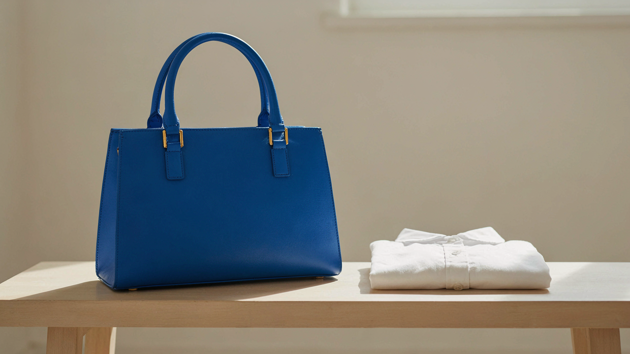
Deploy your accent color at exactly one focal point per outfit. A camel coat, white shirt, dark jeans, and a cobalt bag. The bag commands the visual hierarchy. Eyes land there first. The outfit works because the color has nowhere else to compete. This isn’t restraint for restraint’s sake. Single placement generates the psychological response you’re after: the appearance of someone who knows what they’re doing.
Seasonal Subtlety Vs. Year Round Authority
Winter Palette Outfits Across Different Settings
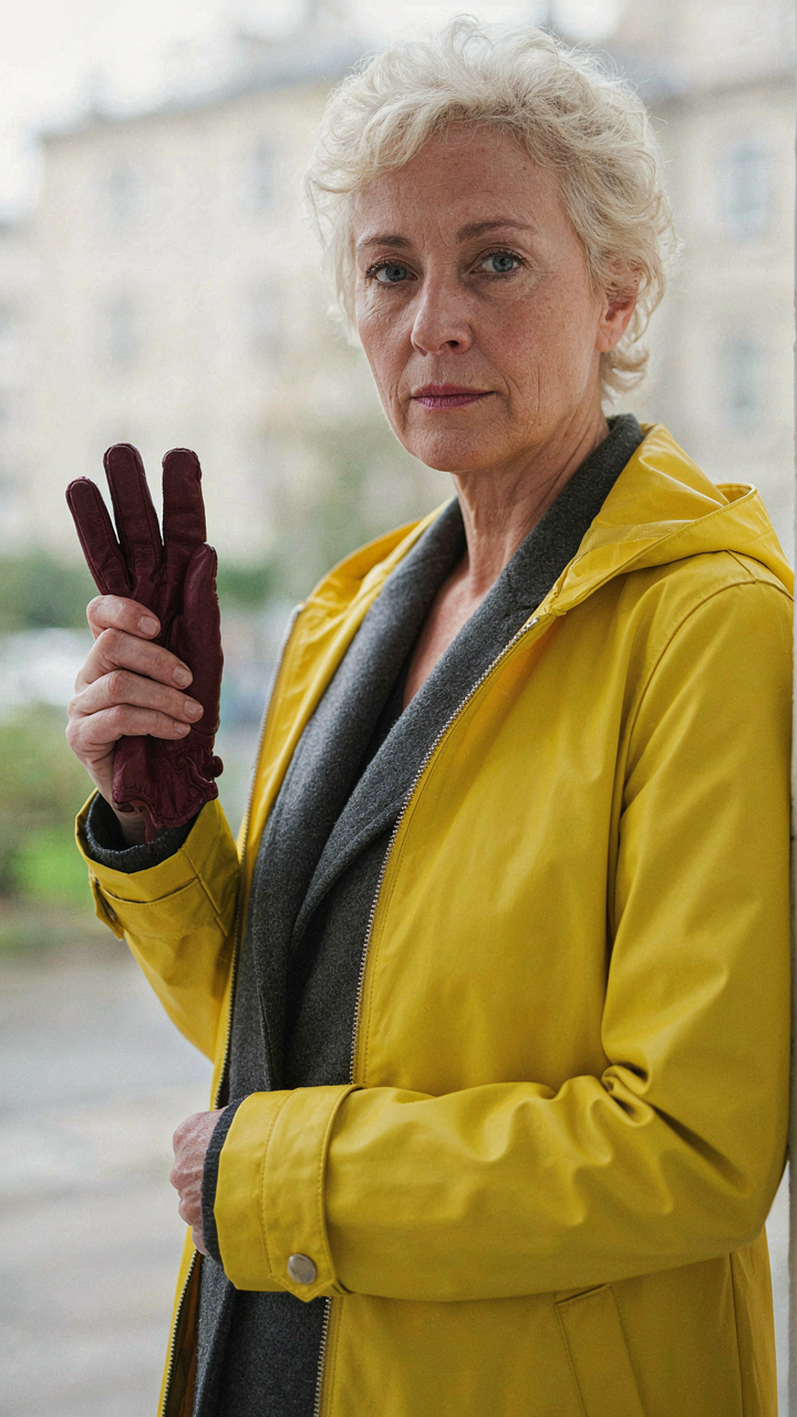
You’re worried that your accent color will look wrong in February. That’s the real anxiety here. The mechanism is simple: winter palettes aren’t locked by season. They’re locked by light. Winter light is flat, diffuse, and blue-shifted. Your accent color doesn’t change. Your context does. A burgundy accent works in an office meeting, a casual dinner, and a formal event because burgundy reads consistently under fluorescent, incandescent, and natural winter light. The variable isn’t the color. It’s what you pair it with.
Adapt your base neutrals to the social context, not the calendar. Wear charcoal with burgundy for boardroom credibility. Wear cream with burgundy for casual warmth. Wear black with burgundy for evening formality. The accent stays put. You’re changing the weight and brightness of your neutrals to signal respect for the room, not to follow a seasonal rule that doesn’t actually exist. This distinction matters because it frees you from seasonal rotation anxiety and anchors your decisions to something real: the social contract of the space you’re entering.
The Accent Color Arsenal That Actually Works
Real versatility comes from color theory in fashion, not from owning more clothes. Think of saturation as your lever. A saturated accent color (deep jewel tone, true primary) demands neutral backgrounds to read clean. A desaturated accent color (muted, dusty, earth-toned) can pair with more textured neutrals because it’s already fighting less for visual attention. Build your arsenal around this principle, not around seasonal trends.
- Deep Jewel Tones: Emerald, sapphire, and burgundy pair cleanly with stark neutrals like black, white, and charcoal. High saturation means you need low-complexity backgrounds to avoid visual noise.
- Muted Earth Tones: Olive, terracotta, and dusty rose work with warmer neutrals like cream, taupe, and warm gray. They tolerate more texture in your base because the accent already reads soft.
- True Primary Accents: Red, cobalt, and pure yellow demand the cleanest neutrals available. These colors have maximum presence and need minimal competition for attention to register as intentional.
- Warm Vs Cool Grounding: Pair warm accents with warm neutrals and cool accents with cool neutrals unless you’re deliberately creating contrast for a specific event. Mismatched undertones read as accident, not strategy.
- The Greyscale Exception: Pure black, white, and true gray work with any accent color because they contain no undertone to conflict with your accent’s temperature or intensity.
The system works when you stop rotating your accent colors by month and instead rotate them by saturation and temperature match to your neutral base. Pick one accent in each saturation tier, one warm and one cool, and you’ve covered every legitimate outfit need for a year. Wear them until they fade. Then replace them with the same formula.
Mastering The Single Stroke: Why Less Color Is More Power

The Minimalist Approach To Colorful Business Outfits
You want permission to stand out without looking like you tried. That’s the real ask here. The mechanism is constraint. When you limit yourself to one accent color against a neutral base, you force intentionality. Every choice becomes visible. There’s nowhere to hide behind layering or color complexity. Business environments reward this clarity because it reads as control.
Neutral bases work because they don’t compete for attention. Beige, gray, black, white, cream, and navy create a visual container. Your accent color becomes the statement, not one voice in a crowd. This isn’t about minimalism as aesthetic preference. It’s about signal strength. A single color against neutrals broadcasts faster and clearer than a palette. The observer processes your outfit in seconds, not minutes.
Contrast Outfit: Amplifying A Lone Accent
Contrast is borrowed from visual design, where it measures the difference between light and dark values. Apply this to your accent color outfit and you see the real lever: your accent’s power scales directly with how different it is from your neutral base. A muted sage on gray produces whisper. A true red on white produces command. You choose the volume by choosing the value distance.
The common advice here is wrong. People say pick colors that “go together” or “complement” each other. That’s interior design thinking. Business outfits operate differently. You want maximum legibility, which means maximum contrast between your base and your accent. Dark neutrals push bright accents. Light neutrals pull darker or more saturated accents. Measure the gap visually. The bigger the gap, the stronger the accent registers. Test your combination by viewing it at arm’s length. If it dissolves into the same visual weight, increase the contrast or shift the hue toward a warmer or cooler pole.
The Unseen Cost Of Indecision

Generic Advice Produces Generic Results
You’re afraid you’ll look wrong. That fear keeps you scrolling through outfit posts instead of committing to a choice. The real mechanism: generic advice works backward. It tells you what to do without explaining what happens when you do it, so you never build the confidence to trust your own eye.
Most accent color guidance stops at surface rules: pair warm with warm, cool with cool, avoid clashing. This is incomplete. The advice assumes you already know how your eye processes color relationships, which you don’t. You need to see the actual structural difference between a successful accent placement and a failed one before rules make sense.
Master Your Color Combination Strategy
Think of color combinations like signal and noise in information theory. Your neutral base is the signal—stable, readable, clear. Your accent color is the noise you’re deliberately introducing. The mechanism works only when you control where that noise appears and how much of it you broadcast.
Start by observing, not guessing. Wear your neutral outfit. Add your accent piece to your wrist, chest, or hip for a full day. Notice what your eye returns to. Notice when the accent feels intentional versus tacked on. The difference isn’t subjective—it’s about visual weight and placement hierarchy. Once you see this pattern repeat across multiple outfits, you stop needing permission to choose. You choose because you understand what’s actually happening.
The Real Obstacle? Your Fear Of Committing To A Clear, Intentional Visual Statement
Most people don’t fail at accent color outfits because they lack style knowledge. They fail because they’re terrified of standing out. You already know what color works. You’re just waiting for permission. Stop. Pick one accent color today and wear it tomorrow without overthinking it. The only opinion that matters is whether you feel more intentional in the mirror. Boring people blend in. Interesting people commit.