

The Primitive Palette: Why Earth Tones Resonate Deeply

Your Brain Recognizes Safety First
You care about this section because you suspect earth tones work, but you don’t want to admit you’re buying them for the same reason humans always have: they signal you’re not a threat. Evolutionary psychology maps this directly onto color selection. Your brain processes earth tones—browns, taupes, ochres, greens—as non-predatory signals. These are the colors of soil, stone, and vegetation. They don’t trigger alertness. They trigger familiarity and low stakes. This isn’t about aesthetics. It’s about what your nervous system reads before your conscious mind forms an opinion.
The mechanism is neural efficiency. Your ancestors survived by moving fast through threat assessment. Muted, natural colors require less processing power to evaluate than bright or synthetic hues. When someone wears earth tones, their threat profile drops instantly. You’re not commanding attention through color alone. You’re removing friction from how people perceive you. That’s the actual leverage. The outfit recedes. The person emerges. This is why military and law enforcement use earth-tone uniforms—not as camouflage in civilian life, but because the palette itself communicates restraint and competence rather than aggression or instability.
Quiet Authority Moves Rooms

Everyone preaches that earth tones are “warm” and “approachable,” which is lazy observation masking the real mechanism. The signal earth tones send is authority without performance. A woman in a charcoal brown blazer, cream blouse, and taupe trousers doesn’t announce her competence through color intensity. She demonstrates it through restraint. Garish colors—bright reds, loud patterns, synthetic metallics—demand validation. They’re asking for feedback. Earth tones make no request. They simply occupy space. This is the inverse of how most people think about standing out, which is exactly why it works.
The protocol is straightforward: when you need to move through a room unquestioned, earth tone outfits bypass the visual noise entirely. People don’t scrutinize what they recognize as baseline. They scrutinize deviation. A woman in black and gray reads as anomaly-free. A woman in earth tones reads as intentional and grounded. The difference matters in negotiations, first meetings, and any environment where your credibility precedes your words. Wear earth tones when you want the room to process your ideas before your appearance.

The “Capsule Wardrobe Earth Tones” Deception: Beyond Basic Matching
Intentional Selection Over Accidental Coordination
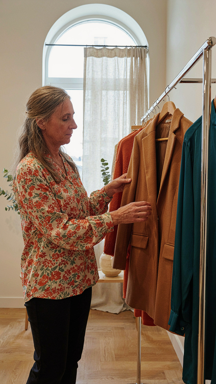
You want permission to stop thinking about your clothes. That’s the real draw here. But throwing together beige, tan, and olive isn’t a strategy—it’s avoidance dressed up as minimalism. The actual mechanism borrowed from design thinking is constraint-based creativity: limits force better decisions. Earth tones work only when you reverse-engineer them from your life, not from a color palette someone else built.
Most advice treats earth tone selection like a paint-by-numbers exercise. Pick five neutrals, combine them randomly, done. That’s lazy and it shows. Real selection means naming why each piece exists in your rotation before you buy it. You choose camel because it layers over your existing base. You choose rust because it anchors your skin tone. You choose sage because it bridges your work life and weekend life. The color itself is secondary to the function.
Personal Brand, Not Just An Outfit
Building outfits and building a brand operate on different timelines and serve different purposes. Outfits last one day. A brand is the pattern people recognize across months. Earth tones read as intentional only when they reinforce who you actually are, not who you think you should be. That consistency is what separates “I dressed myself” from “I have taste.”
The mechanism here is repetition with variation. You establish a baseline—say, neutral trousers, white or cream base layer, earth-tone top. Then you vary the top while keeping the bottom anchor. People see this repetition and assign you coherence. After weeks of this, earth tone outfits stop looking like outfits and start looking like your aesthetic. That’s when they work hardest: when no one thinks you tried.
The Earth Tone Outfits Matrix: Predicting Visual Impact

How Color Temperature Shapes Presence
You care about this section because you want certainty that your outfit will land the way you intend. What actually determines that outcome is the thermodynamic property of color itself, borrowed from physics. Earth tones operate on a spectrum of warmth and coolness that directly controls how much visual energy your outfit radiates toward an observer. Warm earth tones like burnt orange and rust sit closer to red wavelengths and demand attention by their nature. Cool earth tones like sage and taupe approach blue wavelengths and recede slightly, creating space around your body.
The mechanism is straightforward: warm earth tones advance toward the viewer and energize. Cool earth tones retreat and calm. A monochromatic warm earth outfit broadcasts presence without effort. A monochromatic cool earth outfit creates visual breathing room and subtlety. Layer both temperatures together and you control focal points. The outfit doesn’t have to be loud to create impact. Temperature contrast does the work alone.
Fabric Weight And How It Moves
Most advice says to match fabric to season, which misses the real lever entirely. What matters is fabric mass and how it falls against your body, which I’ll map from physics as inertia. Heavier natural fibers like wool and linen resist movement and create defined silhouettes that anchor you visually. Lighter fabrics like cotton voile and linen blend drape and flow, scattering your visual footprint across more space.
Heavy earth tone fabrics in cream or camel read as solid and stationary. They hold a shape and stay put. Light earth tone fabrics in the same colors move with you, shifting how viewers perceive your form. Dense fabric silhouettes work best in monochromatic earth palettes because they need visual stability. Lighter fabrics need intentional layering or color blocking to prevent shapelessness. Test any earth tone outfit by moving in it. If the fabric moves against your body without intention, your silhouette loses definition and your outfit loses impact.
Earth Colors Outfit: Muted Olive, Khaki, And Beyond

The Spectrum Of Understated Power Hues
You want these colors because they signal you’re not trying. That’s the real mechanism: constraint creates authority. In color theory, muted tones work through desaturation, the removal of chromatic intensity that forces the eye to read structure instead of emotion. Olive, khaki, and their cousins operate in the same bandwidth as executive boardrooms and military dress because they demand less attention from the viewer, which paradoxically gives you more control in the room.
The practical difference between muted earth tones and their bright counterparts is saturation level, not hue family. A true olive contains gray undertones that soften the green, making it read as intentional rather than decorative. Khaki functions the same way. Wear these colors when you need credibility without announcement. The outfit recedes; your presence expands.
Beyond Beige: Unexpected Earth Shades
The advice stops at beige, taupe, and tan. That’s incomplete. The earth palette extends into terracotta, warm grays with brown undertones, burnt sienna, and weathered bronze. These shades exist outside the mainstream neutral canon but retain the same low-provocation signal. Terracotta appears in nature as fired clay, giving it historical weight that beige simply lacks. When you layer terracotta with charcoal or deeper brown, you create visual hierarchy without relying on contrast or trend.
The mechanism is specificity. Generic beige reads as default. Terracotta with intention reads as taste. Test this by pairing a terracotta sweater with grey trousers instead of cream. The outfit gains dimension because you’re working with undertones that actually interact rather than simply coexist. Choose earth shades based on undertone consistency, not just color name.
Simple Casual Outfits: Effortless Execution, Not Apathy
Depth Through Strategic Layering
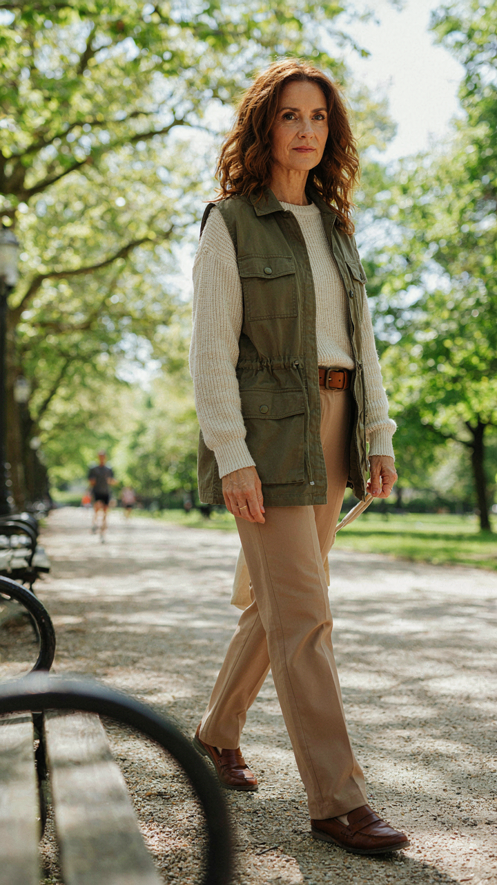
You want casual to read as intentional, not lazy. The mechanism here borrows from architecture: load-bearing walls create structure. In outfits, texture and depth do the same thing. You stack materials in earth tones to build visual weight without adding bulk or formality.
Start with a base layer in a lighter earth tone—cream, sand, pale taupe. Add a mid-layer in a deeper shade: rust, olive, or warm brown. Finish with an outer piece that bridges both tones. This creates dimension. The eye reads complexity instead of flatness. Cotton against linen against wool changes how light hits the outfit and how the proportions land.
When Accessories Stop Working
Most advice tells you to “add accessories to complete the look.” That’s incomplete guidance. Accessories should punctuate, not decorate. One focused piece—a leather belt, a structured bag, a watch—creates a focal point. Everything else recedes. In earth tones especially, where colors already blend together, stacking multiple accessories dilutes the effect and makes the outfit feel scattered instead of casual.
Choose one accessory that solves a functional problem first. A belt defines your waist and anchors the silhouette. A bag carries weight and grounds the composition. A single ring or bracelet provides visual rest. The outfit stays legible. Remove anything that exists only to “add interest.” Your outfit doesn’t need interest. It needs clarity.
Casual Style Outfits: The Unwritten Rules Of Understated Polish

Fabric Quality: The Silent Signal Of Discernment
You care about this because you sense that people judge you on details you can’t name. They do. Fabric quality operates like thermodynamics in clothing: energy is required to maintain poor fabric’s appearance, while quality fabric resists degradation. A linen-cotton blend in taupe holds its structure through washing. A synthetic blend in the same color pills, shrinks, and loses shape within months. The signal isn’t visible at first glance. It accumulates. People notice when something looks lived-in versus worn-out, and that difference lives in fiber choice.
Earth tones expose fabric weakness faster than bright colors. Beige shows pilling immediately. Olive fades unevenly in cheap cotton-poly blends. Buy natural fibers for casual earth tone outfits: linen, cotton, wool blends, and hemp. These age visibly but age well. They wrinkle, but wrinkles look intentional on natural fiber. Synthetics wrinkle and look cheap. Check the tag before buying. If the garment is under 80 percent natural fiber in earth tones, skip it.
Tailoring For Impact
Fit is leverage in casual wear. Most advice says buy your size and move on. That’s incomplete. A garment can fit your measurements and still collapse on your frame because it was drafted for a different body proportion. Casual earth tone outfits demand precision: an oversized cream sweater needs precise sleeve length or it reads sloppy. A taupe linen shirt needs shoulders that sit on your actual shoulders, not two inches past them.
Get two pieces tailored in earth tones before you buy the rest of your casual rotation. A neutral button-up and one knit. Observe what the tailor changes. Most alterations for women involve sleeve length, waist suppression, and shoulder seaming. Now you know what to hunt for in new pieces. You’ll reject 70 percent of what you try on because you can identify the fit gap instantly. That rejection saves money and builds a functional wardrobe fast.
The Muted Olive Outfit Protocol: A Masterclass In Subtlety
Monochromatic Depth Playing With Olive Tones
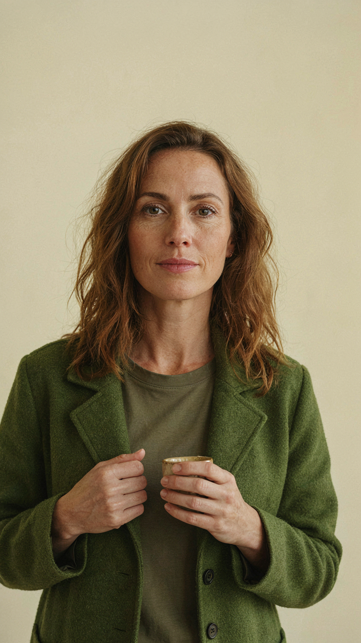
You want this section because you’re afraid a single color reads as lazy or cheap. The real mechanism: monochromatic depth uses value contrast instead of hue contrast. In design language, value is the light-to-dark spectrum. Olive ranges from muted yellow-green to dusty brown-green, and each version has different depths. Stacking these variations creates dimension without breaking the cohesion.
- Olive cargo pants with sage blouse: Cargo’s structural heaviness pairs with sage’s lighter undertone. The two are related but distinct enough to separate the silhouette into clear zones.
- Khaki sweater over olive slip dress: Khaki sits lighter than olive. Layering this way creates a visual hierarchy that reads intentional, not monochrome-flat.
- Dusty green trousers with moss turtleneck: Both lean brown-green but moss sits darker. The contrast holds the outfit together without introducing a competing color family.
- Celadon jacket over olive midi skirt: Celadon pushes toward blue-green while olive stays yellow-green. The shift is subtle but stops the outfit from feeling one-note.
- Taupe base with olive overshirt: Taupe is olive’s neutral cousin, nearly desaturated. This pairing works because taupe provides visual rest while olive anchors the look.
The execution step: pull three olive or olive-adjacent pieces from your closet. Photograph them under the same light. If you can see clear value separation between the lightest and darkest pieces, you have a monochromatic outfit. If they blur together, add a piece that’s two shades lighter or darker than your middle tone.
Contrasting Textures Elevating A Single Shade
One mistake most people make: they think texture matters less than color in monochromatic fits. It’s the inverse. When you remove color variation, fabric construction becomes the primary visual and tactile tool. Olive linen reads completely different than olive wool or olive cotton twill, even at identical saturation levels.
Texture creates perceived depth through light reflection. A matte olive cotton absorbs light and recedes slightly. A structured wool with nap catches light and advances. A silk charmeuse in olive drapes and shifts, creating movement within a single shade. Layer these three together and the outfit moves. The mechanism works on the eye before it registers as “different colors.” Start with a matte base layer, add a structured midlayer, finish with something that moves or has surface variation.
Khaki Wide Leg Pants Outfit: The Modern Power Silhouette

How Volume Commands Space
You want people to register you before they register your insecurity. That’s what the wide leg does. In visual design, negative space functions like weight in physics. The khaki wide leg creates visual mass without adding body mass. The fabric moves away from your frame, which forces the eye to track the silhouette instead of the body. This is why loose pants read as intentional while tight pants read as revealing what you’re hiding.
The volume works because it establishes dominance over the space around you. A narrow pant leg clings to reality. A wide leg pants commands it. Pair the khaki with a fitted top to create proportion contrast. The fitted upper half anchors the eye upward before it tracks down to the volume. Without that anchor, the outfit collapses into formless territory. The rule is simple: fitted on top, volume on bottom, or vice versa. Never both at once.
Setting The Ground Truth
Length kills the grounded presence everyone claims they want but then sabotages by wearing pants that stop mid-ankle. The khaki wide leg needs to graze the top of your shoe or break slightly on it. Too short and you look unstable, like the outfit is floating. Too long and the volume swallows the line between your body and the ground. Your shoe becomes the visual anchor that grounds the entire silhouette.
Wear the khaki wide leg with a shoe that has weight. Leather loafers, minimal boots, or structured flats work because they hold their shape against the fabric flow. Sneakers diffuse the grounded effect by competing for attention. The shoe-to-pant relationship is a protocol, not a preference. Measure from hip bone to floor, add one half inch, cut there. That precision is what separates an outfit that holds authority from one that looks accidental.
Soft Autumn Old Money Outfits: Curating Timeless Influence

The Economics Of Restraint
You want people to assume you have money without you saying it. That’s the real mechanism here. Economics teaches scarcity creates value, and in wardrobing, scarcity means you own fewer pieces that cost more and last longer. Old money dressing in earth tones exploits this directly: a woman in a single camel coat worn for five years signals stability. A woman rotating through ten cheap jackets signals noise.
Soft autumn earth tones enable this restraint because they work across seasons and skin undertones without forcing constant replacement. Warm taupe, rust, terracotta, warm greige, and muted olive create a narrow enough palette that every piece talks to every other piece. You build a capsule, not a closet. The constraint is the statement.
Designing For Permanence
The common advice here is garbage. People say “invest in timeless pieces” like that means anything. It doesn’t. Timeless means the piece survives three shifts: fabric degradation, silhouette drift, and personal wear patterns. Most clothes fail on all three within two years.
Real investment pieces in soft autumn earth tones are cut for the body’s actual geometry, not fashion’s current geometry. A structured wool blazer in warm taupe with a straight cut holds its shape through arm movement and washing. Unstructured linen shifts with every bend. Choose materials that age visibly but don’t tear: wool, linen, structured cotton blends, and leather that develops patina. The garment should look better after one year of wear, not worse. That’s how you know it’s built right.
Wide Leg Pants Fall Outfit: Seasonality Of Strategic Dressing

Layering For Visual Density Without Bulk
You’re reading this because you want permission to look intentional without overthinking it. The real mechanism is thermal layering from textiles engineering: you’re stacking materials with different insulation values to trap air while controlling silhouette. Fall earth tone outfits demand this approach because the palette itself reads as heavy, so you can’t add physical volume without looking sloppy.
Start with a fitted base layer in cream or warm taupe. Add a structured overshirt in camel or rust linen blend. The fitted base prevents the wide-leg pants from drowning the frame while the overshirt adds visual separation without the bulk of a coat. This three-piece stack creates apparent structure even when the bottom half demands space.
Footwear That Grounds The Proportion
Most advice stops at “wear loafers with wide legs.” That’s incomplete. The actual principle is visual weight distribution: your shoe mass must anchor the outfit’s bottom third or the proportions collapse. Neutral earth tones demand deliberate footwear strategy because they offer no contrast to break monotony.
Leather loafers in chocolate brown or oxblood work because the shoe’s solid form matches the pants’ volume. Alternatively, a structured ankle boot in suede grounds the silhouette through defined heel height and taper. The footwear silhouette must have edges, not soft curves. Avoid canvas sneakers or ballet flats in earth tones because they disappear into the overall palette and weaken the outfit’s visual anchor point.
The Real Obstacle Isn’t Your Wardrobe; It’s Your Inability To See Clothing As Strategic Communication
Most women treat earth tones like a safe default instead of a messaging system. You wear them because they’re “neutral,” not because you decided what you want people to think when they look at you. Stop shopping for outfits. Start shopping for the person you’re positioning yourself as. Pull three earth tone pieces from your closet today and write down exactly what signal each one sends. That exercise rewires how you see fabric and color. Your wardrobe doesn’t need fixing. Your intention does.