

The Subtlety Trap: Why Most Pastel Outfits Fail

Washed Out Hues Versus Intentional Softness
You want pastels to signal taste and restraint instead of looking like you grabbed whatever was cheap at the mall. The distinction between washed-out and intentional comes down to saturation and undertone. Washed-out pastels have been stripped of pigment until they sit flat against your skin. Intentional pastels retain enough saturation to read as color while staying soft enough to feel cohesive. A pale pink with gray undertones dies on most complexions. A pale pink with warmth underneath actually lands.
The mechanism is simple: undertone carries the weight. Pastel pieces from quality makers intentionally push undertones forward because saturation can’t do the work alone. A cream-based pastel lavender reads as deliberate. A gray-based pastel lavender reads as faded. Check undertones before you buy. Hold the piece next to your skin in natural light and ask if it has warmth or if it looks depleted.
Avoiding The Easter Egg Aesthetic

Most pastel outfit failures happen because people treat every piece like it needs to be a different pastel. You end up with mint, blush, lavender, and butter in one outfit and look like a decorated egg rather than someone who understands color. The real play is constraint. Pick one pastel as your anchor and build around it with neutrals, whites, or a second pastel in the same color family but different depth.
Monochromatic pastel dressing is the workaround. Wear a pale blue knit with pale blue trousers and white sneakers. The repetition of hue makes the softness feel intentional instead of chaotic. If you add a second color, it should share a foundation. Pastel peach and pastel cream work together because both sit warm. Pastel peach and pastel blue create visual noise because they fight for attention. Limit your palette to two pastels maximum, and make them neighbors on the color wheel.

The Contrast Principle: Elevating Light Color Outfit Ideas

Strategic Dark Accents With Pastels
You want pastel outfits to read as intentional, not washed out. That’s the real fear underneath the search. The mechanism is contrast. Design borrows from visual hierarchy: a dark element commands attention and makes everything around it recede or advance based on placement. Pastels are low-saturation colors. They need an anchor. A black blazer, charcoal trousers, or dark leather shoes don’t fight pastels—they amplify them by creating visual weight that gives your outfit structure.
The mistake most people make is treating pastels as a complete system. They’re not. A blush pink top with cream pants needs an interruption. A navy cardigan, dark denim, or black belt forces your eye to organize the outfit into readable zones instead of a uniform blur. The anchor can be small. A dark shoe or bag works. The point is presence, not dominance. Place your dark element at the base, in layering, or as a frame—usually a jacket or outer piece.
Texture Play: Adding Depth To Soft Shades
Texture is how pastels avoid looking flat. Soft colors have low contrast already, so they live or die on surface variation. A pastel outfit in all matte fabrics reads monotone. Cotton, linen, silk, wool, and knit each interact with light differently. Matte absorbs light. Satin and silk reflect it. Knit has built-in dimension from its structure. Layering textures—a silk camisole under a linen shirt, paired with cotton trousers—creates depth that makes the eye stay longer on the outfit.
The practical move: mix at least two textures per outfit. Pair a smooth fabric like silk or satin with something structured like denim, linen, or a knit. If your entire pastel outfit sits in the same fabric family, add texture through shoes or accessories. A suede loafer against silk pants, or a textured knit sweater over a smooth slip dress both work. Texture compensates for the saturation pastels lack. Without it, your outfit reads costume, not considered.
The “Palette Power Up” Method For Pastel Colors Outfits

Monochromatic Pastels Focused Impact
You want to look intentional without thinking too hard. That’s the real draw here. Monochromatic pastels work because they operate on a constraint principle borrowed from design: limiting your variables forces stronger visual coherence. When you wear one pastel hue across multiple pieces, you eliminate the decision tax and create depth through texture and fit instead of color clash.
Pick one pastel shade—say, soft lavender or pale mint—then layer different fabrics and weights in that single color family. A pale pink linen shirt tucked into pale pink trousers reads as deliberate restraint, not accident. The mechanism works because your eye stays on silhouette, proportion, and material quality rather than competing for attention across five different hues. You need at least two distinct textures to avoid looking flat.
Analogous Schemes For Harmonious Flow
Color theory calls this approach interval stacking: adjacent colors on the wheel share underlying pigments, so they naturally resolve rather than fight. Pastel analogous combos (like soft peach with soft pink with soft coral) work because they feel like a progression, not a collision. Most outfit advice ignores this and just says “match colors”—that’s lazy and produces visual noise.
Start with one primary pastel, then add one neighbor on the color wheel. Soft lavender as your base layer, soft blue-violet as an accent piece. The transition feels natural because your brain recognizes the shared undertone. Skip tertiary colors when building analogous pastel outfits; they dilute coherence. Test the pairing in natural light before wearing it out, since pastel accuracy matters more than with saturated colors.
Baby Blue And Pink Outfit: Beyond Predictable Pairings

Stop Treating Complementary Colors Like A Rule
You want this pairing to feel effortless and distinctive, not like you followed a mood board. The real mechanism here borrows from color theory’s concept of saturation contrast: the tension between two hues matters less than the tension between their intensity levels. Baby blue and pink both sit at low saturation, which is why most people pair them flat and lifeless. The outfit dies because nothing competes for attention.
Drop one color into a higher saturation zone and everything shifts. A muted baby blue base with a hot pink accent—or reverse it—creates depth without clashing. The eye lands somewhere. Your brain registers intention. Saturation contrast beats hue harmony every single time, and most style advice skips this entirely because it requires actual color knowledge rather than vibes.
Weave Texture Into Pale Color Foundations
Pattern integration with pastels fails when people treat pale colors as fragile. They’re not. A baby blue cotton twill pairs with pink gingham or a subtle geometric print the same way darker fabrics do. The constraint is different: scale and density matter more. A large, busy pattern drowns pale foundations. A tight, repeating pattern anchors them.
Linen, cotton, and wool blends all take pattern without fading the base color underneath. Stripes narrow the visual space. Checks add structure. Florals read as nostalgic, not childish, when the print size stays proportional to the garment. Test the pairing by squinting at it from across the room. If the pattern disappears, it’s working. If it screams, scale it down or simplify the base color.
Soft Pastel Outfit Ideas: The Asymmetry Of Dominance

Command Your Outfit With One Anchor
You want permission to wear pastels without looking weak. That’s the real question underneath this section. The mechanism is borrowed from military strategy: a commander doesn’t distribute authority equally across the battlefield. One position dominates. One piece in your pastel outfit must function as the focal point, anchoring the entire composition so the other elements have permission to be soft.
Most advice says “balance your pastels” or “mix light with neutral.” Wrong. A balanced pastel outfit reads as indecisive. You need hierarchy. Choose one garment as your dominant statement—a blush pink trench coat, a lavender sweater, or cream linen pants—then subordinate everything else to it. The focal point absorbs visual weight, making the surrounding pastels read as intentional, not accidental. This is how you wear multiple soft colors without appearing uncertain.
Visual Weight Demands Unequal Distribution
Equal distribution of pastel colors creates visual noise. Your eye has nowhere to land, so it bounces. Asymmetry in fashion works the same way it works in physics: mass concentrated in one location creates gravitational pull. A lavender midi skirt paired with a pale yellow cardigan splits your attention. A lavender midi skirt worn under a cream blazer with a single blush pink accessory creates a clear visual hierarchy.
Soft colors have low contrast, so you have to engineer dominance through proportion and placement, not color intensity. Dedicate 50-60% of your visible outfit to your anchor color, 30-40% to a secondary pastel, and reserve the final 10-15% for a third tone or neutral. This isn’t equal. It’s strategic. Apply this ratio when building your spring pastel outfit: anchor piece takes up the most space, supporting colors fill the gaps, accent pieces finish the statement.
Summer Pastel Outfit: The Kinetic Energy Of Fabric
Flowing Fabrics For Dynamic Movement
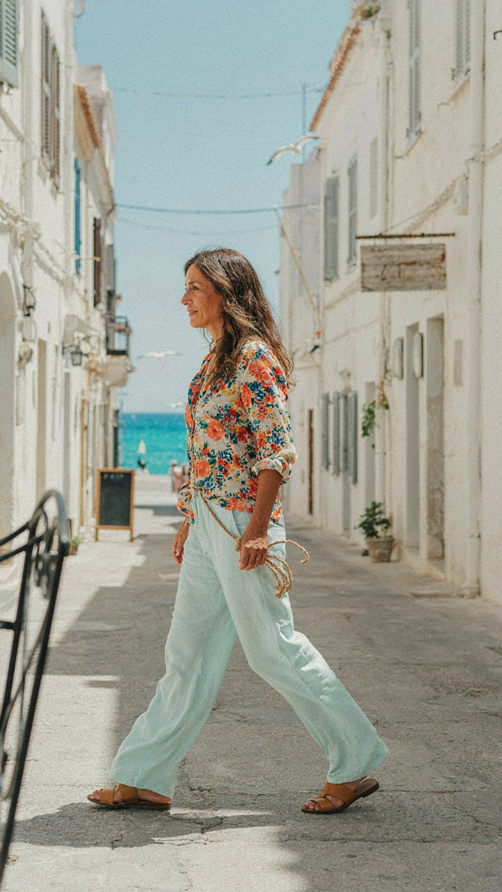
You want permission to dress in a way that signals you’re not locked into corporate rigidity. Here’s the mechanism: flowing fabrics work because they move independently of your body, creating visual separation between you and constraint itself. Physics calls this momentum. In pastel outfits, momentum is what transforms a static color choice into something that reads as intentional rather than accidental.
Linen, cotton lawn, and rayon drape without clinging. These materials have a natural recovery rate that lets them catch air and resettle, which is why they feel expensive without the price tag. Avoid structured synthetics masquerading as breathable. The fabric must move first, then your body moves inside it. That distinction changes how people perceive the outfit’s credibility.
Breathable Blends For Heat And Style
The common advice here is garbage: “just wear cotton.” Cotton alone traps moisture and wrinkles into a useless mass by noon. The real move is blended fabrics engineered for heat dissipation without sacrificing structure.
- Linen cotton blend 60/40: Linen provides wrinkle resistance and breathability while cotton adds durability. This ratio maintains shape through sweat and movement without requiring aggressive pressing.
- Viscose rayon blends: Absorbs moisture faster than cotton and dries quicker. Viscose holds pastel dyes with more depth, so colors read truer and more intentional in daylight.
- Tencel modal blends: Engineered from wood pulp and more moisture-wicking than standard cotton. These fibers regulate temperature actively, not passively.
- Silk cotton blends: Reduces static cling that destroys pastel outfits. Silk-cotton allows fabric to move without sticking to your skin, which is the difference between looking polished and overdressed.
- Performance fabric blends: Synthetic blends with wicking properties. Not ideal for pure aesthetic, but solve the practical problem of sweat marks in pastels where structure matters most.
Check fiber content before buying. A 100% cotton labeled “breathable” is a marketing term, not a guarantee. Blended fabrics are where manufacturers actually engineer for heat management. When you buy a pastel outfit for summer, the fabric composition determines whether you stay cool or become a walking advertisement for sweat stains.
Pastel Fairycore Outfits & Girly Girl Aesthetic Outfits: Reclaiming Delicacy With Edge

When Soft Palettes Meet Structured Tailoring
You want permission to wear pastels without looking powerless. The mechanism is borrowed from dark academia’s core principle: authority lives in contrast, not uniformity. Dark academia pairs structured blazers with moody colors to signal control. Pastel fairycore inverts this. You layer soft hues over sharp tailoring, grid patterns, and rigid silhouettes. The softness becomes intentional restraint, not default weakness. Cream cardigans over structured trousers. Blush button-ups tucked into high-waisted wool skirts. The palette disarms while the cut commands.
Dark academia works because severity reads as discipline. Pastel fairycore works by the same logic, reversed. You’re proving softness requires more confidence than aggression. A builder’s blazer in pale sage forces the wearer to own the paradox. The outfit demands you move with intention because the colors won’t do the talking. You’ll see this most clearly in vintage menswear influences adapted to pastels: oversized button-ups in powder blue, flat-front trousers in cream, structured outerwear in muted mauve. The formula works because structure is the load-bearing wall. Color is decoration.
Softness As Strategic Constraint
Most fashion advice says girly aesthetic means freedom and flow. That’s incomplete. Actual girly girl outfits work through self-imposed limitation. You’re not dressing for comfort or expression. You’re dressing inside a narrow color band and a narrow silhouette range, then winning within those constraints. That’s where the strength lives. A pastel outfit becomes memorable because you made three specific choices perfectly rather than seven mediocre ones. Blush, cream, and sage. Fitted waist, cropped top, midi skirt. Done.
The constraint forces precision. You can’t hide behind variety. Every piece must earn its place or the whole outfit collapses. This is why fairycore outfits photograph well and feel powerful on the wearer. You’re operating under rules, which paradoxically creates more presence than dressing without them. Pick your pastel palette for the season. Stick to silhouettes that fit your frame exactly. Build outfits by adding or removing single pieces, not by mixing random items. The limitation is the mechanism that makes softness read as intention.
The Pastel Outfit Manifesto: Intentionality Over Accident

Color As Your Competitive Edge
You want people to remember you. That’s the real reason you’re reading this. The mechanism is simple: color is information. Your brain processes it faster than facial features. Pastel outfits work because they’re rare enough to register, soft enough to feel intentional rather than loud. Most people wear pastels by accident, buying what’s on the rack. Strategic color deployment is different. You choose pastels to signal taste, not to blend in or perform femininity on demand.
The fashion industry borrowed from color psychology decades ago, but most wearers ignore the signal-to-noise ratio. A pastel outfit sends a specific message only if it’s not fighting against your context. Pale pink works differently on a founder in a tech meeting versus someone in finance. Your role determines what pastel combination reads as competent versus costume. The work is matching the shade and silhouette to your environment, then wearing it without apology. Hesitation kills the signal.
Know Your Pastel Palette Before You Shop
Stop buying pastels based on season or trend. The common advice is wrong. Pastels aren’t about following spring color forecasts. They’re about identifying which specific pastel shades complement your skin undertone and create contrast with your professional or personal brand. Most people buy three pastel pieces that clash with each other because they never mapped their palette. You need a decision framework before you enter a store.
Start by identifying three to four core pastel shades that work with your natural coloring. Pale blue, soft lavender, cream, and butter yellow aren’t interchangeable. One will flatten your complexion. One will make you look intentional. Test each against your skin in natural light, not store fluorescents. Once you’ve locked your palette, every pastel piece you buy must work with the others and serve a specific outfit formula. This prevents the wardrobe waste that happens when you collect random pastels that never coordinate.
The True Obstacle Isn’t The Color Palette; It’s Your Timid Approach To Personal Expression

Most people won’t wear pastel outfits because they fear judgment, not because pastels don’t work. You already know what looks good on you. The real move is buying one piece today, not next month. Wear it. Notice that nobody cares. Repeat. Your wardrobe expands the moment you stop treating style like a permission slip you need from strangers.