

The Visual Volume Control: Understanding Pattern Hierarchy
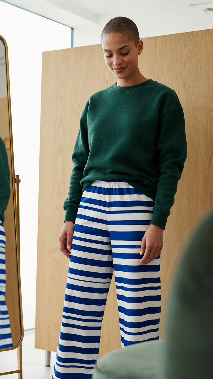
One Pattern Owns The Room
You want permission to break the rules without looking broken. Here’s the mechanism: your eye needs a landing pad, a single visual weight that anchors everything else. Borrow from graphic design’s principle of hierarchy. In pattern mixing, the dominant pattern functions as your visual anchor—the element that stops the eye first and holds it longest. Without this, you create visual noise instead of intentional contrast.
The dominant pattern claims the largest surface area. It’s typically your bottom half or your torso, whichever piece takes up the most real estate in the outfit’s overall composition. Stripes on trousers, a floral dress, a large-scale check on a blazer—these work because they occupy space aggressively. Scale matters here. A pattern printed on 40% of your body reads as dominant. One printed on 15% reads as secondary, no matter how bold the colors. Choose your anchor first. Build everything else around its visual weight, not against it.
Secondary Patterns Know Their Lane

The common advice says “keep secondary patterns subtle.” Wrong. Subtle secondary patterns often vanish, which wastes the entire point of pattern mixing. The real mechanism is contrast through difference, not contrast through timidity. Your secondary pattern should differ in scale, direction, or pattern family from your dominant one—but it should still register visually.
If your dominant is a large geometric print, your secondary works best as a small-scale texture or linear pattern like a fine stripe or micro-check. If your dominant is horizontal stripes, a vertical pinstripe or diagonal pattern creates directional contrast without competing for visual weight. Secondary patterns occupy roughly 10 to 20 percent of the outfit’s visible area. A patterned blouse under a patterned blazer, a printed scarf with a checked shirt, a patterned shoe with patterned socks—these occupy defined zones that don’t blur into each other. Secondary patterns succeed because they occupy distinct garment categories, not because they whisper.

The Unspoken Language Of Scale: Why Size Matters In Mixing Prints

Large Versus Small: Creating Visual Tension
You’re afraid of looking chaotic. That’s the real reason you’re reading this. The mechanism is borrowed from physics: visual weight. A large-scale pattern dominates space the way a heavy object dominates a seesaw. A small-scale pattern recedes. Pair them together and you create balance through contrast, not through matching or playing it safe.
Large patterns demand anchor status. They occupy the primary visual real estate, typically the top or bottom half. Small patterns become supporting players, never competing for attention. This is why a bold geometric print on a shirt pairs cleanly with a fine ditsy print on trousers. The eye lands on the dominant pattern first, then discovers the secondary one. Reverse the logic and your outfit fragments into noise.
Medium Patterns: The Risky Middle Ground
Most advice says avoid medium patterns entirely. That’s incomplete. Medium patterns are risky because they sit in the zone where two of them read as identical at a glance, creating visual confusion instead of intentional mixing. The problem is scale proximity, not medium prints themselves.
A single medium pattern works when it’s the only print in the outfit. Pair it with another medium pattern and you need a clear differentiation in pattern type, not just size. A medium floral with a medium geometric reads as deliberate. A medium floral with another medium floral reads as a mistake. When you use a medium pattern, commit it as your sole print, or ensure its companion pattern shifts to decidedly large or distinctly small.
The Color Equation: Unlocking Harmony In Clashing Patterns Outfits

Shared Color Palettes: The Unifying Thread
You want permission to break the rules without looking broken. That’s the real fear. Here’s the mechanism: color is the connective tissue that makes pattern mixing work. When two patterns share at least one dominant color, they stop competing and start communicating. Think of it like frequency alignment in acoustics—patterns at different visual frequencies need a common wavelength to resonate instead of clash.
The common advice says “pick a color and build around it.” That’s incomplete. You need to identify which color appears in both patterns first, then use that color to anchor the entire outfit. A navy striped shirt paired with a burgundy floral skirt feels chaotic until you realize both contain dark tones. Navy and burgundy as the shared base create coherence. The patterns work because the color math works.
Neutral Anchors: Grounding Your Mixed Pattern Outfit
Neutrals don’t mean beige monotony. A neutral anchor is a garment or accessory with zero pattern that forces your mixed patterns to reference each other instead of screaming for individual attention. Black, white, gray, navy, cream, and tan function as stopgaps. When patterns have nowhere else to attach visually, they attach to the neutral and become part of a unified system rather than separate experiments.
Use the neutral to frame the patterns, not hide them. A white blazer over a striped tee and geometric pants pulls the eye to structure first, patterns second. The neutral creates visual pause points. Without it, multiple patterns demand equal attention and create visual fatigue. Wear the neutral closest to your face or as an outer layer. This sequencing forces hierarchy. Your outfit becomes readable instead of overwhelming.
The “Quirky Fashion” Fallacy: Intentional Clash, Not Randomness

Deliberate Discord Creates Visual Intrigue
You want permission to break the rules without looking broken. That’s the real draw here. The mechanism is simple: contrast arrests attention because the brain expects pattern, then encounters deviation. This isn’t randomness. It’s constraint-based design. You’re not throwing incompatible things together and hoping. You’re introducing one controlled variable into a stable visual system to create tension that reads as intentional rather than confused.
Fashion has always used this. Punk mixed tuxedo elements with torn fabric. Preppy meets streetwear uses tailored silhouettes with casual prints. The difference between “quirky” (which reads as accident) and “pattern mixed” (which reads as authority) is whether your clash obeys a rule you can articulate. If you can’t explain why those two patterns belong together, your eye won’t believe it either, and neither will anyone else.
Avoiding Accidental Chaos: Structured Experimentation
Most advice says “just try different patterns and see what works.” This produces visual noise. Real pattern mixing operates like a controlled variable in an experiment: change one element, hold everything else constant, then evaluate. Start with a neutral base. Add one patterned piece. Lock the other variables (color, scale, formality) so they support that one choice, not fight it.
- The One Pattern Rule: Wear one dominant pattern and one subordinate pattern maximum. The dominant pattern anchors the outfit. The secondary pattern must share at least one color with it to create visual connection rather than collision.
- Scale Opposition: Pair large-scale prints with small-scale prints. A large floral pairs with a small geometric or micro-stripe. Equal scales create visual competition. Opposition creates hierarchy.
- Color Bridge Requirement: If your patterns don’t share a color, they must share the same undertone (warm or cool). A warm burgundy plaid and warm mustard stripes work. Warm plaid and cool blue stripes do not.
- Neutral Anchors: Use solid neutrals (white, black, gray, navy, beige) in at least 40 percent of your outfit. These create visual rest and prevent patterns from overwhelming. Prints alone with no solid space reads as costume.
- Formality Alignment: Both patterns must operate at the same formality level. Silk paisley with cotton gingham confuses the outfit’s purpose. Linen patterns with linen patterns, or structured fabrics with structured fabrics, maintain coherence.
Experimentation means testing one variable while documenting what you changed. Wear the outfit for a full day. Notice where your eye lands. Does the pattern pairing draw attention to your face or away from it? Does it feel balanced or weighted? Does the visual weight match the garment’s actual weight? These observations build your intuition faster than abstract rules ever will. After three deliberate tests, you develop a calibration that guides future mixing without overthinking each decision.
The Proximity Principle: How Spacing Dictates Pattern Mixing

When Patterns Touch
You want permission to break the rules without looking broken. That’s the real ask here. The mechanism is borrowed from visual physics: contrast increases with proximity. Put two patterns next to each other and they compete for attention instead of cooperating. Your eye can’t rest. The patterns create visual friction.
Adjacent patterns demand intention. A striped shirt under a checked blazer doesn’t blend—it vibrates. The patterns fight because there’s no visual buffer between them. You need either extreme contrast in scale (one large, one small) or matching color saturation to make it work. Most people skip this and wonder why they look chaotic instead of intentional.
When Patterns Breathe
Separation solves the problem. Put a solid-colored piece between two patterns and the visual load drops immediately. A patterned top, solid jacket, patterned pants read as three distinct decisions instead of one visual assault. Distance gives each pattern room to exist without demanding constant comparison.
The spacing acts as a visual contract between patterns. A neutral piece—white, black, gray, or a matching color from both patterns—interrupts the eye’s path and prevents competition. When patterns have breathing room, they can coexist at similar scales or saturations without chaos. The rule is simple: separate patterns with solids to let each pattern keep its authority.
The Texture Overhaul: Beyond Prints For Dynamic Mixed Pattern Outfits

Tactile Contrast: Adding Dimension To Flat Patterns
You’re afraid that mixing patterns makes you look chaotic. The real issue is that most people treat pattern mixing as a visual problem when it’s actually a tactile one. Texture creates hierarchy. A smooth silk shirt paired with a rough linen print reads as intentional. A matte cotton print next to a glossy satin print reads as accidental. The eye interprets tactile contrast as control.
Fabric weight and surface finish do the sorting work your eye can’t. Pair a lightweight linen with a dense wool. Combine a flat knit with a corduroy. The difference in how light hits each material separates the patterns instead of colliding them. This is the mechanism most pattern mixing advice skips entirely. You need opposing surfaces, not just opposing prints.
Subtle Textures: Elevating Simple Prints
Adding micro-textures to basic prints solves the problem of looking flat. A simple striped tee gains complexity when layered under a chunky cable knit. The knit’s raised surface breaks up the stripe visually, preventing monotony. This works because texture adds visual frequency without requiring another pattern.
Corduroy, waffle knit, chenille, and ribbed fabrics all accomplish this. They don’t compete with prints. They amplify them. The protocol: start with one strong print, then add one textured solid. Let the texture do the work of preventing visual boredom. This beats adding a second print and gambling on whether they’ll clash.
The “Strategic Ambiguity” Protocol: Mastering Advanced Pattern Mixing
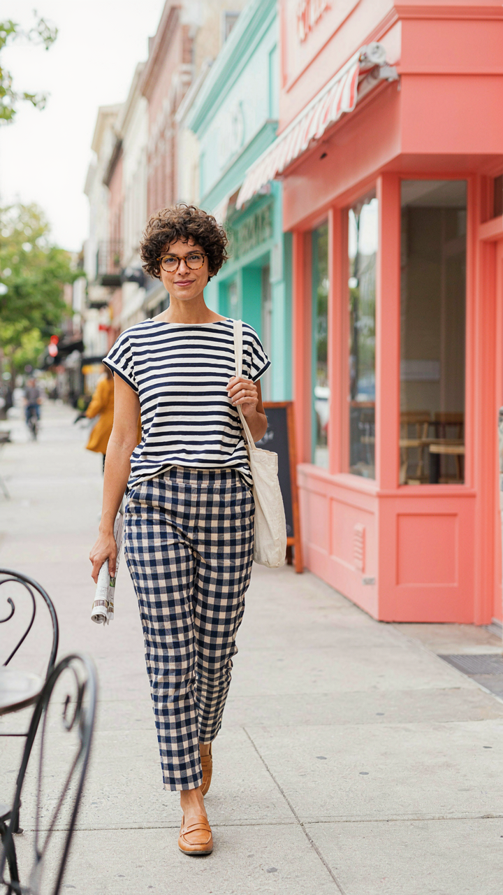
When Your Opponent Can’t Predict Your Move
You want to look intentional, not confused. Game theory from military strategy and economics maps directly onto visual perception: your outfit is a signal, and the observer is trying to decode whether you made a choice or stumbled into chaos. The mechanism is constraint removal. Most people mix patterns badly because they add rules when they should subtract them. Conventional advice says “pick a dominant pattern and support it with a smaller one.” That’s defensive thinking. It signals fear of complexity.
The real leverage point is predictability. The moment an observer can anticipate the next pattern in your outfit, you lose authority. When you break their prediction model, they read it as intentionality instead of accident. This happens when patterns compete for visual weight without resolution. Stripes and checks at similar scales don’t cancel each other. They create tension. That tension reads as control, not confusion, if the colors stay disciplined. The observer’s brain can’t decide which pattern to follow, so it defaults to assuming you knew what you were doing.
Order Emerges From Visual Noise
Chaos theory in design teaches that systems with apparent randomness often follow hidden rules that create coherence. Apply this to pattern mixing: establish one non negotiable element, then break every other rule around it. A single solid color that appears in both patterns acts as the strange attractor. Your eye returns to it. Everything else becomes orbits around that anchor.
Most pattern mixing fails because people believe more variety equals more sophistication. It doesn’t. Complexity requires an organizing principle you never explicitly state. The organizing principle here is repetition of a single hue across incompatible patterns. If your stripes are navy and white, and your check is navy and cream, the navy becomes the throughline. The patterns stop fighting. They organize themselves. You execute this by selecting patterns that share one color value, then varying scale and direction aggressively. The visual system processes this as intentional layering, not accident.
Accessory Alchemy: Elevating Your Mixing Patterns Outfit With Intent

Small Doses, Powerful Pattern Accents
You want permission to go bigger without looking reckless. Here’s the mechanism: accessories operate on a different visual weight than garments. A patterned scarf or bag occupies maybe 5-10% of your visual field, but it registers as a deliberate move because you chose it. The constraint forces intentionality.
Most pattern mixing advice tells beginners to “start small” then never explains why. It’s not timidity. It’s economics of attention. One patterned accessory against two coordinated prints in your base layers creates visual hierarchy. Your eye lands on the prints first, then finds the accent. Without that anchor, all three patterns compete for dominance and nothing reads as coherent.
Unifying Elements Bridging Disparate Prints
Color repetition isn’t decoration—it’s the glue that makes pattern mixing work. Pull one color from your dominant print and echo it in your secondary print and your accessories. This is borrowed from graphic design’s principle of unity: you repeat elements to create cohesion across distinct objects.
One color thread running through all three patterns collapses visual chaos into intentional composition. A navy stripe, a rust geometric, and a cream texture feel disconnected until you add a navy accessory or shoe. The repeated navy doesn’t blend the patterns together. It tells your eye they belong in the same outfit. When shopping for accessories, identify which color in your outfit appears least, then prioritize accessories that amplify it.
The True Obstacle Isn’t The Patterns; It’s Your Internal Resistance To Asserting Visual Dominance

Most people blame pattern mixing on complexity. They blame trends. They blame their closet. Wrong. You’re afraid of being seen. Pattern mixing outfits demand you stop hiding behind neutral safety. Today, grab two patterned pieces you own and force them together. The discomfort you feel isn’t a design problem. It’s permission you’re finally giving yourself to take up space. Most people dress small their entire lives because they never learned that confidence looks better than matching.