

The Illusion Of Novelty: Why Black And White Outfits Endure

Your Brain Craves Contrast
You want permission to stop overthinking your wardrobe. Here’s the mechanism: your visual cortex processes contrast faster than any other design signal. Black and white create maximum contrast without relying on trend cycles. The human eye locks onto boundary lines where light meets dark before processing anything else. This isn’t preference—it’s neurology. Your brain treats high contrast as information-rich, which registers as intentional and competent. Low contrast reads as passive or accidental. Black and white force clarity.
The practical application is simple: contrast creates perceived effort. You can wear a shapeless black top and white bottom and the outfit reads as considered because your eye gets pulled to the boundary between them. That boundary demands attention. Colors require harmony work. Black and white require none. They’re neurologically efficient, which is why they always read as put-together, regardless of decade or fashion cycle.
Design Never Actually Left

Everyone treats black and white as timeless, which is lazy framing. The real story is this: design movements cycle through complexity and simplicity, but when designers need to reset, they default to pure contrast. After baroque maximalism, modernism stripped everything to black, white, and grid. After 1980s maximalism, minimalism came back with black and white. After digital maximalism, we’re seeing monochrome again. It’s not that black and white survive trends—they survive the pattern of human taste oscillating between too much and nothing.
The historical constant is this: black and white appears whenever a movement needs to establish authority through reduction. Coco Chanel didn’t invent the little black dress because she was nostalgic. She introduced it because post-WWI, women needed functional clothing stripped of ornamentation. The white shirt existed before, but it became a power signal when paired with black trousers during the rise of formal business culture. The mechanism is identical each time: reduce visual noise, increase perceived control. When you wear black and white, you’re borrowing the same psychological weight that design movements used to signal cultural reset.

The Contrast Cadence: Mastering Visual Dominance In Black And White Clothes

Where The Eye Lands First
You want this section because you’re tired of looking boring without understanding why your black and white combinations feel flat. The mechanism is contrast hierarchy, borrowed straight from physics: light reflects at different intensities, and your eye always tracks the highest intensity first. Black and white exploit this principle in opposite directions. Hard contrast means placing pure black against pure white with zero gradient—think a crisp white button-up tucked into black trousers. Soft contrast introduces gray tones, textures, or fabric weight variations that dilute the visual shock. Hard contrast reads as intentional and structured. Soft contrast reads as refined and considered.
The difference matters tactically because hard contrast demands precision in fit and proportion—any sloppiness amplifies because nothing hides behind tone. Soft contrast forgives fit errors and works better when you’re layering or mixing fabric weights. A black wool blazer over a cream silk blouse creates soft contrast through warmth and texture, not just darkness and lightness. Hard contrast requires all pieces to land clean. A black matte shirt and white matte pants with sharp edges between them give no mercy to baggy cuts or poor tailoring. Choose hard contrast only when your pieces fit exactly as intended.
Symmetry Breaks The Monotony
The real advice says balance black and white fifty-fifty for harmony. That’s incomplete. Asymmetrical splits actually hold visual interest longer because your brain doesn’t lock into a pattern. A black outfit with a single white accent—a white belt, white socks, white pocket square—creates a focal point that symmetry destroys. Symmetrical splits (black top, white bottom, or vice versa) read as safe and formal because the eye has nothing to hunt for.
Asymmetry works because it forces your eye to move across the outfit, not stop at the midline. A black blazer, black trousers, and a white undershirt reads professional but static. Black blazer, black trousers, white undershirt, white shoes creates movement. The eye travels from one white element to the next, building narrative. Use asymmetry in street wear and casual settings. Reserve symmetry for contexts where uniformity signals respect or authority—boardrooms, formal events, coded spaces where conformity matters more than visual dynamism.
The Material Matrix: Texture As Your Secret Weapon

When Contrast Becomes Friction
You want black and white to work because you believe the colors alone carry the load. They don’t. Borrowing from physics, texture creates visual friction, and friction is what stops an outfit from dissolving into a flat graphic. A black wool blazer next to white linen reads as deliberate. Black cotton next to white silk reads as intentional. The texture differential is the actual work happening. Without it, you’re just wearing two colors that cancel each other out.
The mechanism is contrast at the fiber level, not the color wheel. Matte absorbs light. Shiny reflects it. Place them adjacent and your eye gets pinned to that boundary. That’s where a black and white outfit shifts from costume to composition. Most people ignore this entirely, then blame the colors when the outfit feels thin. The colors aren’t the problem. The sameness of surface is.
Silk, Wool, Leather, And How They Stack
Material interplay isn’t decoration. It’s structural logic for how an outfit holds attention.
- Silk against wool: Silk’s light reflection bounces off wool’s matte absorption. A white silk blouse under a black wool sweater creates depth. The materials work in opposition, which is the point.
- Leather and cotton: Leather’s density and sheen make cotton look permeable by comparison. Black leather jacket over white cotton tee establishes hierarchy through material weight, not design alone.
- Wool and linen: Both matte, but linen’s weave is looser and catches light differently. A black wool coat and white linen pants feel connected because the eye can track the material shift without breaking.
- Silk and leather: The highest contrast pair. Silk drapes and reflects. Leather holds rigid form and absorbs. Together in black and white, they read as sophisticated because the materials are doing opposing jobs.
- Cotton and felt: Felt’s density makes cotton look threadbare next to it. A white cotton shirt under a black felt coat creates dimension through material authority, not pattern.
The pairing rule is simple: vary the surface behavior. If everything is matte or everything has sheen, the outfit collapses into a flat statement. The material combinations you choose determine whether black and white reads as deliberate or accidental. Pick one matte and one reflective element per outfit layer.
The Negative Space Protocol: What You Leave Out Defines Your Black White Outfit

Skin Exposure As Architectural Constraint
You want this section because you’re afraid bare skin reads as “unfinished.” It doesn’t. In architecture, negative space isn’t emptiness—it’s load-bearing structure. Your exposed skin functions the same way. It creates visual weight distribution that either anchors or destabilizes your outfit’s entire silhouette.
Black and white outfits live or die on proportion. Show collarbone and ankle with a fitted waist, the eye settles. Show collarbone, waist, and ankle simultaneously with loose fabric everywhere, you’ve created visual chaos. The mechanism: exposed skin creates visual “stops” that tell the eye where the silhouette ends. One strategic exposure point per outfit. Maximum two if they’re separated by at least twelve inches of covered fabric.
Layering Through Subtraction
The standard advice is “layer for depth.” Wrong. Layering in black and white actually means removing what doesn’t serve contrast or structure. Each layer must create a visible line or shadow. Dropping a sheer white layer over solid black creates edge. Dropping a gray anything over black and white kills the entire outfit’s tension.
Count your visible seams and edges. Three to four is maximum before your eye loses hierarchy. A black turtleneck under a white oversized blazer generates one seam line. Add a belt, you’ve got two. Add a visible tank strap, you’ve got three—now stop. The protocol: outline each layer’s visible boundary on paper before wearing. If you draw more than four lines, remove a layer.
Beyond Basic: Elevating Classy Black And White Outfits With Intent

Structure Over Decoration
You want to look intentional without trying too hard. That fear drives most people toward safe choices that read as invisible. The real mechanism is borrowed from architecture: load-bearing walls versus decoration. In black and white outfits, structural integrity means the fit and cut of each piece does the work, not prints or layering tricks.
A well-cut black blazer with sharp shoulders carries weight. White trousers with a clean break at the ankle establish proportion. These elements function like columns and beams—they’re non-negotiable. When your foundation pieces have architectural precision, you can subtract everything else. The outfit stands alone because the garment construction itself creates visual interest and authority.
One Detail Breaks The Pattern
Adding multiple accent pieces to black and white feels cluttered. That’s the common advice everyone misses. One unexpected element deployed correctly creates tension and pulls the whole composition forward. A white silk camisole under a black oversized menswear blazer. A single gold chain. A structured leather belt in a unexpected width. The detail must have material weight or scale to register.
The mechanism is contrast within contrast. Black and white are already at maximum opposition, so you’re not adding visual noise—you’re creating a focal point that makes the entire outfit feel deliberate. Place that single detail at the torso or waist where it anchors the silhouette. Everything else recedes. The outfit becomes about that one choice, not about having tried.
The Accessory Algorithm: Precision In The Peripheral
Three Point Rule For Accent Pieces
You want to know the right number of accessories because you’re afraid of looking either empty or chaotic. The real mechanism is restraint as contrast. Black and white outfits operate on high visual contrast already, so accessories function like a signal-to-noise problem. Add one focal piece, one functional piece, and one textural piece. Stop. More than three creates visual competition that dilutes the outfit’s core structure.
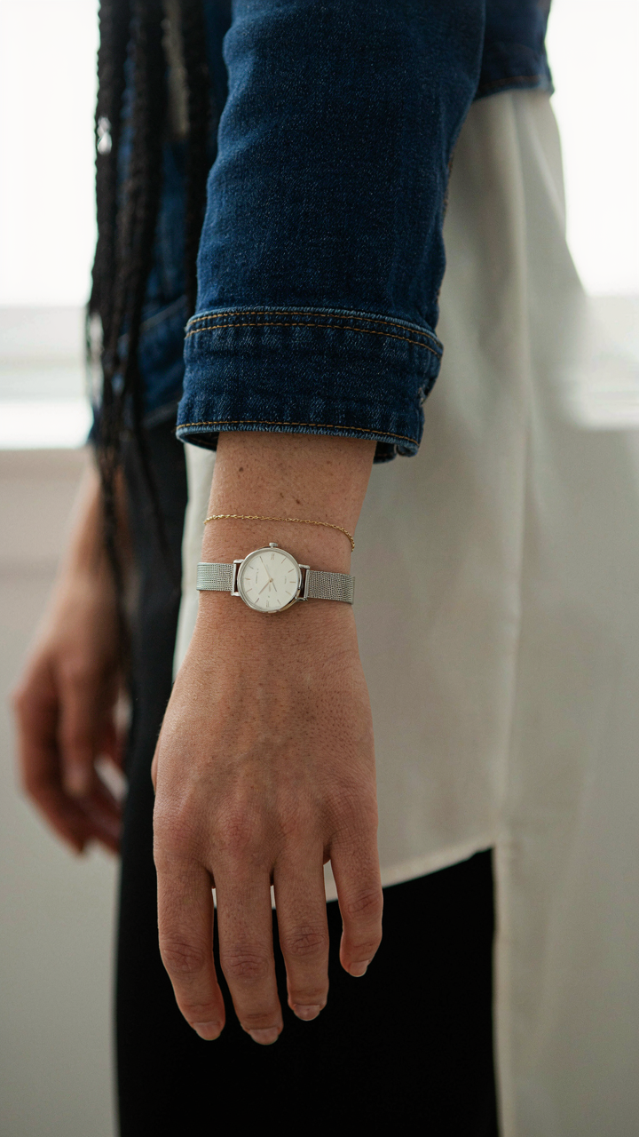
The focal piece draws attention deliberately: a statement bag, structured shoes, or bold jewelry. The functional piece serves the outfit’s logic: a belt, watch, or scarf that seems necessary rather than decorative. The textural piece adds dimension without adding visual weight: a leather accessory, metal hardware, or woven element. This isn’t aesthetics. It’s editing. Your black and white base is already doing the work. Accessories either reinforce the structure or undermine it. Choose pieces that support the outfit’s line and proportion, not pieces that compete for dominance.
Cold Metal Versus Warm Metal
Most advice says “match your skin tone,” which is incomplete. The real rule involves treating metals as visual temperature. Silver, platinum, and white gold read as cool and visually recede slightly, making them expand the negative space in your outfit. Gold, brass, and copper read as warm and advance forward, adding visual weight to wherever you place them on your body.
Black and white outfits need intentional metal placement because the outfit already carries maximum contrast. Warm metals on a black and white outfit create a focal point through temperature shift, not just material. Cold metals maintain the outfit’s geometric clarity and feel contemporary. Choose based on where you want the eye to land. Warm metals on wrists, ears, or hands draw attention to those zones. Cold metals on the same zones maintain focus on the outfit’s silhouette instead.
The Wardrobe Decimation Method: Building A Functional Capsule Wardrobe

Stop Confusing Quantity With Options
You want a capsule wardrobe because you’re afraid empty hangers mean empty choices. The mechanism is simple: more items create decision paralysis, not freedom. A bloated closet forces you to hunt for combinations that work. Black and white pieces eliminate this friction because they pair with almost everything else you own, but only if you ruthlessly cut the noise first. Start by removing anything that doesn’t perform double duty in your black and white rotation.
The real cost of keeping non-essential pieces isn’t space. It’s cognitive load. Every item you keep demands a mental decision about whether it fits the outfit you’re building. Your brain burns energy on that decision tax before you even leave the house. Black and white outfits work because they reduce variables, but only when you’ve already eliminated the outliers. Go through every piece and ask: does this black or white item work with at least three other things in my closet right now? If the answer is no, it goes.
The System That Compounds
Economics calls this the concept of diminishing returns. In fashion terms, that means each new piece you add has to increase outfit combinations by a real percentage, not just sit there. A black blazer compounds with white shirts, black pants, white pants, and neutral layers. A black blazer that only works with one outfit is a decoration, not a garment. This is why black and white outfits multiply faster than other color combinations. The interplay between two opposing colors creates mathematical efficiency in your closet.
Build backwards from the life you actually live, not the life you think you should want. If you work from home, a structured black blazer won’t compound anything useful. If you meet clients weekly, it compounds with every outfit you own. Count your planned outfit scenarios for the next month. Write down what you wore. Now look at the gaps between what you own and what you actually repeated. Black and white pieces fill those gaps because they’re the connective tissue. Buy only pieces that solve three specific gaps you identified, then stop buying.
Decoding Monochrome Outfit: When Black And White Outfits For Women Are More Than Just Colors

The Contrast That Controls Perception
You want to know if black and white actually works because you’re afraid it won’t—that it’ll look boring or try too hard. Here’s the mechanism: contrast is a physics principle. Light reflects off white, absorbs into black. Your eye processes this maximum difference faster than any other color pairing. The outfit doesn’t just sit there. It demands attention through pure optical force, not decoration.
Black and white outfits exploit how human vision prioritizes edges and boundaries. Your brain reads the silhouette first, the details second. This inversion of normal fashion hierarchy means fit matters more than fabric texture, proportion matters more than embellishment. When contrast does the work, excess becomes liability. You build authority through subtraction, not addition.
Beyond Gender, Beyond Trends
The idea that black and white dressing is gender-neutral is half-true and half-marketing. Reality: the palette works because it strips away the coded signals that make clothing read as “masculine” or “feminine” in the first place. A black blazer and white shirt don’t signal gender. They signal function. Gender gets read into the cut and fit, not the color.
This is why black and white appears across workwear, streetwear, formal dress, and subcultures with no translation needed. The palette translates across economies and geographies because it removes cultural color symbolism. You’re left with pure composition. That’s the actual reason it endures—not because it’s universally flattering, but because it’s universally decipherable. The outfit communicates its intent before anything else registers.
The Unspoken Language Of Style: Your Presence, Not Just Your Black And White Outfit

Confidence As The Real Signal
You’re reading this because you hope the outfit does the work for you. It doesn’t. Black and white outfits work like a signal in information theory: they reduce noise, but only if the sender transmits clearly. The outfit creates permission for people to look. Your confidence determines what they see when they do.
Most advice treats confidence as motivation or mindset. Wrong. Confidence is a physical state that changes how you occupy space. When you wear black and white, the high contrast demands attention. If your posture, pace, and eye contact don’t match that demand, people sense the disconnect. They read it as uncertainty, not humility. The outfit promises directness. Your body must deliver it.
How You Move Changes What They See
Body language doesn’t amplify an outfit. Body language is the outfit’s actual message. Black and white has no personality until you inhabit it. A slouch in monochrome reads as hiding. An open chest and steady stride in the same outfit reads as intentional. The clothes are neutral. You’re the variable.
Stand and walk like you’re claiming the space, not asking permission to use it. Keep your shoulders back without tension. Move deliberately between points instead of drifting. Make eye contact longer than feels comfortable for three seconds. These aren’t performance tricks. They’re the only way a black and white outfit communicates what it’s designed to communicate: clarity and control. Without them, you’re just wearing a costume.
The Real Obstacle Isn’t Your Wardrobe; It’s Your Inability To See Style As A System, Not A Shopping List

Most people buy black and white pieces randomly, then wonder why nothing clicks together. You don’t need more clothes. You need a framework. Start today by picking one black and white outfit combination you already own and wear it three times this week. Notice what works. Notice what doesn’t. Build from observation, not impulse. The person who masters constraints always outfits the person drowning in options.