

Beyond Basic Black: The True Power Of Monochrome Aesthetic Outfits

Why Most People Fail At Monochrome
You’re hoping monochrome solves the “what do I wear” problem without forcing you to think about fit or proportion. That’s why it fails. The real mechanism is contrast within constraint. You’re not buying a uniform. You’re working with tonal gradation, texture variation, and silhouette tension inside a single color family. Most people skip this and just wear two shades of the same gray. That’s not monochrome. That’s lazy.
The difference between a deliberate monochromatic outfit and a sloppy accident is whether you’ve engineered visual interest through material and cut instead of relying on color to do the work. A charcoal wool blazer over a lighter cotton tee under a dark denim jacket creates hierarchy through weight and weave, not hue. The eye still travels and reads the outfit. Without that layered texture strategy, a monochrome fit reads as unfinished or like you ran out of time.
What Intentional Monochromatic Dressing Actually Signals

Clothing sends encoded information about decision-making quality, and monochrome outfits function like a filter in signal processing: they amplify what remains visible because they eliminate noise. When you remove color variation, every other choice becomes magnified. The observer processes fit precision, fabric quality, and silhouette discipline faster. You’ve eliminated the escape route of “bright colors distracted me.” Your bones show.
This is why monochromatic dressing reads as intentional. You’ve made visible the part of your thinking that most people hide behind pattern and color combinations. It signals you understand proportion because nothing else is working for you. It signals you invest in fabric because texture becomes the primary visual tool. The mechanism is simple: remove one variable, and suddenly every other variable demands competence. That’s the real power.

The Hue Hierarchy: Mastering Monochromatic Colors Beyond The Obvious

Underrated Shades For Powerful Grey Outfit Looks
You think grey is safe. That’s why you’re here—you want permission to disappear while looking intentional. The mechanism is tonal separation. Grey’s power comes from its position on the value scale, not from the color itself. The lighter and darker your greys sit relative to each other, the more visual structure your outfit generates without needing contrast.
Charcoal, stone, ash, and dove grey occupy different positions on the grey spectrum. Most people stack similar tones and wonder why their outfit reads as flat. Pairing charcoal trousers with a stone sweater and dove accessories creates depth through value separation alone. This works because your eye reads contrast before it reads color. The outfit doesn’t need black and white to register as intentional.
How Color Temperature Dictates Outfit Impact
Color temperature is a physics concept applied to light wavelengths, and your monochrome outfit either aligns with it or fights against it. Warm greys contain undertones of brown or beige. Cool greys lean toward blue or purple. The mistake everyone makes is mixing them without recognizing what they’re doing. A warm grey blazer worn over cool grey trousers creates visual noise that reads as mismatched, not intentional.
Identify your dominant grey’s temperature first. Does it pull toward brown or blue when you hold it in natural light? Build your outfit in that direction. Warm greys pair with warm charcoals and warm blacks. Cool greys do the same with their cool counterparts. Monochrome doesn’t mean colorless—it means every shade serves the same temperature anchor. When all pieces share the same undertone family, the outfit coheres instead of fragments.
The Material Matrix: Elevating Your Monochromatic Outfit Through Texture
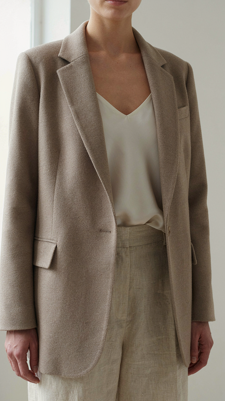
Blending Fabrics For Depth, Not Distraction
You want texture because you’re afraid a monochrome outfit looks flat and cheap. The real mechanism is contrast in light absorption. Matte fabrics kill light. Glossy fabrics bounce it. Combine them in the same color family and your brain registers dimension without your eye detecting a color shift. This is basic material science applied to clothing.
Pair a matte wool blazer with a silk camisole underneath in the same neutral tone. Add linen trousers. The three fabrics reflect light differently at different angles. Your outfit gains visual weight and sophistication without introducing competing colors. The monochrome framework stays intact while texture creates the illusion of intentional complexity.
The Subtle Language Of Tactile Contrasts
Common advice says “mix smooth and rough textures.” That’s incomplete. The real play is matching the scale of texture contrast to the visual weight you want. Borrowing from material engineering, you’re creating a composite. Fine textures like crepe or jersey paired with bold textures like cable knit or tweed establish hierarchy without noise.
Wear a smooth charcoal turtleneck under a chunky knit cardigan in the same color. The turtleneck recedes. The cardigan advances. Your silhouette gains shape and intentionality. The monochrome story reads stronger because texture does the work color normally does. Texture becomes the only variable you’re controlling, which means you control it completely.
The Silhouette Strategy: How Shape Defines A Monochromatic Outfit

Lines Create Hierarchy Without Color
You want people to read your body before they read your face. That’s the real reason you care about this. When you remove color, line becomes your only tool for directing attention. In architecture, sight lines guide movement through space. In a monochrome outfit, vertical, horizontal, and diagonal lines guide the viewer’s eye exactly where you want it. A vertical seam elongates. A horizontal band cuts and anchors. Diagonal elements create tension and energy. The mechanism is pure geometry: your body becomes the canvas, and lines become the language.
Black outfits on women work best when you layer conflicting lines to create visual interest without relying on color contrast. A fitted black turtleneck paired with wide-leg trousers creates vertical continuity interrupted by horizontal volume at the hip. A structured black blazer with a draping black slip dress underneath uses hard and soft lines simultaneously. The eye doesn’t get bored because the silhouette tells a story through shape, not hue. This is why generic all-black advice fails: most people throw on matching pieces and wonder why they look flat.
Weight Distribution Demands Strategic Placement
Commanding presence isn’t about confidence. It’s about visual weight distribution that makes people perceive you as occupying more space than you physically do. Place volume where you want attention. If you want authority, anchor weight at the shoulders with structured fabric or intentional bulk. If you want elongation, keep the torso lean and place volume only at the hem or at the legs. A monochrome outfit reveals this immediately because nothing distracts from proportion. An oversized black coat over fitted black trousers creates a pyramid shape that signals control. A fitted black top with a voluminous black skirt creates an inverted pyramid that signals movement and unpredictability.
The mistake everyone makes is assuming balance means equal distribution. It doesn’t. Strategic imbalance creates impact. Heavy fabric concentrated at the shoulders and chest makes you read as grounded and immovable. Heavy fabric only at the hem makes you read as dynamic and unstable. Your silhouette either commands the room or it drifts. Test this by photographing yourself in different monochromatic proportions and assessing where your eye lands first. That’s where your visual weight actually sits.
The Contrast Calibration Method: Preventing Blandness In Your Monochrome Outfits For Women

How Light Absorption Creates Visual Hierarchy
You’re afraid a monochrome outfit will make you disappear. Physics gives us the actual lever: light absorption. Fabrics absorb and reflect light differently based on weave density, finish, and fiber type, not just color name. Cotton matte absorbs more light than silk satin in the same shade. A monochrome outfit needs textural variation because your eye tracks where light bounces, not where it doesn’t. This is why all-black looks flat but black wool next to black silk reads as intentional depth.
The mechanism is straightforward. Layer a dense fabric against a reflective one at the same tonal value. Matte leather over silk. Structured wool beside fluid knit. The tonal value stays unified, but the light plays differently across surfaces. Your brain reads this as sophisticated restraint, not accidental uniformity. This is the actual difference between a monochrome outfit that lands and one that reads like you grabbed whatever was clean.
Texture Over Tone Shifts
Everyone says add accessories or play with undertones. That’s incomplete advice that keeps people buying more stuff they don’t need. The real calibration happens through fabric composition, weight, and surface treatment. A monochrome outfit with three different fabric textures beats a monochrome outfit with one fabric in three different tones. Texture creates shadow and dimension without breaking the visual rule of sameness.
Pick one dominant fabric weight, then interrupt it strategically. If your base is fluid crepe, add crisp cotton at the collar or cuff. If your base is structured wool, layer a knit underneath that shows texture contrast. The monochrome outfit holds because you’re not introducing new colors, only new light behavior. This approach works in every season and every skin tone because you’re working with light, not marketing categories.
Accessorizing With Intent: The Monochromatic Outfit Multipliers

Metallics And Natural Textures As Contrast Anchors
You want accessories to feel intentional rather than like you grabbed what was nearby. The mechanism is borrowed from industrial design: contrast ratio. In monochrome, your accessories create visual separation not through color but through material finish and surface properties. Gold, silver, and bronze catch light differently than matte fabrics. Natural elements like leather, wood, and stone interrupt visual monotony without breaking the color story.
Metallics work because they reflect light at angles that cloth cannot. A silver watch against a gray outfit doesn’t clash because it occupies a different visual frequency. Leather belts, wooden bag handles, and stone jewelry function as visual resting points. The strategy is simple: choose one primary metal tone and one natural material, then repeat both twice across your outfit. This creates coherence while fighting the flatness monochrome can produce without active accessorizing.
Strategic Color Breaks That Strengthen Monochrome
Most advice says never break monochrome, which is incomplete and self-defeating. The real rule is this: a single accent color works only if it occupies less than 10 percent of your visual mass and sits at a focal point. Your eyes move to contrast first. A burgundy scarf or a red lip against all black isn’t a monochrome failure, it’s a focal anchor that makes the monochrome read as deliberate framing rather than default.
The mechanism here is figure-ground separation from perception psychology. Your brain needs somewhere to land. Without it, monochrome reads as costume or laziness. A small, saturated color at face level, wrist level, or shoe level (one location only) forces viewers to register the monochrome as choice. Execute this by selecting one accent color, limiting it to a single accessory or detail, and placing it where the eye naturally settles first.
The Psychology Of Neutral Outfit Dominance

Why Neutrals Command Silent Authority
You want to be taken seriously without trying. That’s the real reason you’re reading this. The mechanism is simple: neutrals work because they operate in the background of human perception. Your brain processes color as information. When you wear a monochrome outfit, you eliminate competing signals. The viewer’s attention routes directly to your face, your posture, your movement. Nothing distracts from your presence. This is why boardrooms default to black, gray, and navy. It’s not tradition. It’s neurology.
Contrast is what builds authority, not color saturation. Military dress codes have known this for centuries. Formal wear strips away the chromatic noise that makes people visually exhausted. A monochrome outfit forces the observer to read you differently. They assess your silhouette, your fit, your grooming. They notice what you choose to emphasize because nothing competes for their eye. The outfit becomes invisible while you become visible. This is the inversion most people miss.
The Invisibility Trap And How To Escape It
The common advice here is garbage: “Add an accessory for pop.” That’s band aid thinking. The real pitfall isn’t blandness. It’s sameness without intentionality. Wearing gray because you think it’s safe produces the opposite effect. You become background noise yourself. The fix is textural contrast. Use fabric weight, weave patterns, and surface variation to create visual interest within the monochromatic range. A charcoal wool coat over a cream silk shirt registers differently than two flat gray fabrics. Texture speaks louder than hue.
The other escape route is silhouette precision. Monochrome only disappears when the fit is generic. A sharp, tailored monochrome outfit commands attention through structure and proportion. Oversized or slouchy neutrals read as indifference. Fitted or intentionally draped monochrome reads as control. The outfit stops being invisible and becomes a statement about how you move through space. Your job is to make every neutral shade count through either fabric or form.
Seasonal Adaptations: The Monochrome Outfit Across Climates

When Heat Demands Fabric Strategy
You care about this because you’re afraid a monochrome outfit will trap you visually in summer—that you’ll vanish into a blob of fabric instead of looking intentional. The real mechanism is fabric physics: drape and breathability interact with monochrome’s visual weight. Light fabrics read as airier; heavy ones read as dense, regardless of color. Summer monochrome demands natural fibers that move. Linen, cotton, and silk all compress the visual bulk of single-color dressing by creating surface variation through texture rather than hue contrast.
The common advice is to “go light and breezy.” That’s incomplete. What matters is structure paired with ventilation. A lightweight linen shirt with intentional pleats or a draped linen dress creates visual interest without breaking the monochrome frame. Unstructured, formless pieces in summer monochrome read as lazy. Pair fitted or purposefully loose silhouettes with breathable materials. Invest in garments with intentional seaming that creates shadow lines—a monochrome outfit survives summer heat through geometric precision and fabric choice, not color dodging.
Layering Without Collapse
Winter monochrome requires textile intelligence, not just stacking. Thermodynamics teaches us about insulation: the principle of trapping dead air without adding volume. Apply this directly to monochrome layering. Three thin, high-density layers beat two thick ones. Merino wool base layers, a fitted mid-weight sweater, and a structured coat maintain visual sharpness while managing temperature. Bulk destroys monochrome’s clarity.
- Merino wool base layers: Thin, insulating, and compressible. They regulate temperature without adding visual mass under your monochrome silhouette.
- Fitted turtlenecks: Create definition at the neckline and torso. They prevent the formless blob effect that loose layering creates in winter monochrome.
- Structured outerwear: A tailored wool coat or puffer maintains line integrity. Avoid oversized pieces that bury your monochrome outfit’s intentionality.
- Knit textures with density: Cable knits, ribbed sweaters, and waffle-weave pieces add surface variation that compensates for single-color restriction.
- Monochromatic accessories: Scarves, hats, and gloves in matching shades extend the visual line without introducing competing hues or bulk.
The tactical protocol: choose pieces where each layer serves a function—insulation, definition, or line extension. Layer vertically, not horizontally. A monochrome winter outfit works when you subtract visual weight while adding thermal resistance.
The Investment Play: Building A Lasting Monochrome Wardrobe

Buy Once, Wear Forever
You’re worried you’ll waste money on clothes that don’t work. That fear is rational. The mechanism most people miss: monochrome outfits compress decision friction, which means you actually wear what you own instead of cycling through unworn pieces. A black wool coat worn 200 times over five years costs less per wear than a trend piece worn twice. Economics calls this cost-per-unit. In monochrome dressing, you’re lowering the cost-per-wear by eliminating the color-matching problem entirely.
Start with one neutral base: black, navy, grey, or cream. Invest in natural fibers that hold structure and age visibly—wool, linen, cotton blends. Cheap synthetics pill, fade unevenly, and look exhausted within months. A monochrome wardrobe punishes low-quality construction because you see every flaw across multiple wears. Buy pieces that survive 50+ washes or seasons of wear without degrading. This isn’t morality. It’s arithmetic.
The Anchor Pieces Never Change
Common advice says “invest in basics.” That’s too vague to act on. Real strategy: identify which silhouettes work on your body, then buy variations in your chosen monochrome palette only. A well-fitted crew neck t-shirt, a structured blazer, straight-leg trousers, a long-sleeve shirt—these become your anchors. Trends in monochrome come and go through fit and fabric texture, not through adding random colors or patterns that break cohesion.
Your anchors stay constant for years. You build around them. A crisp white button-up from 2015 is still functional in 2024 because button-ups don’t trend out. Chasing fleeting trends within monochrome means swapping silhouettes every season, which fractures your wardrobe coherence. The goal is to wear 80% of your closet regularly. When every piece works with every other piece, redundancy vanishes.
Common Monochrome Mistakes: What To Ruthlessly Avoid
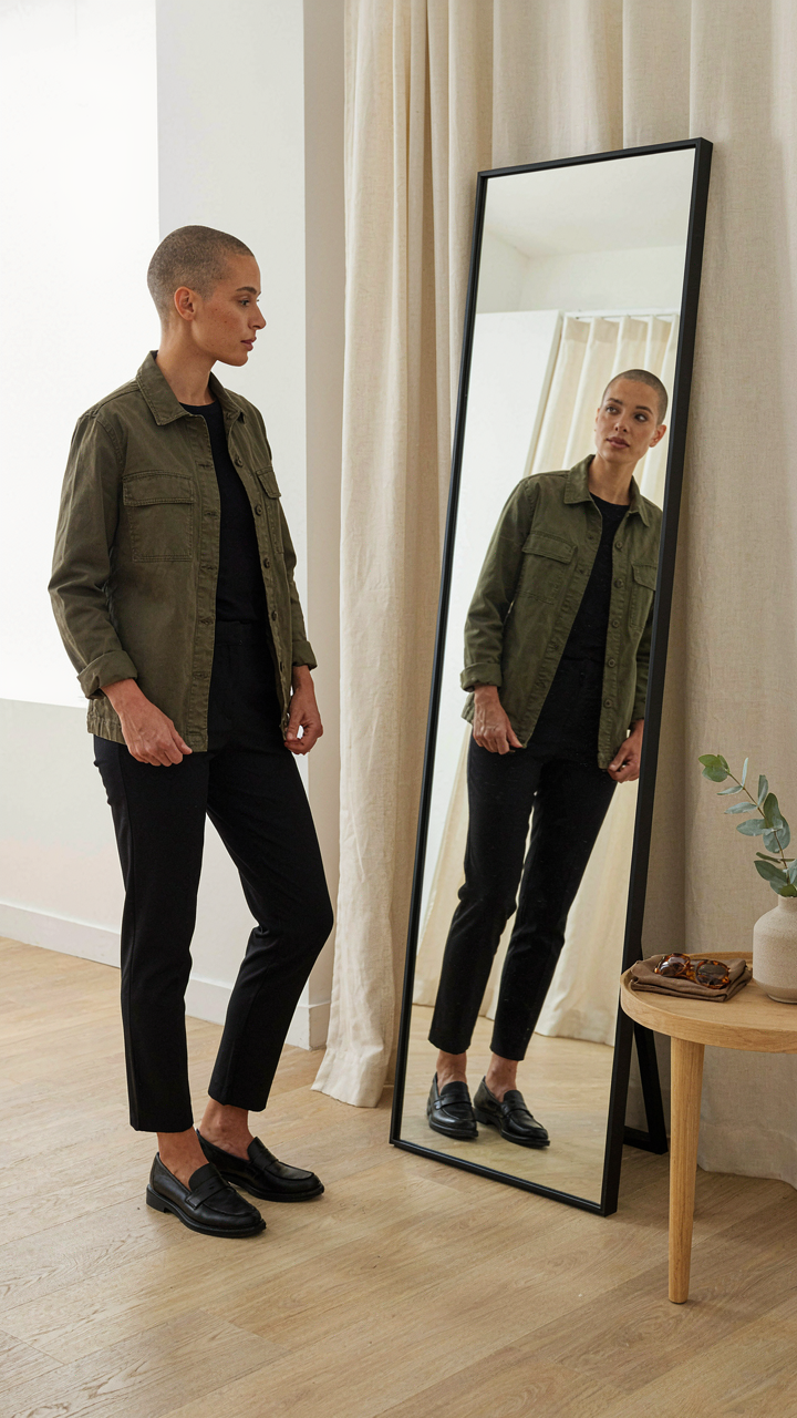
Fit Breaks The Entire Visual System
You’re reading this because you’re afraid that a monochrome outfit will expose you instead of protect you. Here’s the mechanism: fit is structural integrity. In architecture, a building with poor proportions collapses regardless of material quality. A monochrome outfit operates the same way. When everything matches in color, silhouette becomes the only variable your eye processes. Loose fabric, bunched hems, or shoulders that don’t land correctly immediately signal sloppiness. There is no color to distract from the construction.
Most advice tells you to “just size up” or “wear what feels comfortable.” That’s incomplete. Monochrome demands precision because you removed the only tool that hides poor construction: color contrast. Get pieces tailored at the hem and shoulders. Check that your top doesn’t extend past your hip bone unless it’s intentionally oversized. Verify that your pants or skirt sits at your natural waist, not floating. Fit first, color second.
Fabric Care Determines Whether It Stays Monochrome
Ignore laundry mechanics and your monochrome outfit degrades into a patchy, faded version of itself within months. Different fabrics age at different rates when grouped together. Black cotton bleeds dye onto lighter neutrals during the first five washes if you don’t separate loads. Wool shrinks unpredictably if dried hot. Linen wrinkles aggressively without proper humidity control. The visual cohesion of monochrome depends on consistent color tone across all pieces.
Establish a protocol: wash darks separately in cold water, dry on low heat. Hang knit pieces to dry flat instead of using the dryer. Iron or steam linen pieces within hours of washing, not days later. Replace any piece that fades noticeably faster than the others, because it will become the visual anchor that breaks your monochrome system. Fabric maintenance is not optional if you want the outfit to remain monochrome.
The Real Obstacle Isn’t Your Wardrobe; It’s Your Fear Of Intentionality

Most people won’t wear a monochrome outfit because it demands a choice. You can’t hide behind trends or blend into the background. A monochrome outfit forces you to commit. Pick one color, own it, move through the world in it. That’s the entire game. Stop waiting for permission or the perfect shade. Pick your color today and wear it tomorrow. Intentionality looks better than anything hanging in your closet.