

The Unspoken Truth: Why Two Colors Outperform Three

Your Brain Picks Outfits, Not Your Closet
You’re worried you’ll look boring. That’s why this matters to you. But the real mechanism is cognitive load. Every color you add forces your brain to process one more decision point, one more visual relationship, one more potential clash. Two colors eliminate that tax. Your outfit either works or it doesn’t in seconds.
Neuroscience calls this “visual processing bandwidth.” You have a fixed amount. Two color outfits consume less of it, both when you’re getting dressed and when people look at you. That’s not poetic. That’s how attention works. Your brain stops working and starts reacting instead.
One Focus Point Beats Visual Noise

Common advice says “add a pop of color” or “layer textures to keep it interesting.” That’s lazy thinking. Contrast works because it narrows where the eye goes, not because it multiplies options. In design hierarchy, you win by restricting choice, not expanding it.
Two color outfits force a single story. Dark jeans plus white shirt. Navy blazer plus cream. The viewer processes the outfit as one coherent statement instead of scanning multiple competing elements. Simplicity doesn’t mean invisible. It means your intention lands. The outfit communicates before anything else does.

The Contrast Outfit Matrix: Beyond “Matching”

When Contrast Does The Heavy Lifting
You want to look intentional without overthinking it. That’s the real reason you care about this section. Contrast is borrowed directly from visual design and physics—the principle of opposition creating clarity. In two color outfits, contrast functions as your signal-to-noise ratio. High contrast combinations read instantly. Low contrast combinations read as refined. Neither works universally. The mechanism is simple: your eye registers difference before it registers color. A navy blazer and white shirt create immediate visual separation. The same navy blazer over a charcoal tee creates cohesion instead of drama. Both are valid. The difference determines whether the outfit communicates “sharp” or “unified.”
The amateur advice says “pair light with dark.” That’s incomplete. Contrast exists on a spectrum, and where you land on that spectrum controls the outfit’s function and how it lands socially. Dark gray and light gray sit close together on the contrast scale. They read as sophisticated restraint. Navy and white sit far apart. They read as formal or corporate. Medium brown and tan sit even closer, almost blending into one another. They read as earthy and casual. Most people choose combinations by accident rather than intention. They grab whatever’s clean. Building a two color outfit matrix means mapping contrast levels to specific contexts, then choosing deliberately each morning. The outfit stops being random and starts being a system.
Texture Changes The Equation Entirely
Texture is the variable that breaks every contrast rule people think they understand. Two colors with identical value and saturation look totally different when one is matte and one is shiny. This is where most people fail at two color outfits. They focus only on hue and lightness, ignoring material entirely. A matte black cotton t-shirt under a glossy black leather jacket creates visible contrast even though both are black. The surface properties generate distinction your eye registers before it registers the color match. Conversely, a light gray linen shirt paired with light gray wool pants read as one unified tone because both scatter light similarly, creating visual continuity despite being technically different colors.
This mechanism matters because it gives you leverage most people don’t use. You can pair two colors that sit closer together on the traditional contrast scale and still create visual interest through texture alone. A charcoal wool sweater with a charcoal silk scarf looks intentional because the materials refuse to blend. A cream cotton shirt with cream wool trousers read as deliberately monochromatic. Texture operates as a hidden contrast variable most outfit builders ignore completely. When you’re designing two color combinations, evaluate the material surfaces as aggressively as you evaluate the colors themselves. Matte with matte flattens the look. Matte with shiny creates dimension without adding a third color.
The “Visual Gravity” Method For Colourful Outfits

Where Weight Lands On The Body
You want people to notice you look intentional, not like you grabbed what was clean. The mechanism isn’t mystical. Physics governs how the eye processes mass and balance. In outfit construction, color weight works like actual weight distribution: dark colors feel heavy, light colors feel light, and where you place them determines whether an outfit looks stable or scattered. A dark bottom and light top feels grounded. Reverse it and the outfit floats, pulling attention upward unnaturally.
Most advice says “wear what you like.” That’s incomplete. Your brain processes color density before it processes preference. Place a heavy color at your shoulders and your frame appears wider and more commanding. Put it at your feet and your silhouette anchors to the ground, making your torso the focal zone. The same two colors read completely differently based on placement. Bottom-heavy outfits work for most body types because they mirror the natural weight distribution humans recognize as stable.
Where The Eye Stops First
Focal point strategy comes from visual art. It’s the intentional placement of contrast or intensity that forces attention to land somewhere specific. In a two color outfit, your focal point isn’t random. It’s wherever the two colors meet or wherever one color dominates by area. Most people reverse this: they choose colors they like, then wonder why the outfit feels directionless.
The real tactic is inverted. Decide where you want attention first, then choose colors with enough contrast to stop the eye there. A dark blazer over a light shirt pulls focus to the chest and shoulders. A light top with dark pants pulls it down to the hip and legs. You’re not trying to be “balanced.” You’re building a hierarchy that guides vision. Start by naming one body zone you want emphasized, then assign the heavier color there and the lighter color everywhere else.
Colour Block Fashion: Architecting Your Silhouette

How Color Blocks Actually Reshape What People See
You want to look intentional without trying hard. That’s the real reason you care about this section. Here’s what nobody tells you: color blocking uses contrast as a visual boundary, borrowing from graphic design’s principle of figure-ground separation. When you place two distinct colors against each other, your eye doesn’t blend them. Instead, it reads them as separate zones. Those zones become your silhouette’s architecture. Dark on top, light on bottom doesn’t just look “put together.” It literally redraws where people perceive your body to end and begin.
The mechanism is simple. Your brain processes color boundaries faster than it processes body shape. A strong horizontal color line acts like a visual baseline. Place it at your waist, and observers register that as your body’s width point. Place it lower, and the eye reads a longer torso. This isn’t psychology. It’s how contrast and spatial perception work in vision. Two color outfits work because they weaponize this optical fact. You’re not adding interest to your frame. You’re redefining the frame itself.
Where You Place The Line Matters More Than The Colors
The position of your color block determines the effect. High contrast at the chest creates width. High contrast lower creates length. Most advice gets this backwards by focusing on which colors to pick instead of where to position them. The vertical line between colors controls perceived height and proportion far more than hue saturation ever will. A vertical color division lengthens. A horizontal one shortens or widens. You choose the line first, then pick colors that hold that line visually.
Apply this with intention. If you want to appear taller, run a vertical color split down the center or use a long color panel. If you want to balance a bottom-heavy frame, place your color transition at mid-hip, not at the waistline. If you want to emphasize shoulders, bring the color block across the upper chest. The color block succeeds only when its placement corrects what you’re trying to adjust. Measure your proportions, identify the visual shift you need, then position the color boundary to achieve it.
The Subtraction Principle: What To Eliminate For Impact

Accessories Stop Here
You want permission to look intentional without effort. That’s the real ask. Here’s the mechanism: accessories multiply visual weight exponentially, not linearly. In information design, signal-to-noise ratio determines what the viewer actually processes. Add a third color through a belt, bag, or watch, and you’ve fractured the two-color contract. Your outfit stops reading as a deliberate statement and starts reading as a collection of things you put on.
Two color outfits demand accessory restraint. One functional piece per outfit maximum. A watch or belt or bag—pick one and commit. Skip the rings, the scarves, the layered chains. The power of two colors evaporates when competing accessories demand attention. Neutral metallics fade into nothing, which is the point. When everything fights for focus, nothing registers.
Pattern Chaos Kills Color Impact
The common advice here is dead wrong: people think patterns add interest to two color outfits. They don’t. They destroy the entire mechanism. Pattern introduces a third visual language into a system designed around two discrete colors. Stripes, florals, checks—each one fragments the color story you’re building.
Two color outfits live or die on color clarity. If you use pattern at all, confine it to a single piece and keep it subtle. Micro patterns read as texture, not visual noise. Your dominant two colors remain the actual information. The outfit stays coherent. Pattern becomes subordinate to the color architecture, not a competitor for dominance.
Color Combos Outfit: The Unexpected Power Duos
Breaking The Rules That Don’t Matter
You want permission to break the rules because you’re afraid an outfit will look wrong and expose you as someone who doesn’t know what he’s doing. The mechanism is simple: most color rules exist to protect people from bad taste, not to create good taste. Once you understand why a rule exists, you can break it intentionally instead of by accident. Contrast, saturation, and value matter far more than the specific colors themselves.
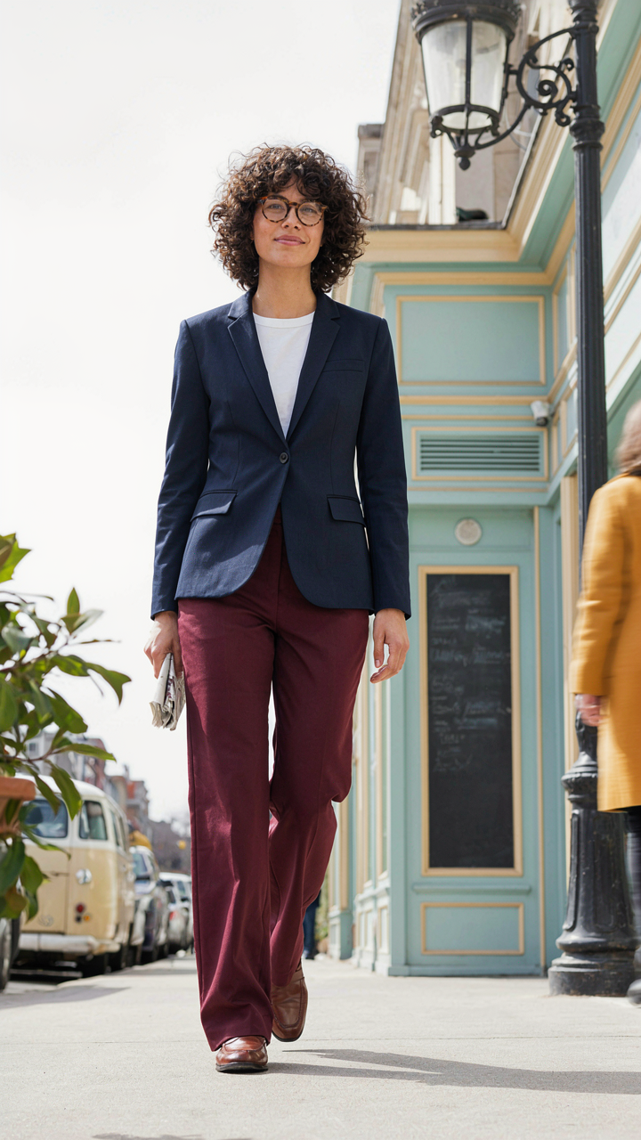
The “safe” advice tells you to pair neutrals with one accent color. That works. It’s also boring and invisible. Real combinations come from understanding that colors interact through contrast, temperature, and visual weight. Navy and burgundy shouldn’t work together by traditional logic, but they do because both are dark and cool enough to coexist without fighting. The rule you need to break isn’t about which colors go together. It’s about assuming that looking “safe” is the goal.
- Cream and charcoal: Opposite ends of the value spectrum create separation without screaming. Works because the lightness difference matters more than the colors themselves.
- Olive and cream: Muted tones reduce saturation clash. The olive pulls earth tones; cream keeps the outfit from feeling heavy or costume-like.
- Black and deep teal: High contrast pairing that feels refined instead of loud because teal reads as dark first, colored second. The navy neighbor effect.
- Tan and deep brown: Monochromatic in warmth but different in depth. Creates dimension without requiring you to mix opposing color families.
- Gray and rust: Cool gray anchors warm rust, preventing the rust from dominating. Works because gray is neutral enough to let rust exist without competition.
The outcome isn’t memorizing combinations. It’s learning to see value and saturation before you see color names. When you get dressed, you’re making a decision about whether those two pieces create enough visual separation to read as intentional, or so much separation that they conflict. The combinations that work aren’t magical. They’re predictable once you stop thinking in color names and start thinking in contrast levels.
When To Go Bold And When To Refine
Context isn’t about fashion rules. It’s about signal. A muted two color outfit signals competence and restraint. A bold combination signals either confidence or carelessness, depending on execution. The difference is saturation control and proportion. At work, you’re usually refining. In social settings where you want to be noticed, you can go bold. The rule everyone misses: your environment dictates whether bold reads as intentional or desperate.
Refining means choosing two colors that are close in saturation and value but distinct enough to read as two colors. Tan and camel. Charcoal and black. Navy and forest green. You’re signaling that you thought about the pairing without demanding attention. Going bold means picking colors with clear contrast in either temperature or value or both. It works in environments where visual presence is neutral or positive. A client meeting calls for refinement. A first date or a creative industry event calls for bold. The mechanism is straightforward: your audience determines whether visual boldness reads as confidence or insecurity. Choose your saturation level based on whether you want to be remembered for the outfit or for what you said.
Quick Fashion Sketch: Training Your Eye For Effective Duos

See The Ratio, Not The Colors
You want permission to stop thinking about this. That’s the real ask here. The mechanism that makes two color outfits work comes straight from visual weight distribution—borrowed from graphic design, where contrast and mass determine whether an composition holds or collapses. In clothing, the same principle applies: you’re not balancing colors, you’re balancing the proportion of each color’s visual footprint. A 70/30 or 60/40 split reads as intentional. A 50/50 split reads as accident.
Most guides tell you to “pair light with dark” or “choose complementary colors.” That’s incomplete. You can pair two dark colors or two light colors and nail it if you get the ratio right. Start by assigning percentages. Your dominant color takes 60-70 percent of your outfit. Your secondary color takes 30-40 percent. The dominant color typically anchors your largest piece—pants, jacket, or dress. The secondary color appears in smaller, visual anchors: shoes, belt, bag, or shirt. Observe this ratio consistently for one week. You’ll stop second-guessing yourself.
Build The Pattern Before You Build The Fit
The real work isn’t matching colors. It’s recognizing which placement patterns your body responds to. This takes iteration, not inspiration. The pattern refers to where each color lands on your frame: is your secondary color near your face, at your waist, or at your feet? Does it cluster or distribute? Your eye trains through rapid repetition, not theoretical study. Set a constraint: wear only two colors per day for two weeks. Photograph each outfit straight on. Review them for patterns you gravitated toward naturally.
You’ll notice you default to certain placements. Some people always put the secondary color at their feet. Others cluster it at the top. Neither is wrong. Your eye has already solved what works for your proportions and coloring. The mistake people make is treating every outfit as a new problem. It isn’t. It’s a variation on existing patterns you’ve already discovered. Respect that pattern. Repeat it. The confidence you gain from repetition beats the novelty of constantly mixing.
Colorful Fashion: The Psychology Of Two Tone Statements

Deliberate Color Choices Build Real Authority
You want people to perceive you as someone who has their life together. That’s the real reason this matters. The mechanism is simple: intentional two color combinations signal decision making. When you wear a planned pairing instead of grabbing whatever’s clean, observers register the difference. This isn’t mystical. Your brain processes consistency as competence. A black blazer with white pants tells a viewer you chose it. Random color chaos tells them you didn’t.
Consistency in color pairing works like contrast in design. Dark plus light. Warm plus cool. Saturated plus neutral. These deliberate pairings require a decision tree. You’re not defaulting. You’re executing. That execution shows up in how people respond to you before you speak. The two color outfit removes decision fatigue from your morning and removes doubt from how others read you.
Color Codes Trigger Specific Interpretations
Most advice on color psychology is garbage because it ignores context. Red doesn’t universally mean power. Navy doesn’t automatically convey trust. What actually happens is this: colors in combination create a statement that viewers decode against their existing associations. Navy and white reads different than navy and burgundy, even though navy supposedly stays constant.
The pairing itself is the message, not the individual colors. Pairing navy with gold accessories, for example, signals luxury because gold carries wealth associations. Navy with white signals clarity and professionalism because white represents blank slate and openness. Navy with black creates authority but reads colder. Pick your two color combination based on the specific interpretation you want people to land on, not the color meanings you’ve read online. Then stick with it across outfits.
The Deliberate Wardrobe: Curating For Two Color Efficiency

Color Foundation Before Purchase
You want this section to work because you’re tired of owning clothes you don’t wear. Most people buy first and build a palette backward, which wastes money and creates decision paralysis every morning. The mechanism is simple: constraint precedes creation. Borrowing from systems engineering, your wardrobe needs a “load path”—the route through which all decisions flow. For two color outfits, that load path is your base palette. Choose it deliberately before buying anything else.
Start with neutrals that match your skin tone and existing pieces. Navy, charcoal, black, cream, and gray work across seasons and lighting. Then pick one secondary color that appears in your life already—your car, your office, your favorite jacket. This isn’t creative; it’s strategic. Your palette should be small enough to memorize and large enough to prevent boredom. Most people fail here because they choose colors they think they should like instead of colors that work with their existing life.
Fabric Weight Over Trend Cycles
Generic advice says buy trendy pieces. That’s wrong. Trends accelerate the death of your wardrobe and guarantee you’ll regret purchases in eighteen months. Real two color efficiency depends on fabric weight and fiber content staying constant across seasons. Invest in pieces that will outlast the social media cycle. A quality cotton blend in your base colors lasts three to five years with normal care. A synthetic trend piece lasts one.
The math is brutal: paying 40 percent more upfront for a merino wool sweater means you get double the wearing life and triple the versatility across temperature shifts. Stick to natural fibers or high quality blends. Buy fewer pieces. Rotate them. Wash them properly. Your two color system only works if the pieces survive long enough to become invisible in your daily routine—the point where you stop thinking about what you’re wearing and just wear it.
The Real Obstacle Isn’t Your Wardrobe; It’s Your Unwillingness To Make A Deliberate Statement
You already know two color outfits work. You’ve seen them everywhere. The real problem is you’re afraid of looking intentional. You hide behind complexity because complexity feels safe. Pick one two color combo today. Wear it tomorrow. Most people won’t notice. The ones who do will notice you finally stopped apologizing for taking up space. Confidence isn’t loud. It’s just decisive.