
Introduction
Earth posters are becoming a popular design trend in health and fitness spaces. These posters typically showcase natural landscapes, environmental themes, and earthy tones that promote wellness and calm. In this article, we look at how earth poster trends influence the design and style choices in health and fitness environments.
We will explore the key visual elements that make earth posters effective, discuss the role of color in creating fitness motivation, and provide practical tips for integrating earth posters into your health-related spaces for a stylish and inspiring environment.
What Defines an Earth Poster

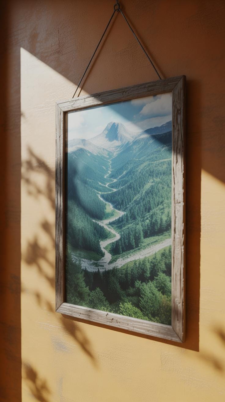
Earth posters often revolve around visual cues drawn directly from the natural world and the environment. You’ll notice a consistent focus on earthy colors—greens, browns, blues—tones that echo forests, soil, water, and sky. These palettes invite calmness but also a subtle energy that tends to ground the viewer. Imagery often includes elements like leaves, trees, mountains, rivers, or even the planet itself, which together emphasize a connection to nature.

In health and fitness spaces, these features aren’t just decorative. They serve a purpose: reminding people of the natural rhythms of life and the importance of balance. When you see an earth poster, it might gently prompt breathing, mindfulness, or movement that aligns with the body’s natural state. It can almost feel like an invitation to step outside, even if you are indoors.
Core Themes in Earth Posters
Themes in earth posters tend toward simplicity but with weight. Common subjects often include:
- Wide-open natural environments—forests, oceans, mountains.
- Environmental preservation—images hinting at sustainability or care for resources.
- Elements like soil, water, air, and plants, shown in a tactile or symbolic way.
These themes resonate well within wellness contexts because they tap into a collective desire to reconnect with something larger than oneself. They’re not just about looking at a pretty picture, but about engaging with ideas of health on multiple levels: personal, ecological, and even spiritual. That makes them quite fitting around gyms, studios, or therapy centers where health is more than physical.
Visual Styles Typical of Earth Posters
Earth posters vary in style, but some patterns stand out. Minimalist designs use sparse imagery and clean lines, often emphasizing a single natural element or a serene color block. It’s a subtle style that invites quiet reflection without overwhelming the senses. Then there’s photo-realistic imagery, where detailed nature shots create an immersive effect, as if you’re peering through a window into the wild.
Abstract interpretations also appear frequently, using shapes and textures inspired by natural forms to evoke feelings rather than direct representations. Each style alters engagement differently—minimalist might soothe and centralize focus; photo-realistic can refresh and energize; abstract can provoke curiosity or introspection. Depending on your space and audience, you might lean one way or another—sometimes, mixing styles brings an unexpected layer of interest.
Why Earth Posters Matter in Fitness Design

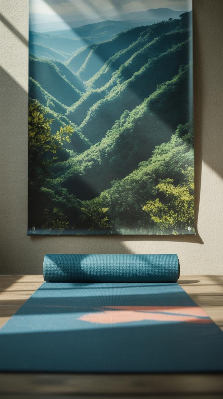
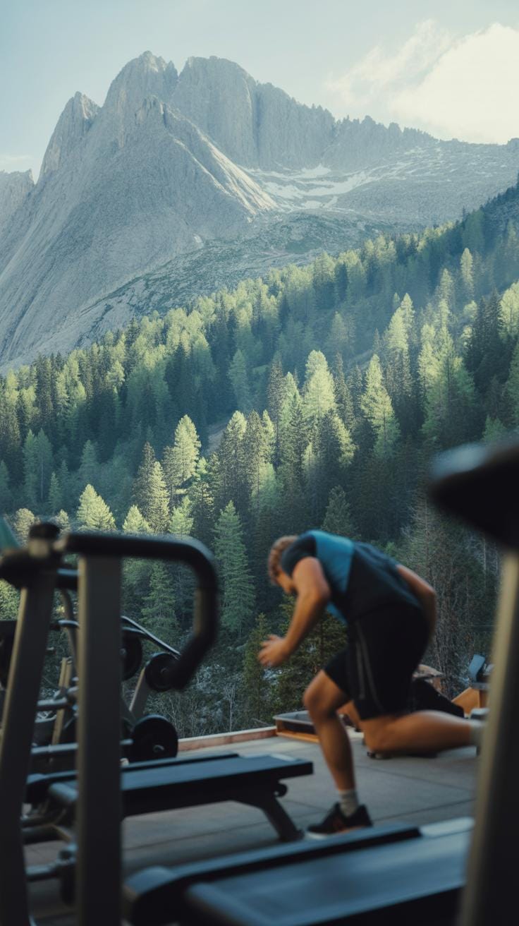
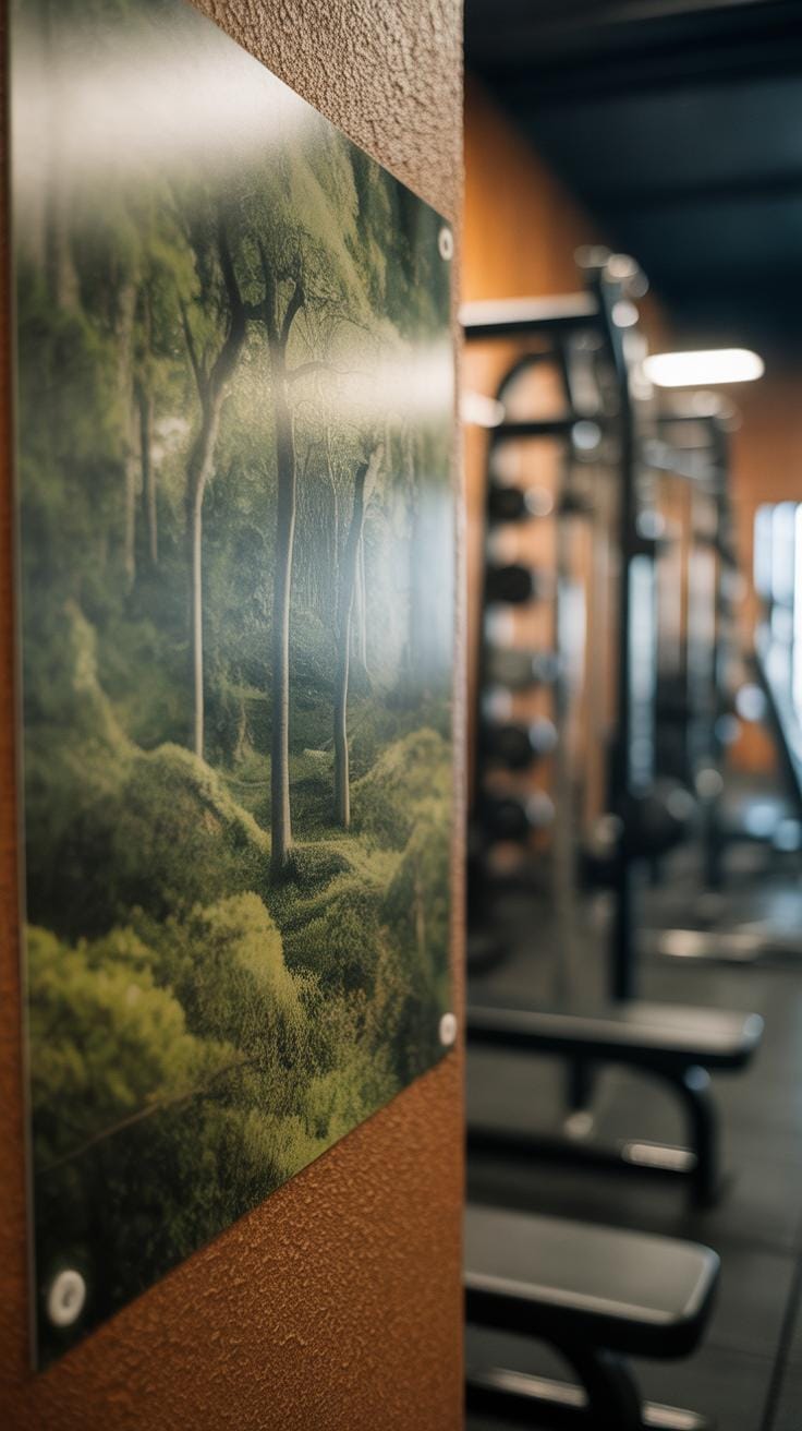
Using earth posters in fitness spaces—gyms, studios, wellness centers—can subtly shift the whole mood. These prints, with their greens, browns, and blues, ground a room in something familiar yet calming. I’ve noticed, for instance, how even just a single poster of a forest or mountain scene can pull focus away from the typical noise and clutter. It’s like the space breathes a bit easier.
There’s more than just aesthetics at play. Earth posters seem to create a kind of mental pause—a moment where stress gently drops and the mind resets. That pause can be crucial when you’re pushing through a tough workout or trying to reach a new level of calm in yoga.
Plus, from what I’ve seen, the presence of nature-themed imagery nudges people toward feeling more connected. And sometimes, that connection brings a lift in motivation. You might find yourself going one more round or holding a pose just a bit longer—not because someone told you to, but because the space encourages it.
Psychological Impact of Nature Imagery
Many studies highlight how nature scenes reduce stress and improve concentration. It’s not surprising if you think about it—our brains are wired to respond to natural environments in a soothing way. Even just a glance at trees or earth tones can lower cortisol levels.
For example, a research project observed office workers exposed to nature photographs reported less anxiety and better focus throughout the day. Now, imagine how this might translate into a fitness setting. The clarity and calm that follow could help someone concentrate on form or pace, making workouts safer and more effective.
Of course, context matters. Not every nature image produces the same effect. Some are tranquil; others invigorate. In a gym, where energy is key, bright scenes with sun-dappled paths might energize clients. At a wellness center, deeper, denser forest imagery could calm a racing mind. You’d want to pick carefully.
Enhancing Fitness Motivation with Earth Posters
Earth posters don’t just decorate; they inspire. This inspiration doesn’t have to be loud or demanding—it often works quietly, through visual cues that coax a certain feeling.
When you see a landscape dominated by enduring mountains or a slow river, you might unconsciously relate those qualities to your own goals: resilience, persistence, flow. It makes you wonder if the environment around you might somehow steel your own will.
Alternatively, softer earth tones evoke tranquility, which may help when your body wants to quit but your mind needs to press on. That subtle calm can be just the thing to reduce mental fatigue during tough sessions.
As a result, fitness spaces with earth posters can foster a balance—between energy and rest, between challenge and ease—helping people stay engaged without feeling overwhelmed. It’s a quiet motivator, but often a lasting one.
Integrating Earth Posters Into Your Space
When it comes to placing earth posters in fitness and wellness areas, where you put them really matters. Think about spots that naturally draw attention—like near entranceways or by water stations where people pause. These areas allow the calm, grounding vibe of earth imagery to hit just at the right moment. At times, it’s the unexpected corners that work too—small rest nooks or stretching zones can benefit from a touch of nature’s calm.
Don’t feel limited to flat walls. Posters can hang from ceilings or lean against wooden shelves for a softer look. Combining them with natural elements—say, potted plants or wooden benches—can amplify that earthy connection. I once saw a small gym use a trio of earth posters framed in warm wood, surrounded by greenery. It made the space feel less sterile, more inviting.
If you have a large wall, grouping multiple posters works well but avoid overcrowding. Keep some breathing room. You want people to actually feel drawn in, not overwhelmed or distracted. And framing isn’t just about protection—it can add weight or even lightness depending on the frame style. Sometimes simple matte black works, other times thin bamboo frames bring an extra layer of texture you might not expect.
Ask yourself: what atmosphere do you want? And how could earth posters support that feeling? Do you want visitors to reset their minds, or feel energized? The answers may shift where you hang them and how you style the display. It’s a bit of trial and error. But getting these small details right can change the whole experience, making health spaces feel less mechanical and more connected to something real.
Color Theory in Earth Poster Design
Color plays a surprisingly big role in earth poster design, especially within health and fitness settings. You might expect these posters to just look natural or simple, but the colors actually affect how people feel and behave in subtle ways. Think about greens, browns, and blues—the core earth tones. They tend to calm and ground the viewer, which could help reduce stress or anxiety during a workout. I remember entering a yoga studio once, walls lined with muted greens and soft browns, and it definitely felt easier to relax, almost as if the colors whispered “slow down.”
Using these earth tones can make fitness spaces feel more welcoming and less intimidating, which is important since many people approach exercise with some hesitation. You might even find it interesting that these colors encourage longer focus, helping users stay present rather than distracted.
Using Earth Tones to Create Calm
Greens—especially the deeper, muted shades—often connect to nature and growth. That association can promote renewal or recovery, which you want in health environments. Browns tend to feel stable, like the earth beneath your feet, giving a subtle sense of security. Blues are generally soothing and can lower heart rates, which is notable in places where people might feel pumped up or anxious.
Still, the calming effect isn’t automatic. The context matters. For example, too much brown, in a dull tone, might feel heavy or boring rather than comforting. It’s a bit of a balancing act. You want warmth without dragging mood down. So using these tones thoughtfully, maybe pairing green accents with blue backgrounds, can create a calm but inviting vibe.
Contrast Between Earth and Vibrant Colors
On the other hand, introducing colors like reds or oranges changes the game. These colors are energizing, pushing for action and intensity. Including a bright splash of red in an earth-toned poster can signal urgency or motivation, which sometimes motivates quicker responses or higher energy.
But this contrast isn’t always straightforward. Mixing calm earth tones with these energetic hues can confuse the eye or mood if done badly. Sometimes, the poster feels split—part chill, part hype—and the message might lose clarity. Yet, if done carefully, this contrast can work well. For instance:
- Earth tones set the base mood—steady and grounded.
- Vibrant colors highlight key calls to action or important info.
This strategy lets the design breathe while still pushing engagement. When you’re deciding about colors, ask yourself: what reaction do you want the viewer to have first? Peaceful reflection or a quick burst of energy? Mixing earth and bright colors involves a bit of trial and error to get right, but the impact can be quite engaging.
Examples of Earth Posters in Fitness
Case Study Gym Poster Design
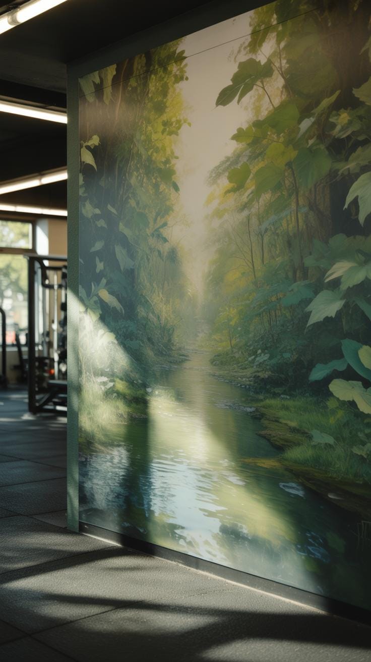
There’s a gym in Portland that incorporated earth posters throughout its workout areas, and it’s interesting to see how it changed the environment. They used large-scale posters of natural landscapes—forests, mountains, rivers—with muted, earthy tones. The goal was to create a calming yet motivating vibe. Members often told the staff that the visuals made their sessions feel less tense, almost like an outdoor workout without leaving the city.
The design focused on simplicity: minimal text, mostly quotes about strength and endurance paired with natural imagery. Over six months, the gym noticed people stayed longer in the workout zones where these posters hung. Attendance at yoga and stretching classes increased, which might be because those spaces felt more inviting and centered.
But maybe what surprised them the most was feedback about mental health. Some gym-goers said the images helped them focus better or reduce stress before a session. So, yes, earth posters don’t just decorate—they might even support a more mindful workout experience.
Home Workout Room Earth Poster Ideas
When you think about your own workout space, earth posters could be a quiet, simple way to change the mood without too much effort. Consider placing a poster of a gentle forest trail or a calm ocean scene where you usually stretch or cool down. The idea isn’t to distract but to provide small moments of calm during a tough workout.
Here are a few approaches you might try:
- Use a poster with a muted color palette to avoid overstimulating your senses while you exercise.
- Incorporate motivational phrases that connect with nature, like “Grow stronger every day,” or “Find your balance.”
- Swap posters seasonally—an autumn leaf print in fall, snow-covered branches in winter—to keep the space feeling fresh and connected to the earth’s rhythms.
- Place smaller earth-themed posters near mirrors or by your weights to encourage brief moments of reflection.
I’d say these subtle reminders of nature could help with focus or even inspire you on days when motivation dips. It might not work the same for everyone, but it’s worth trying. After all, your workout space should feel right for you—not the way it looks to others.
DIY Earth Poster Creation Process

Creating your own earth poster to complement a health and fitness space can be quite rewarding. It doesn’t require professional skills, just some planning and a bit of trial and error—sometimes you’ll find what works only after a few tweaks.
Stepwise Poster Design Planning
Start by thinking about the overall mood you want. Earth tones usually bring calm, but maybe you want sharper greens or blues to energize your space. Picking a theme can narrow things down: are you emphasizing nature’s power, growth, or sustainability? Don’t get stuck on just one idea right away—you might want to mix elements, like mountains with forests or water alongside earth textures.
Color choices matter. Try sticking to three or four key colors to keep the design unified but still interesting. If you’re not sure, test small color swatches next to your workout gear or room walls. Design elements can include leaf patterns, mineral textures, or simple organic shapes. Balance busy areas with clean spaces; sometimes less clutter actually feels stronger.
Tools for Creating Earth Posters
You have options depending on how hands-on you want to get. Digital tools like Canva or Adobe Spark offer ready templates and are user-friendly, perfect if you want to avoid complex software. For a bit more control, Illustrator or Photoshop are good, although they take some learning. On the physical side, watercolors or acrylics give nice texture, and printing on recycled paper can add authentic earth-friendly vibes.
Remember, the process is part of the design. Sometimes a rough sketch on paper leads to your favorite final version. Maybe you’re like me and don’t quite trust digital color until you see it printed—that feeling can actually push you to improve the design in ways you didn’t expect.
Common Mistakes with Earth Poster Use

When selecting earth posters for health and fitness spaces, it’s easy to fall into some traps that actually dull the impact these visuals are supposed to have. One common mistake is overloading walls with too many posters. I’ve walked into gyms where every inch of the wall was covered with leaves, mountains, and the planet’s textures—and honestly, it just gets overwhelming. Instead of inspiring calm or focus, the crowding makes it hard to focus on anything at all. Your eye doesn’t know where to settle, and the message gets lost.
Then there’s the issue of lighting and wall colors. You might pick a subtle green-toned earth poster that looks great in a store, but once it’s slapped on a dimly lit, dark blue wall, all the detail fades. Or bright sunlight washes out the softer hues. You want your earth poster to complement the mood and light of the room, or else it ends up mismatched—like a quiet image in a noisy space. Sometimes, a poster that seems perfectly natural just feels off because the environment fights against it.
Think about the space you have and how people will interact with the visuals. Could the colors look better elsewhere? Does the wall feel too busy already? Not every poster fits everywhere. Sometimes less really is more when it comes to earth imagery in these settings.
Measuring Poster Impact in Fitness Areas
Tracking how earth posters influence gym users is trickier than it seems. You might expect everyone to react the same way, but emotions and motivation are varied, sometimes subtle. One practical approach is designing short surveys that fit into a quick break—think a few questions about how the visuals make users feel or if they notice a boost in motivation. Asking things like “Does this poster inspire you to keep going?” or “How does the natural imagery affect your mood during workouts?” can reveal surprising insights.
Visual behavior observations offer another angle. Observing whether people glance at the posters, linger nearby, or even change their routines after installation can hint at engagement. For example, your eye might catch someone pausing to reflect or smile at the imagery, or maybe workout patterns shift subtly—like longer stretches or more breaks near the poster area.
Interpreting these observations takes patience and a pinch of guesswork. Not every reaction is obvious. Do people find the images calming, distracting, or just background noise? Combining survey answers with these behavioral cues paints a fuller picture. You might find unexpected patterns, like some users drawn to earth tones while others prefer bold, contrasting designs.
Have you noticed the impact yourself? Sometimes it’s what you don’t see—the quiet moments of reflection—that signal the true influence of these visuals. Measuring this influence means balancing direct feedback with careful watching, always remembering that motivation isn’t one-dimensional. It’s complex, often tangled with personal mood, timing, and even day-to-day gym energy.
Costs and Sources for Earth Posters

When thinking about earth posters for health and fitness spaces, the costs can vary quite a bit. Buying a ready-made poster from an online retailer might set you back anywhere from $10 to $50, depending on size and print quality. If you want something larger, like a wall-sized piece, prices climb to $100 or more. Custom designs can add to that cost, especially if you hire a graphic artist, which might push your budget up by a few hundred dollars if you’re not careful.
You might wonder where to find these posters without spending too much. Websites like Etsy, Society6, and even Amazon offer a range of earth-themed prints that are fairly affordable and often come with decent print quality. Local print shops sometimes carry designs as well, and they might be open to small custom orders. Another option is to look for downloadable digital files—then you just pay for printing, which you can control by choosing paper type and size.
Saving money on production can feel tricky, but a few tactics help. Consider smaller sizes, which lower printing costs and make it easier to replace or update posters. Matte finishes often cost less than glossy. You might skip elaborate framing or opt for simpler display options like clips or basic mounts. Also, some design platforms offer budget-friendly templates you can tweak yourself, avoiding pricey custom design fees.
But remember, you don’t want to sacrifice too much on quality, since a dull or blurry poster won’t inspire the right vibe. It’s a bit of a balancing act—paying attention to how much impact your poster gives for the price you pay. So, what’s more important to you: a standout, pricey piece or several smaller, budget-friendly prints that can be swapped out often?
Conclusions
Earth posters offer a unique way to combine nature-inspired visuals with health and fitness motivations. Their use of natural colors and imagery helps to create calming and motivating environments. This trend highlights the importance of visual design in supporting well-being.
By understanding the design choices and color schemes in earth posters, you can select or create artwork that fits your fitness space style. Embracing these trends enhances both the aesthetic and the atmosphere of health and fitness settings.